
The Typography of Kanye West's Album Covers
From ornate collegiate type to total erasure, Kanye West's album covers tell a story through typography. Here's how his type evolved toward nothing.
You can trace Kanye West's entire artistic arc through one element of his covers: type. He began with ornate, maximal lettering and ended, more or less, by erasing text entirely. Few artists have used typography — and the absence of it — as deliberately.
Here's the evolution.
The College Dropout (2004) — Ornate Maximalism
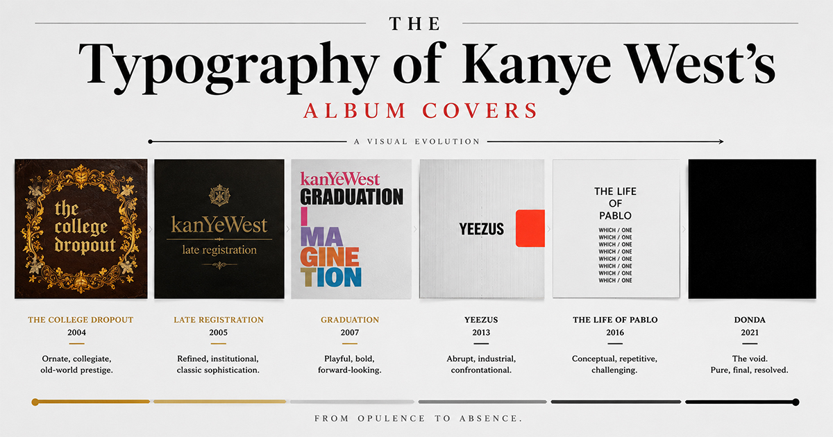
The debut leans into a collegiate fantasy: ornate, ceremonial lettering and a crest-like seal, all gold-tinged and grand. The type is doing heavy thematic lifting, selling the school concept before you hear a bar.
Late Registration (2005) — Refined Continuity
The college theme continues with more polished, classical type. Still ornamental, but calmer — a sequel that tidies up the debut's exuberance.
Graduation (2007) — Type as Illustration
With Takashi Murakami's vivid artwork, the lettering becomes part of the illustration itself — integrated into a cartoon cosmos rather than sitting on top of a photo. Type and image fuse.
808s & Heartbreak (2008) — Stripping Down
A single heart, minimal type. The maximalism is gone; this is the first cover where restraint carries the emotional weight. The quiet typography mirrors the album's cold, vulnerable sound.
My Beautiful Dark Twisted Fantasy (2010) — Type Disappears
George Condo's painting dominates, and on the most circulated cover, type is essentially absent from the front. The art is allowed to speak alone — a major turning point.
Yeezus (2013) — The Void
No artwork, no type — just a bare jewel case and a strip of red tape. The most radical typographic statement is to have no typography at all. Anti-design as a thesis.
The Life of Pablo (2016) — Deliberate Ugliness
A jarring, DIY orange cover with repeated stacked text ("WHICH / ONE") and a family photo, set in plain, almost careless type. It looks unfinished on purpose — type as provocation, rejecting polish entirely.
ye (2018) — Handwriting
An iPhone snapshot of a Wyoming mountain range with a handwritten green scrawl across it. The casual, personal lettering matches the raw, confessional mood — typography as a diary note.
Donda (2021) — Total Erasure
A pure black square. No image, no title, no type. The logical endpoint of a 17-year journey: a cover that removes everything, daring the listener to bring their own meaning.
The Arc
Kanye's typography traveled from ornate maximalism to complete absence — and that journey is the story. Early on, type sold a concept. Later, the refusal of type became the concept. It's one of the clearest examples in pop music of an artist using design language as deliberately as lyrics.
Make Any of These Your Wall Art
In PosterVibe, search any Kanye album and the cover art loads into the editor automatically — and you can experiment with the same kind of typographic choices, from ornate to barely-there. Customize and export at 300 DPI for print.
Start designing your poster — free →
Which Kanye cover has the best type? Debate it in the community.
Ready to Create Your Own?
Put these ideas into practice with our typography album poster maker, or explore the album poster maker, spotify poster maker.