How to Make an Album Poster for Instagram (4:5 Size Guide)
Instagram rewards the right dimensions. A poster designed for a bedroom wall will look cropped, oddly proportioned, or forced into a square on a feed. A poster designed specifically for Instagram looks like it belongs there — filling the screen, commanding attention in a scroll.
This guide covers every Instagram format, which one works best for album posters, and exactly how to design and export for each.
Instagram's Three Main Formats
Before designing anything, decide where the post will appear. Each format has its own dimensions, and designing for the wrong one means cropping or compromising the design later.
Feed Post (Square: 1:1)
- Dimensions: 1080×1080 pixels
- Appears: In your profile grid and home feed
- Album poster fit: Works for square album covers. Feels compact — less space for tracklist and artist name.
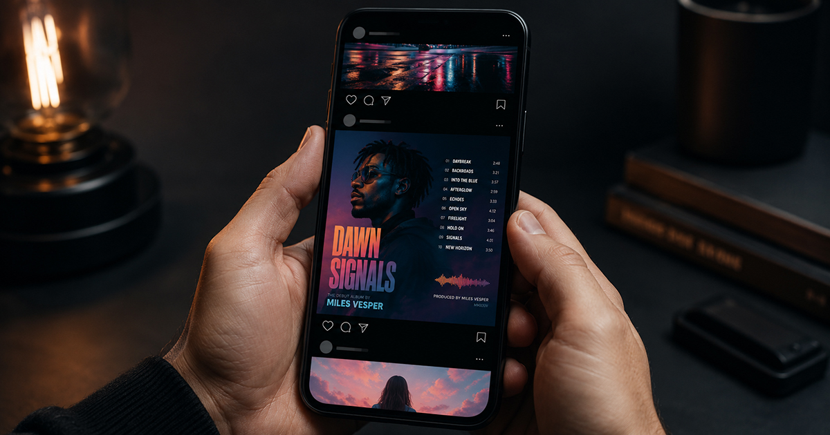
Feed Post (Portrait: 4:5)
- Dimensions: 1080×1350 pixels
- Appears: In your profile grid and home feed (takes up more vertical space)
- Album poster fit: ✅ Best format for album posters. Taller canvas = more room for cover art, tracklist, and typography. Takes up the maximum vertical space in the feed.
Stories / Reels Cover (9:16)
- Dimensions: 1080×1920 pixels
- Appears: Stories bar, Reels thumbnail, Close Friends
- Album poster fit: Works well for atmospheric, minimal posters. Lots of vertical space. Cover art typically takes up the upper portion; text below.
Recommendation: Use 4:5 for feed posts. It's the tallest format Instagram allows in the main feed (they crop anything taller to 4:5 anyway), maximizes your screen presence in someone's scroll, and gives you the most design space for a complete album poster layout.
Why 4:5 Works Better Than Square for Album Posters
A square canvas is the shape of an album cover — not a poster. When you design at 1:1, you end up with the album cover filling most of the space and very little room for any additional information. It reads as "album art image" rather than "album poster."
At 4:5, you have 35% more vertical space. That extra space is where the poster elements live: the tracklist below the cover, the artist name above, the label and year in small type at the bottom. The design starts to feel like a proper poster rather than a screenshot.
Step-by-Step: Designing a 4:5 Instagram Album Poster
Step 1: Open the Editor and Search Your Album
Go to postervibe.app and open the editor. Search your album in the left panel — PosterVibe auto-fills all the data from Spotify.
Step 2: Set Canvas to 4:5
In the Size tab of the left panel, select 4:5. The canvas resets to portrait format, and the template layout adjusts automatically.
Step 3: Choose a Template Designed for Mobile Viewing
Instagram is viewed on phones. Design decisions that work on a desktop monitor may not translate to a 6-inch screen.
What works on mobile:
- Large, bold type for artist name and album title (at least 36pt equivalent)
- High contrast between text and background
- Minimal clutter — less information reads better at small screen size
- Strong cover art presence — it's the hook that stops the scroll
Templates that work well for 4:5 Instagram:
- Modern Bold (high contrast, reads well at small size)
- Minimal White (clean, works for all genres)
- Dark Atmosphere (dramatic, stops scrolls)
Step 4: Optimize Typography for the Feed
When someone sees your post in their feed, it's roughly 250–300 pixels wide on most phone screens. At that size, fine detail is lost — only the strongest visual elements read.
Checklist for Instagram-optimized type:
- Artist name: Large and bold, should read from a thumbnail
- Album title: Clearly legible, at least half the size of the artist name
- Tracklist: Can be smaller — it rewards people who tap to zoom, but shouldn't be the hook
- Background: High contrast with text color — avoid light gray text on white, dark gray on dark
Step 5: Consider the Caption Space
On Instagram, your caption appears below the image. Design the poster to stand alone visually — don't rely on the caption to explain what the image is. The cover art and artist name should be immediately identifiable without reading anything in the caption.
Step 6: Export at the Right Specifications
For Instagram feed (4:5):
- Format: JPEG or PNG
- Dimensions: 1080×1350 pixels minimum (PosterVibe handles this automatically)
- DPI: 72 (screen resolution — Instagram compresses further on upload anyway)
- Color mode: RGB
Export from PosterVibe:
- Click Export in the top toolbar
- Select JPEG (slightly smaller file, loads faster)
- Resolution: 72 DPI
- Download
Instagram recompresses uploaded images. The platform recommends uploading at 1080×1350 at maximum quality (JPEG 100% if possible) and letting Instagram handle the compression rather than pre-compressing yourself.
Instagram Stories: Using 9:16
For Stories, the 9:16 ratio fills the entire screen. Album posters work well here with a different layout approach:
Upper portion (top 60%): Album cover art, large and centered
Middle: Artist name and album title
Lower portion: Tracklist or select lyrics
Very bottom (bottom 10%): Small label/year — Instagram Stories UI overlaps this area, so keep it clear
Export for Stories:
- Canvas: 9:16 in PosterVibe
- Format: JPEG or PNG
- Dimensions: 1080×1920px
- DPI: 72
Posting Strategy
Feed post: Post at your best engagement time. Add a caption with the album name, why it matters to you, and relevant hashtags.
Relevant hashtags for album poster posts:
#albumart #albumcover #albumposter #musicposter #vinylart
#recordcollection #musicdesign #[artistname] #[albumname]
#posterdesign #musiclover
Stories: Add a link sticker pointing to PosterVibe or the album on Spotify. Use polls ("Have you heard this album?") to boost engagement.
Carousel post: Make 3–5 versions of the same album poster with different templates, post as a carousel. Carousels have higher engagement rates than single images on Instagram.
Common Instagram Design Mistakes
Designing at 1:1 instead of 4:5: Wastes vertical feed space. Always use 4:5 for feed posts.
Text too small for mobile: What looks fine on a desktop is illegible on a phone. Preview your design at phone size before exporting.
Low contrast: Dark text on a dark background, or light text on a light background, disappears in a busy feed. Aim for at least 4.5:1 contrast ratio for readability.
Exporting too small: Instagram accepts up to 8MB for images. Export at full quality — let Instagram do the compression.
Ignoring the safe zone: Instagram's UI overlays the bottom of posts (username, like button). Keep important design elements in the upper 90% of the canvas.
FAQ
What's the ideal resolution for an Instagram post?
1080×1350 pixels at 72 DPI for 4:5. Instagram compresses on upload, so uploading at full quality gives the best result after compression.
Will Instagram crop my 4:5 poster to a square in the grid?
Your profile grid shows a square preview of each post, but users see the full 4:5 image when they tap it or see it in their feed. The grid crop is just a thumbnail.
Can I post a 2:3 poster (wall poster ratio) on Instagram?
Instagram will crop anything taller than 4:5. If you try to post a 2:3 image, Instagram will crop the top and bottom. Design in 4:5 specifically for feed posts.
Should I watermark my design?
PosterVibe adds no watermarks. Whether to add your own handle as a watermark is personal preference. A small @username in one corner is unobtrusive and establishes attribution.