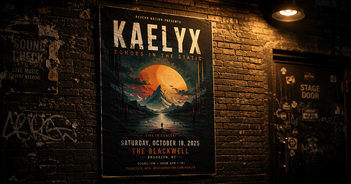
How to Make a Concert Poster Using Album Artwork
A concert poster does two things at once: it announces an event and it represents an artist. The best gig posters feel like extensions of the artist's visual world — and the most direct way to achieve that is to start with the album artwork.
This guide covers how to take existing album cover art and build it into a complete, functional concert poster: what elements to add, how to integrate them without destroying the art, and how to get a print-ready file.
What Makes a Concert Poster Different from an Album Poster
An album poster displays; a concert poster informs. The functional difference is the presence of event details — date, venue, city, supporting acts, ticket information — that the design has to accommodate.
The tension is real: event details are text-heavy, and good album art is often image-dominant. The design challenge is integrating necessary information without turning the artwork into a flyer.
The three approaches:
- Art-dominant: Event details are small, secondary. The artwork fills most of the canvas. Works for well-known artists where the visual identity sells itself.
- Balanced: Art takes the upper portion; a dedicated event details section sits below. Clean, readable, efficient.
- Typography-dominant: The artwork becomes background or accent. Bold typography carries the poster. Works for artists with iconic visual branding (think: band name as large as the image).
Choose your approach before designing.
What to Include on a Concert Poster
A complete concert poster typically contains:
Required:
- Artist/band name (headline)
- Event date
- Venue name
- City/location
Strongly recommended:
- Show time (doors open, set time)
- Ticket price or "tickets at [URL]"
- Supporting act(s) — if any
Optional:
- Tour name or series name
- Promoter logo
- Sponsor logos
- Age restriction (18+, all ages)
- QR code linking to tickets
Keep the hierarchy strict: artist name reads first, date second, venue third. Everything else is supporting information.
Step-by-Step: Building a Concert Poster in PosterVibe
Step 1: Search the Album
Open postervibe.app and search the artist's album in the left panel. PosterVibe imports the album cover art, artist name, and album title automatically.
For a concert poster, you'll mostly use the album cover art and artist name — the tracklist and label information are less relevant (you can hide or remove them in the editor).
Step 2: Choose a Poster Size
Concert posters are typically:
| Format | Dimensions | Use case |
|---|---|---|
| A3 | 297×420mm | Standard gig poster, wall display |
| A2 | 420×594mm | Venue lobby, prominent display |
| 11×17" (US) | 279×432mm | North American standard |
| 18×24" (US) | 457×610mm | Feature venue poster |
| 24×36" (US) | 610×914mm | Large-format venue/festival |
For a personal concert memory poster, A3 or 18×24" is the most common choice.
Step 3: Choose and Customize the Template
Select a template that matches the artist's visual identity. For a concert poster:
- Dark Atmosphere — works for most rock, electronic, metal, hip-hop. The artwork glows; event text reads cleanly on dark backgrounds.
- Modern Bold — high contrast, works for contemporary artists. Event details can be large and assertive.
- Vintage Vinyl — for classic rock, jazz, soul. Warm texture complements older album art.
Step 4: Add Event Details as Free Text
In PosterVibe's left panel, use Add Free Text (under Fields) to create text elements for each piece of event information.
Recommended text hierarchy:
ARTIST NAME
[already pulled from album data — scale up if needed]

VENUE NAME
City, State/Country

Month DD, YYYY
Doors XX:XX  |  Show XX:XX

Tickets: [URL or venue name]
Supporting: [Act Name]
Typography approach:
- Artist name: Largest element, often matching the font used in the template
- Date: Second largest — usually 30–50% of artist name size
- Venue and city: Third tier
- Supporting info: Smallest — same size, neutral weight
Step 5: Position Event Details Without Destroying the Art
This is the key design problem. Options:
Option A: Below the artwork
Stack event text beneath the album cover in a clean block. The art is protected; the text is legible. This is the safest approach.
Option B: Semi-transparent overlay
Add a semi-transparent dark panel (50–70% opacity black rectangle) across the lower portion of the image. Place white text over it. Maintains the full-bleed art feel while keeping text readable.
Option C: Dedicated lower section
Use a template that already has a distinct lower zone for text. Typically a solid color band at the bottom — often pulled from the album art's dominant color.
What to avoid:
- Placing text directly over busy parts of the artwork without any background treatment — it becomes illegible
- Making event details compete with the artist name in visual weight
- Centering everything — creates visual boredom. Left-align the event details for a more editorial, gig-poster feel.
Step 6: Handle Supporting Acts
If there's a support act, they should appear clearly but subordinately:
THE MAIN ACT
with SUPPORT ACT ONE  ·  SUPPORT ACT TWO
Put supporting acts in a lighter weight at 40–60% of the headline size. If there are multiple support acts, a single line with dots or slashes between names reads cleanly.
Step 7: Export Print-Ready
For venue-printed gig posters:
- Format: PDF
- DPI: 300
- Color mode: CMYK
- Bleed: 3mm on all sides
For a personal keepsake to frame at home:
- Format: JPEG or PDF
- DPI: 300
- Color mode: RGB (for home printing) or CMYK (for print shop)
Typography Principles for Concert Posters
Concert poster typography has its own conventions:
All caps for the headline: The artist name almost universally appears in all-caps or title case on gig posters. All-caps reads faster at a distance.
Condensed fonts read better large: At large sizes (artist name spanning the width of the poster), condensed fonts pack more character into the space and are a gig poster tradition.
Date in a contrasting style: Many concert posters use a different font for the date than the headline — the combination creates visual interest. A bold sans-serif headline with a lighter, wider font for the date is a common and effective pairing.
Stack the date: Rather than "June 14, 2025," consider:
JUNE
14
2025
Stacked dates read more like poster design and less like a calendar.
Commemorative vs. Advance: Two Types of Concert Posters
Advance poster (promotional): Designed before the show to promote ticket sales. Needs full event details, ticket URL, sometimes age restrictions. Printed in quantity and distributed.
Commemorative poster (keepsake): Designed after or around the show as a personal memento. Doesn't need ticket URLs or promotional language. Can be more artistically expressive. This is what most people are making in PosterVibe — a personal record of a show they attended.
For commemorative posters, you can omit ticket information entirely and add details that make it personal:
- "Sold out show"
- "Row G, Seat 14" in small type
- The exact setlist as the tracklist
- A date written out in full ("The fourteenth of June, twenty twenty-five")
FAQ
Can I use a setlist as the tracklist on a concert poster?
Yes — in PosterVibe, you can manually edit the tracklist in the Fields panel. Replace the album tracklist with the actual songs played at the show for a personalized setlist poster.
What if the artist has no album art I want to use?
You can upload your own photo from the show using PosterVibe's image upload feature. Replace the album cover with a concert photo, then design around it.
Should the poster say "World Tour" or "Live" or any other designation?
Optional, but common on gig posters. A small "LIVE" above the artist name or "[Tour Name] Tour" below the date adds context without being necessary.
What's the standard aspect ratio for a gig poster?
In the US, 11×17" and 18×24" are traditional. In Europe and Australia, A3 (similar to 11.7×16.5") is standard. All of these are portrait orientation — landscape concert posters are rare.