How to Design a Vinyl Record Poster at Home
There's something about vinyl that demands proper reverence. The ritual of pulling a record from its sleeve, the weight of it, the warmth of the sound — it's a tactile, intentional experience. Your walls should reflect that.
A vinyl record poster is more than decoration. It's a statement about what music means to you. And making one at home — designing it yourself, choosing every element — gives it a weight that a store-bought music print never has.
Here's how to do it.
What Makes a Great Vinyl Record Poster
Before opening any design tool, it's worth thinking about what a vinyl poster should feel like.
The best vinyl record posters share a few qualities:
They're specific. Not "music" as a concept — a particular album, a particular pressing, a particular moment in time. The specificity is what makes them meaningful.
They respect the artwork. Great album art from the vinyl era — Blue Note jazz covers, early rock album sleeves, soul and R&B cover photography — was designed to be seen at 12 inches. A poster gives that art the scale it deserves.
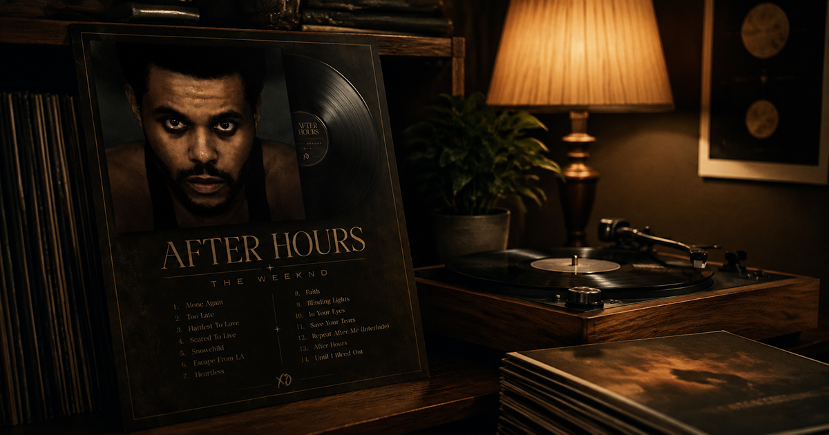
They include context. The tracklist, the label, the year, the catalog number if you want it. A vinyl poster should feel like an archival document as much as a piece of art.
They have the right mood. A Miles Davis Blue Note cover belongs in a different visual language than a Black Sabbath sleeve. Let the music guide the design.
Choosing the Right Album for Your Poster
The album choice matters more than any design decision you'll make. A few questions to guide you:
Which album do you return to most? Not your "objectively favorite" album — the one you actually put on when you don't know what else to play.
Which cover art looks best large? Some album covers are designed for the 12-inch sleeve and look spectacular at poster scale. Others don't translate. Search the album title + "high resolution" and see how the art holds up.
What mood do you want in the room? A vinyl poster changes the energy of a space. A dark, moody jazz cover feels different from a bright pop sleeve. Choose deliberately.
Classic vinyl suggestions by mood:
| Mood | Album | Year |
|---|---|---|
| Warm & soulful | Marvin Gaye — What's Going On | 1971 |
| Cool & intellectual | Miles Davis — Kind of Blue | 1959 |
| Atmospheric & dark | Pink Floyd — The Dark Side of the Moon | 1973 |
| Energetic & bold | Led Zeppelin — IV | 1971 |
| Timeless & minimal | The Velvet Underground & Nico | 1967 |
| Warm & folk | Joni Mitchell — Blue | 1971 |
Step-by-Step: Designing Your Vinyl Poster
Step 1: Open PosterVibe and Search Your Album
Go to postervibe.app and open the editor. Search your album in the left panel search bar.
PosterVibe pulls the album data from Spotify and MusicBrainz — cover art, tracklist, artist, label, year — automatically. This is particularly useful for vinyl-era albums where sourcing high-resolution artwork separately can be frustrating.
Step 2: Choose a Vinyl-Appropriate Template
For a vinyl aesthetic, look for templates with these characteristics:
- Warm color tones rather than cold or neon palettes
- Serif or vintage-styled typography that feels period-appropriate
- Generous white space around the cover art — vinyl sleeves breathe
- Tracklist prominence — vinyl listeners care about track order
The Vintage Vinyl and Dark Atmosphere templates in PosterVibe are specifically designed for this aesthetic.
Step 3: Set the Canvas to 2:3 (Poster Ratio)
In the Size tab, select 2:3. This matches standard poster frames (A3, A2, 18×24) and gives your design the proportions of a tall portrait — the natural orientation for a vinyl poster.
Step 4: Customize for the Vinyl Feel
A few specific customizations that elevate a vinyl poster:
Typography choices:
- For jazz and classical: serif fonts (Garamond, Playfair Display, EB Garamond)
- For rock: bold condensed serif or distressed fonts
- For soul and R&B: elegant script or warm serif
- Avoid clean sans-serif for vinyl-era albums — it reads as modern, not classic
Color palette:
- Pull from the album art itself using the extracted palette
- Warm off-white or cream backgrounds for jazz and folk
- Deep black or dark navy for rock and electronic
- Avoid pure white (#ffffff) — it reads as digital. Use warm white (#f8f5f0) instead.
Layout details to include:
- Catalog number (find it on Discogs.com for your specific pressing)
- Label name (automatically pulled from Spotify)
- Side A / Side B tracklist split if the album has a clear side structure
- Recording location or studio if notable (e.g., "Recorded at Van Gelder Studio, Englewood Cliffs, NJ")
Step 5: Add the Catalog Number (Optional but Authentic)
This small detail makes a vinyl poster feel genuinely archival. Find your album on discogs.com, look up the original pressing, and note the catalog number (e.g., "Blue Note BLP 1595" for Kind of Blue).
In PosterVibe, use a free text element at the bottom of the poster in small type. It adds almost nothing visually but everything contextually.
Step 6: Export and Print
For wall display:
- Format: PDF, 300 DPI, CMYK (Pro plan)
- Size: A2 or larger for maximum impact
- Paper: Ask for matte — glossy is too modern for a vinyl aesthetic
For framing:
- Target: A2 (420×594mm) or 18×24 inches
- Frame: Black or natural wood — avoid silver or chrome for vinyl-era albums
Printing Recommendations for Vinyl Posters
Paper type matters for vinyl posters. The right paper reinforces the warm, tactile feel:
- Matte fine art paper (200gsm+): Best choice. Warm, non-reflective, feels premium.
- Luster photo paper: Slight sheen, still warm. Good middle ground.
- Glossy photo paper: Avoid. Too reflective, too modern, wrong feel entirely.
Where to print:
- Local print shops often have fine art paper in stock — ask specifically
- Online: Printique, Nations Photo Lab, or MPIX for US; Photobox or Snapfish for UK/EU
- IKEA print service for affordable A2/A3 on decent paper
Framing Your Vinyl Poster
Frame choice is the final design decision, and it matters as much as the paper.
Black frame: Works for any genre. Clean, slightly contemporary, doesn't compete with the art.
Natural wood / oak: Best for jazz, folk, acoustic. Warm and analog-feeling.
Dark walnut: Works for blues, soul, classic rock. Rich and moody.
White frame: Use only for very graphic, modern-designed vintage art (e.g., The Velvet Underground banana). Tends to feel too clean for most vinyl-era covers.
No frame (mounted): Some vinyl posters look best mounted with archival tape on a dark wall with no frame at all. More gallery, less bedroom.
FAQ
Can I use PosterVibe for albums that predate Spotify?
Yes. PosterVibe's MusicBrainz fallback covers a huge catalogue of pre-streaming releases. Most classic albums from the 1950s through the 1980s are in the database.
What's the best size for a vinyl poster?
A2 (420×594mm) is the sweet spot — large enough to show album art detail, fits standard frames. For a feature wall, A1 makes a more dramatic statement.
Should I print on matte or glossy paper?
Matte, always, for vinyl-aesthetic posters. Glossy reads as modern and digital. Matte is warm, analog, and suits the material.
Can I add my own text like "Pressed on 180g vinyl" or custom details?
Yes. PosterVibe's free text element lets you add any custom text anywhere on the canvas.