How to Design a Tracklist Poster That Actually Looks Good
A tracklist poster sounds simple: list the songs, make it look nice. In practice, it's one of the more technically demanding things to design well.
The problems are specific: tracks with wildly different title lengths, albums with 6 tracks and albums with 22, long song names that break into awkward hyphenations, track numbers that look orphaned from their titles. Get any of these wrong and the poster reads like a spreadsheet instead of art.
This guide covers the specific decisions — layout, typography, columns, spacing, hierarchy — that separate a great tracklist poster from a mediocre one.
The Three Tracklist Poster Types
Before making any design decisions, decide what kind of tracklist poster you're making:
Type 1: Full album poster with tracklist
Album cover art is the dominant element. The tracklist appears below or beside it, usually smaller, as supporting information. Most album posters fall into this category.
Type 2: Tracklist-forward poster
The tracklist is the hero element. The album cover might be small, in the corner, or absent entirely. The track titles are large enough to read across the room.
Type 3: Pure typographic tracklist
No album cover at all. Just the track titles, artist, and album name arranged as pure typography. The most minimalist approach — works for albums with great song titles or significant typographic potential.
Layout: How Many Columns?
Column count is the first structural decision, and it depends on track count.
1–8 tracks: Single column
Short albums have room to breathe. A single centered or left-aligned column with generous line height looks elegant and uncluttered.
9–14 tracks: Either single column or two columns
This is the decision zone. A single column starts to feel dense; two columns can feel forced if the album doesn't fill both well. Test both. If any column has fewer than 4 tracks, stay single.
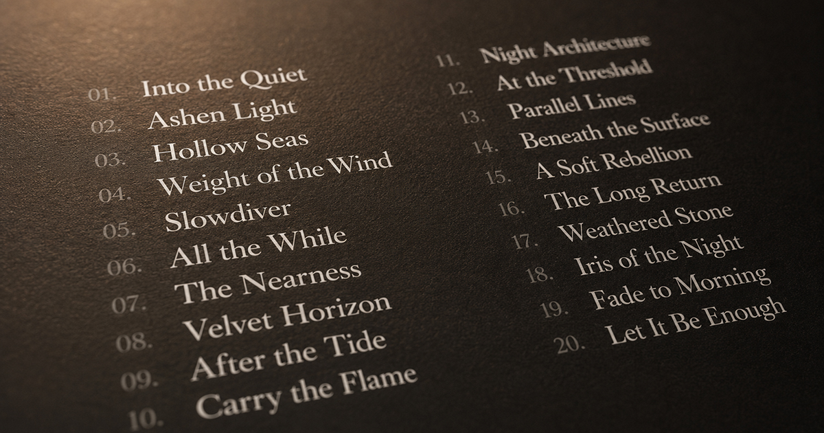
15+ tracks: Two columns
Double albums, extended releases, and anything approaching 20 tracks need two columns. Three columns are possible but cramped at most poster sizes — reserve for very large prints.
The rule: Each column should have roughly equal track counts. An uneven split (12/4) looks accidental. Aim for (8/8) or (9/7) — close enough to feel intentional.
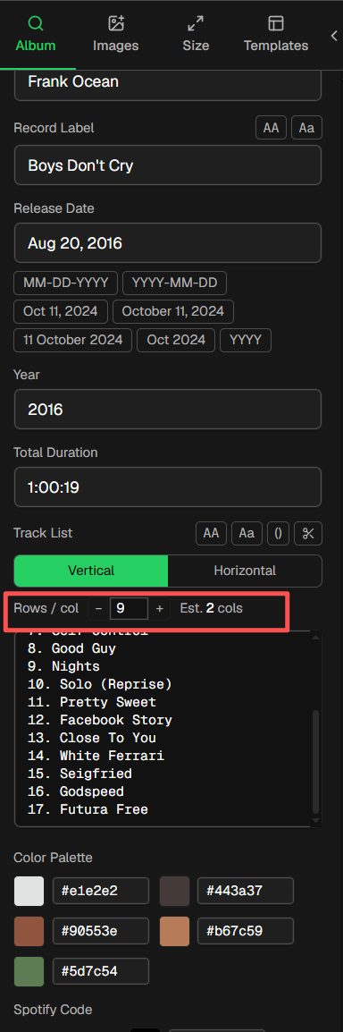
How to quickly adjust the number of columns in the song list: 在In the left Album panel, the -tracksList field controls and adjusts the number of columns in the tracksList, see the example image below.
Typography: The Decisions That Make or Break It
Track number vs. track title hierarchy
Track numbers are navigational; track titles are the content. The track number should be clearly subordinate:
- Track number: Same font as the title, but smaller (70–80% of title size) and lower opacity (60–80%)
- Track title: Full opacity, full size
- Separator: Period, dash, or space — consistent throughout. Avoid colons and parentheses around numbers.
Example:
01  Intro
02  Song Title Here
03  Another Song
vs. the cluttered version:
[01] Intro
[02] Song Title Here
[03] Another Song
The brackets add visual noise. The number, a small gap, and the title is cleaner.
Font choice for tracklists
For readability: Choose a font with clear letterform distinction between similar characters (I, l, 1 / O, 0). Mono or tabular-width fonts handle track numbers well because the numbers stay aligned.
For mood matching:
| Music style | Tracklist font direction |
|---|---|
| Jazz, classical, folk | Elegant serif (Garamond, Cormorant, EB Garamond) |
| Hip-hop, R&B | Bold grotesque (Neue Haas Grotesk, Aktiv Grotesk) |
| Electronic, ambient | Geometric sans (Futura, Circular, Montserrat) |
| Rock, metal | Condensed display or slab serif |
| Indie, alternative | Humanist sans (Gill Sans, Raleway, Lato) |
Font size guidance:
- Full album poster (tracklist is secondary): 8–11pt equivalent
- Tracklist-forward poster: 14–24pt
- Pure typographic poster: Can be very large — fill the space
Line height and spacing
Tight line spacing makes a tracklist feel cramped and stressful to read. Too loose and it falls apart.
Rule of thumb: Line height at 150–160% of font size. For a 10pt tracklist, line height should be 15–16pt. This creates enough air between lines to read comfortably without feeling disconnected.
Between track groups (side A / side B, or between column entries), add extra space — roughly one blank line equivalent. This creates natural breathing room.
Handling long track titles
Long titles that run to multiple lines create visual inconsistency. Options:
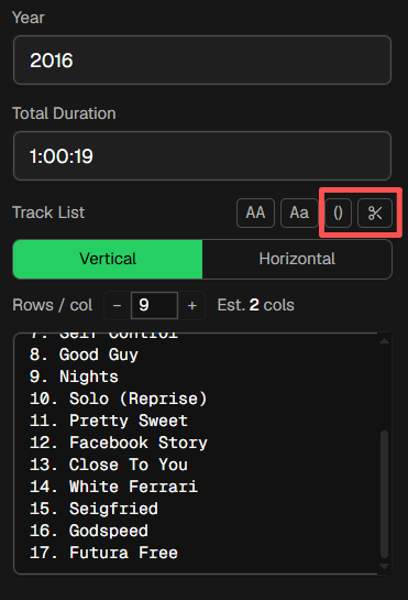
- Remove parentheses content - Use the Remove parentheses content function for quick shortening
- Remove remastered / version suffixes - Use the Remove remastered / version suffixes feature for quick shortening
3. Let them wrap — keep line height consistent, accept the extra vertical space. Works if only a few tracks are long.
4. Reduce font size for that specific track (slightly) — risky, creates inconsistency.
5. Abbreviate — only if you're certain the reader will recognize the abbreviation.
- 6. Use a narrower column — gives each title more width to work with before wrapping.
PosterVibe's tracklist component handles long titles automatically with intelligent wrapping.
Color and Contrast
Tracklist text should be legible, not decorative.
High contrast between text and background is non-negotiable. Black text on white, white text on black, or a closely related pairing that maintains at least 4.5:1 contrast ratio.
Where designers go wrong:
- Gray text on a dark background (insufficient contrast)
- Overlaying tracklist text directly on the album art (legibility destroyed by busy background)
- Using a decorative script font at small sizes (beautiful at 48pt, illegible at 10pt)
If your tracklist sits over the album art (not below it), add a semi-transparent panel behind the text — dark for light text, light for dark text. Even 50% opacity creates enough separation for legibility.
Side A / Side B Division for Vinyl Albums
If you're designing a poster for a vinyl release with two sides, respecting the side structure adds authenticity:
Option 1: Label each group
Small "Side A" / "Side B" labels above each track group in uppercase, spaced away from the tracks. Clean and explicit.
Option 2: Thin rule between sides
A 0.5pt horizontal line (matching text color at 30% opacity) between the last Side A track and the first Side B track. Subtle and elegant.
Option 3: Column-based split
Left column = Side A, right column = Side B. Works well if each side has the same track count.
Putting It Together in PosterVibe
PosterVibe's tracklist component handles much of this automatically:
- Search your album — tracklist is imported in order from Spotify
- Left panel → Fields → Tracklist — choose vertical (single column) or horizontal (dual column) layout
- Max rows per column — set how many tracks appear per column before a new column starts
- Right panel (tracklist selected) — adjust font, size, color, line height, and opacity
For a standard album of 10–12 tracks, the default vertical layout usually works well. For double albums or releases with 16+ tracks, switch to horizontal (two-column) and set max rows to 8–10 per column.
Examples: What Works and What Doesn't
Works:
- White text, 10pt, Garamond, 160% line height, track numbers at 70% opacity, dark background
- Single column, generous margins, side A/B divided by thin rule
Doesn't work:
- Light gray text on a dark background (unreadable at distance)
- Three columns of 7 tracks each on an A3 poster (each track is 6pt — illegible)
- Script font for tracklist (beautiful in isolation, hard to read in a list)
- No visual hierarchy between track number and track title
FAQ
How do I handle albums with very long song titles?
Allow wrapping, keep line height consistent, and increase column width to minimize breaks. PosterVibe's tracklist component handles this automatically.
Should I include track durations?
Optional. Durations add information but also clutter. For a minimalist design, omit them. If you include them, right-align them in a separate column from the title.
Can I include bonus tracks or deluxe edition tracks?
Yes. Add them manually in PosterVibe's field editor. Separate them from the main tracklist with a small label ("Bonus Tracks" or a thin rule).
What's the smallest readable font size for a tracklist?
8pt is the practical minimum at A3 size viewed from 1 meter. For A4, go no smaller than 9pt. For digital display only, 10pt minimum.