How to Create a Music Poster Wall: Layout and Sizing Guide
A single great poster is a statement. Four or five together with no plan is clutter. A well-arranged music poster wall — with intentional sizing, consistent framing, and considered spacing — can transform a room.
This guide covers the planning decisions that make the difference: how to choose sizes, how to arrange multiple posters, how to mix frame styles, and how to measure before putting holes in the wall.
Start with the Wall, Not the Posters
Most people design poster walls backward — they buy posters, then try to arrange them. The better approach starts with the wall itself.
Measure your wall space first.
Decide:
- How much of the wall you want to fill (a small cluster vs. an edge-to-edge arrangement)
- Where the visual center of the arrangement will be (usually eye level — about 145–155cm / 57–61 inches from the floor)
- Whether you want a structured grid or an organic arrangement
Write those dimensions down before you design or order any posters.
Sizing Your Posters
The most common poster wall mistake
Mixing too many different sizes without a unifying logic. One very large, one medium, three small creates visual chaos. Even when sizes vary, there should be a system behind the variation.
Three sizing strategies that work
Strategy 1: Single size, repeated
All posters the same size. The arrangement itself creates visual interest.
- Most cohesive approach
- Easiest to frame (one frame size, bought in bulk)
- Works best in a tight grid layout
- Ideal sizes: A3 (12 posters fits a 2×6 row), 12×16" (US), or A4 for smaller walls
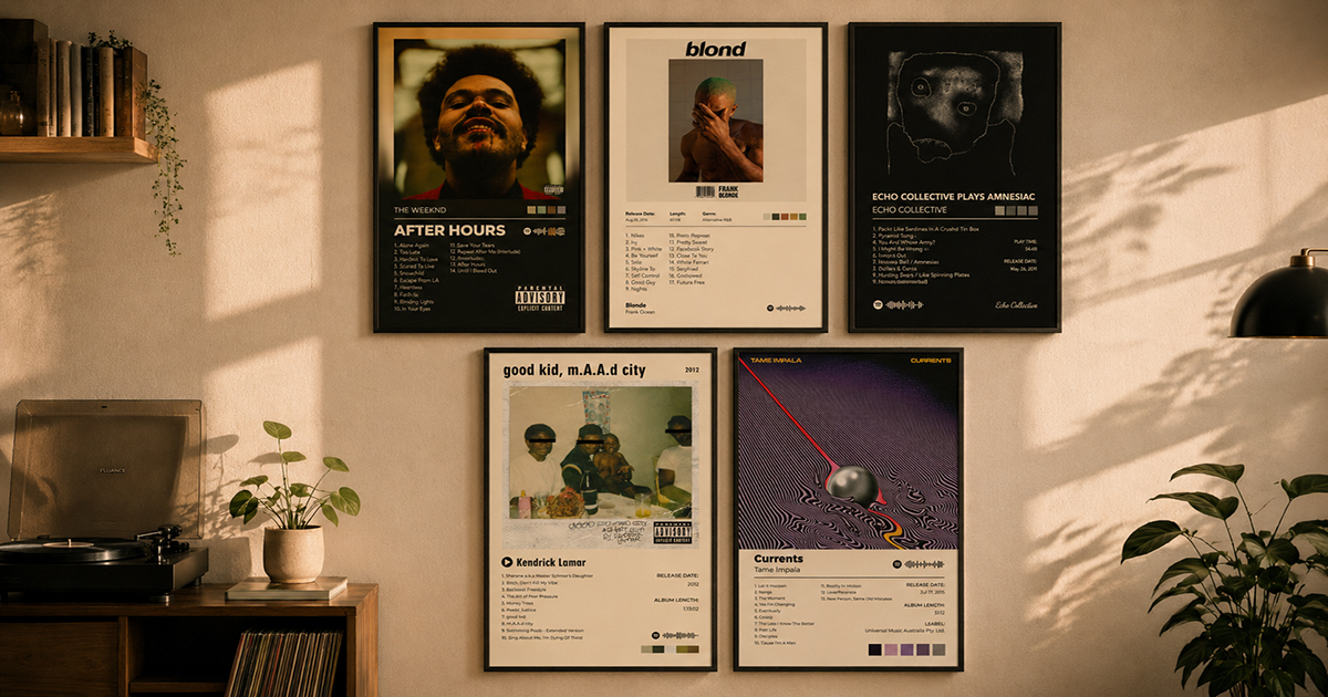
Strategy 2: Dominant + supporting
One large central poster flanked by smaller supporting posters.
- The large poster anchors the wall; smaller prints surround it
- Typical ratio: 1× large (A1 or 24×36") with 4–8× small (A4 or 8×10")
- Creates hierarchy — the central poster should be your most meaningful album
Strategy 3: Mixed but proportional
Different sizes, but all in a consistent proportion (e.g., all 2:3 ratio: A4, A3, A2, A1 are all 2:3).
- Sizes vary but shapes stay consistent — looks intentional
- PosterVibe's default 2:3 ratio works perfectly for this strategy
Grid vs. Organic Layouts
Grid layout
Posters are aligned in a strict row-and-column structure. Spacing is consistent. Everything aligns to an invisible grid.
Best for:
- Larger collections (6+ posters)
- Rooms with clean, modern aesthetics
- Symmetrical walls (between two windows, above a sofa)
Common grid configurations:
- 2×2 (4 posters, square cluster) — classic for a corner or above a desk
- 2×3 (6 posters) — works on a standard bedroom wall section
- 3×4 (12 posters) — feature wall for dedicated music rooms
Spacing: 5–8cm (2–3") between frames is the sweet spot. Too tight looks cramped; too loose breaks the visual connection.
Organic / salon-style layout
Posters at varying heights, with mixed sizes, following no strict grid. The overall shape of the cluster is usually rectangular or curved.
Best for:
- Collections with varied poster sizes
- Rooms with eclectic or vintage aesthetics
- Stairwells and awkward wall shapes
Planning organic layouts: Cut paper templates to scale (1:10 works — a 30×42cm A3 poster becomes a 3×4.2cm paper rectangle). Tape them to the wall with painter's tape and step back. Rearrange until it looks right, then mark hole positions.
The Eye-Level Rule
Gallery walls look best when the visual center of the arrangement sits at eye level — roughly 145–155cm (57–61") from the floor. This is the standard used in galleries and museums.
For a single poster: the center of the poster sits at eye level.
For a group arrangement: the center of the overall cluster (not any individual poster) sits at eye level.
Practical method:
- Mark 150cm from the floor on the wall
- Decide the total height of your arrangement
- The top of your arrangement should be at
150 + (total arrangement height / 2)
Framing: The Detail That Unifies Everything
Frame choice has more effect on the overall look than almost anything else.
The safest frame strategy: Black frames, white mats
A black frame with a white mat works for nearly any album poster:
- High contrast against both light and dark walls
- Neutral — doesn't compete with the artwork
- Creates breathing room between the print and frame edge (the mat)
- IKEA RIBBA frames (black, with mat) are the go-to recommendation for budget builds
Going matless
A frame without a mat has a more immediate, high-impact feel. The art bleeds to the frame edge. Works well for:
- Bold, graphic album covers
- Modern, minimal rooms
- Grid layouts where the frames themselves become the design element
Frame material considerations
| Material | Look | Cost | Notes |
|---|---|---|---|
| Black metal/aluminium | Sleek, modern | Low–medium | Lightweight, consistent |
| Black wood | Warmer, classic | Medium | Slight variation adds warmth |
| Natural wood (oak, walnut) | Warm, Scandinavian | Medium–high | Works with warm-toned albums |
| White | Light, airy | Low–medium | Good for light walls |
| Gallery-wrap canvas | Frameless look | High | For oversize pieces |
The rule on mixing frame materials: Mix at most two — e.g., black metal + natural wood. More than two frame styles starts to look accidental.
Planning Your Wall: A Step-by-Step Process
Step 1: Choose your posters and sizes in PosterVibe
Design each poster in the same aspect ratio (2:3 recommended for portrait walls). You can mix the content — different albums, different templates — while keeping the shape consistent.
If you're using different sizes:
- A4 (21×29.7cm) — small
- A3 (29.7×42cm) — medium
- A2 (42×59.4cm) — large
These are all the same 2:3 ratio, so frames from the same product line will share visual language.
Step 2: Sketch the arrangement on paper
Draw your wall to scale. Mark:
- The wall dimensions
- Windows, doors, power outlets (things that constrain placement)
- The target visual center (eye level)
- Approximate poster positions
This takes 10 minutes and saves you from measuring wrong and making extra holes.
Step 3: Make paper templates
Cut paper to the exact size of each framed poster (including frame edge). Label each one with the album name. Tape them to the wall with painter's tape.
Step back and look from the doorway. Check:
- Does the overall shape read as intentional?
- Is the visual center at eye level?
- Is the spacing consistent?
- Does the arrangement relate correctly to furniture below (if any)?
Adjust the paper templates until it looks right.
Step 4: Mark and measure
When the paper layout is right:
- Mark the top-center of each paper template with a pencil
- Measure from the top-center to the hanging hardware on the frame (this is the offset)
- Mark the nail position: top-center pencil mark minus the offset = nail position
- Use a level for grid arrangements
Step 5: Hang and adjust
Start from the center and work outward for organic layouts. Start from a corner and work row-by-row for grids. Use a level obsessively — crooked frames in a grid are immediately visible.
Special Considerations for Music Rooms
If you're designing a dedicated music room or listening room poster wall:
The listening position matters: If you have a primary listening chair or sofa, the wall it faces is the feature wall. Design the densest, best-curated part of your display there.
Album chronology as layout logic: For a single artist, arrange albums chronologically — left to right, or top to bottom. The wall becomes a timeline of a discography.
Genre clustering: In a room with eclectic taste, grouping by genre or era in adjacent zones can feel more intentional than random mixing.
Vinyl storage integration: If you have visible record storage (Kallax, record crates), plan the poster wall to extend or complement the LP collection. Matching frame colors to the storage unit creates a cohesive look.
FAQ
How many posters is too many?
There's no hard limit, but start with fewer than you think you need. A tight cluster of 4 great posters looks better than 12 posters that fill the wall without logic. You can always expand.
Should all posters be the same artist or can I mix?
Either works. A monographic wall (one artist's full discography) is a strong statement. A mixed-artist wall reflects broader taste. What unifies a mixed wall is usually consistent framing and sizing, not the subject matter.
What's the minimum spacing between frames?
2–3cm (about 1") is the absolute minimum and will look tight. 5–8cm (2–3") is more comfortable. More than 15cm and the arrangement starts to break apart visually.
Can I use PosterVibe to design all the posters in a matching style?
Yes — choose the same template for each album, or choose templates that share the same background tone (all dark, or all minimal white). Consistent template choices unify a mixed-album wall as much as consistent sizing.