How to Choose the Right Template for Your Album's Mood
The right template makes an album poster look inevitable — like it couldn't have been designed any other way. The wrong template makes even a great album feel like a generic product.
Template selection is the most important creative decision in designing an album poster. Choose well and the design does most of the work. Choose poorly and no amount of customization will save it.
This guide breaks down how to match template style to musical mood — by genre, by era, by aesthetic, and by feel.
The Core Principle: Template Serves Music
Before anything else, one rule: the template should feel like it grew from the music, not like it was imposed on it.
A dark, grainy, atmospheric template on Taylor Swift's Lover would feel wrong. A clean, pastel minimal template on Black Sabbath's Paranoid would feel absurd. The template is the visual mood — it should match the emotional register of the record.
Ask yourself: if this album had a room, what would it look like?
Template Styles and When to Use Each
Minimal / Clean
Visual character: Lots of white or neutral space. Simple typography. The album cover art is the primary element. Everything else recedes.
Mood it conveys: Thoughtful, tasteful, restrained, modern, intellectual.
Best for:
- Indie folk, acoustic, singer-songwriter (Phoebe Bridgers, Sufjan Stevens, Bon Iver)
- Modern jazz and ambient (Nils Frahm, Ólafur Arnalds)
- Lo-fi and bedroom pop
- Any album with a quiet, introspective quality
- Albums with very strong, graphic cover art that should dominate
Avoid for: Metal, hip-hop with aggressive energy, classic rock, anything that needs visual impact.
Example: folklore by Taylor Swift, For Emma, Forever Ago by Bon Iver, In a Lonely Place by Grouper.
Dark / Atmospheric
Visual character: Deep blacks and dark backgrounds. Moody lighting effects. Typography that recedes into shadow. The cover art glows against the darkness.
Mood it conveys: Intense, cinematic, emotional, dramatic, nocturnal.
Best for:
- Electronic and ambient (Burial, Boards of Canada, The Caretaker)
- Post-rock (Explosions in the Sky, Mogwai)
- Dark indie (The National, Daughter, Big Thief on heavier records)
- Metal and hardcore
- Hip-hop with cinematic production (Kendrick Lamar, Pusha T)
- Any album you listen to at night with the lights off
Avoid for: Upbeat pop, daytime acoustic music, anything with bright or pastel cover art.
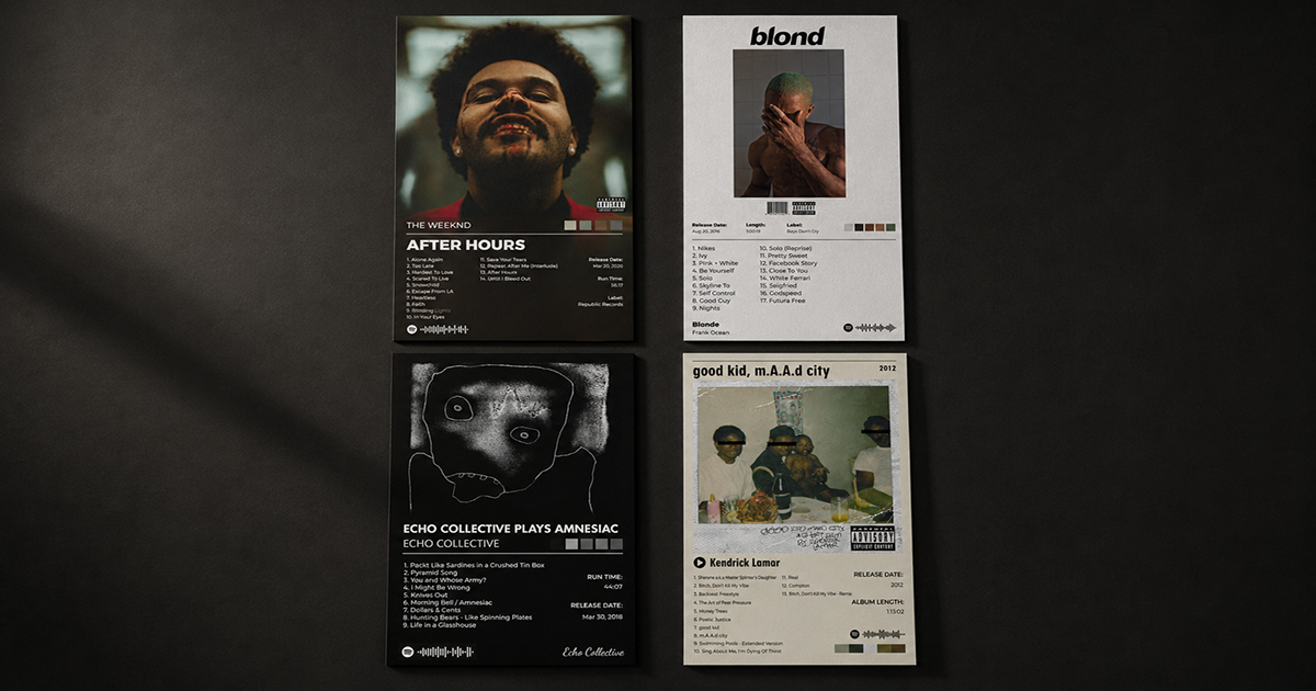
Example: Untrue by Burial, F♯ A♯ ∞ by Godspeed You! Black Emperor, DAMN. by Kendrick Lamar.
Modern Bold
Visual character: High contrast. Large, assertive typography. Strong geometric elements. The design makes a statement before you read a word.
Mood it conveys: Confident, contemporary, energetic, uncompromising.
Best for:
- Hip-hop and trap (Kanye West, Travis Scott, Future)
- Contemporary R&B and pop (The Weeknd, Drake, Beyoncé)
- EDM and club music
- Punk and indie rock with aggressive energy
- Any album that feels current and culturally aware
Avoid for: Classical, jazz, folk, anything that benefits from restraint.
Example: My Beautiful Dark Twisted Fantasy by Kanye West, After Hours by The Weeknd, IGOR by Tyler, the Creator.
Vintage / Retro
Visual character: Warm color tones. Textured backgrounds (grain, paper, film). Serif or display typography. References to print design from the 1950s–1980s.
Mood it conveys: Nostalgic, warm, human, analog, timeless.
Best for:
- Classic rock (The Beatles, Led Zeppelin, Fleetwood Mac)
- Jazz and blues (Miles Davis, John Coltrane, Billie Holiday)
- Soul and R&B from the 1960s–1980s (Marvin Gaye, Stevie Wonder, Aretha Franklin)
- Country and folk from the same era
- Neo-soul and modern artists with vintage aesthetics (Leon Bridges, Anderson .Paak)
Avoid for: Electronic music, aggressive hip-hop, minimalist modern releases.
Example: What's Going On by Marvin Gaye, Kind of Blue by Miles Davis, Rumours by Fleetwood Mac.
Color / Vibrant
Visual character: Bold, saturated color — often pulled from the album artwork itself. Energetic and visually stimulating. Typography is confident and playful.
Mood it conveys: Joyful, celebratory, bold, optimistic, youthful.
Best for:
- Upbeat pop
- Funk and soul with bright production
- Latin and Caribbean music
- K-pop
- Any album with a brightly colored, vibrant cover art
- Music you listen to while doing things (cooking, running, commuting)
Avoid for: Anything moody, dark, or introspective.
Example: Lover by Taylor Swift, Harry's House by Harry Styles, BEYONCÉ by Beyoncé.
A Genre-by-Genre Quick Reference
| Genre | Recommended Template Style |
|---|---|
| Alternative / Indie | Minimal or Dark |
| Hip-Hop (classic) | Vintage Bold |
| Hip-Hop (modern) | Modern Bold or Dark |
| Jazz (classic) | Vintage, warm tones |
| Jazz (modern) | Minimal |
| Electronic / Ambient | Dark Atmospheric |
| Metal / Hardcore | Dark, maximum contrast |
| Classic Rock | Vintage |
| Pop (mainstream) | Color / Vibrant |
| Pop (indie/art) | Minimal |
| R&B (classic soul) | Vintage |
| R&B (modern) | Modern Bold |
| Folk / Acoustic | Minimal, warm |
| Country | Vintage or Warm Minimal |
| K-Pop | Color / Vibrant |
| Classical | Minimal, elegant |
Beyond Genre: Three Questions That Help You Choose
Genre is a starting point, not a rule. These three questions get you closer to the right choice:
1. What time of day do you listen to this album?
Morning coffee albums = lighter templates. Late night albums = darker templates. This simple heuristic is surprisingly reliable.
2. What color is the album cover?
Your template should either complement or deliberately contrast the album art. A bright yellow cover on a dark template = striking. The same cover on a light cream template = harmonious. Both can work — choose consciously.
3. What would the artist think?
Not as a constraint, but as a compass. A band known for meticulous visual branding (Radiohead, Kanye, Beyoncé) has already made choices about what their music looks like. Respecting that instinct usually leads to better results.
How to Preview Templates in PosterVibe
In PosterVibe, click the Template tab in the left panel. Click any template to apply it instantly — your album's cover art, tracklist, and metadata load into the new template preview in real time.
You can switch between templates freely at any time without losing your album data. There's no cost to trying multiple templates before deciding.
Workflow for template selection:
- Open your album in PosterVibe
- Narrow to 2–3 template candidates based on genre/mood
- Apply each and view the result for 30 seconds
- Trust your gut — the right template usually feels immediately right
FAQ
Can I customize a template after choosing it?
Yes, fully. Every element — font, color, size, position, layout — can be adjusted in the right panel. The template is a starting point, not a constraint.
What if no template feels exactly right?
Start with the closest match and customize from there. Changing the background color or font often closes the gap significantly.
Can I mix elements from different templates?
PosterVibe doesn't support direct template mixing, but you can customize individual elements from any template to achieve a different overall feel.
How often are new templates added?
PosterVibe adds new templates regularly. Check the template library periodically — styles added after you last visited may be exactly what you're looking for.