20 Album Covers So Iconic They Deserve to Be Posters
Some album covers are functional. They identify the product, communicate a mood, maybe catch the eye in a record store.
And then there are the ones that stop you cold. The covers you keep returning to — not just because of what's inside the record, but because the image itself is that good. The ones that have appeared on t-shirts, bedroom walls, tattoos, and museum exhibitions. The ones that changed what album art could be.
These are 20 of those covers. And every single one deserves to be printed, framed, and hung somewhere you'll see it every day.
1. The Beatles — Abbey Road (1969)
Why it's iconic: Four men. A crosswalk. No text. No band name. Just a photograph taken in 37 minutes on a Wednesday morning in London that became arguably the most recognized image in music history.
What makes it poster-worthy: The composition is deceptively simple — a straight-on shot of a zebra crossing with the four Beatles mid-stride. The white border gives it room to breathe. The absence of any branding makes it feel timeless rather than promotional. It works at any size, in any room, against any wall color.
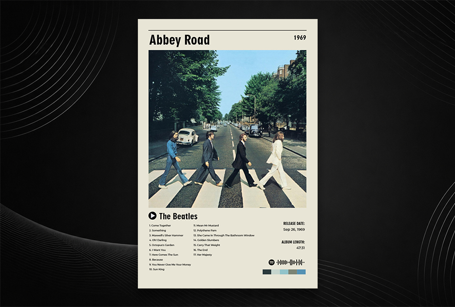
Design note: The power is in what's not there. No logo, no title, no framing device. Pure photography, perfectly composed.
2. Pink Floyd — The Dark Side of the Moon (1973)
Why it's iconic: A triangular prism splitting white light into a rainbow spectrum on a black background. Designed by Storm Thorgerson and Hipgnosis, it's one of the most immediately recognizable images ever created — you don't need to read the text to know what record this is.
What makes it poster-worthy: It's essentially a piece of minimalist geometric art. The stark black background gives it dramatic presence, the rainbow stripe provides color contrast, and the clean lines work equally well at postcard size or 24×36 inches. It also ages perfectly — no fashion, no people, no cultural markers to date it.
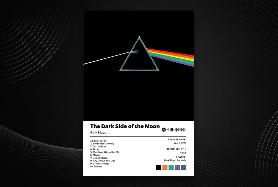
Design note: A masterclass in using scientific imagery for aesthetic effect.
3. David Bowie — Aladdin Sane (1973)
Why it's iconic: Bowie's face, the lightning bolt across it, the platinum hair. Photographed by Brian Duffy, the image is simultaneously portrait, costume, and character design. The lightning bolt became one of the most imitated graphics in music history.
What makes it poster-worthy: It's a portrait with graphic design built directly onto the face — the bolt isn't overlaid in post-production, it was painted on. The composition is elegant and the color palette (pale skin, red and blue bolt, platinum hair against white) is striking enough to hold a wall on its own.
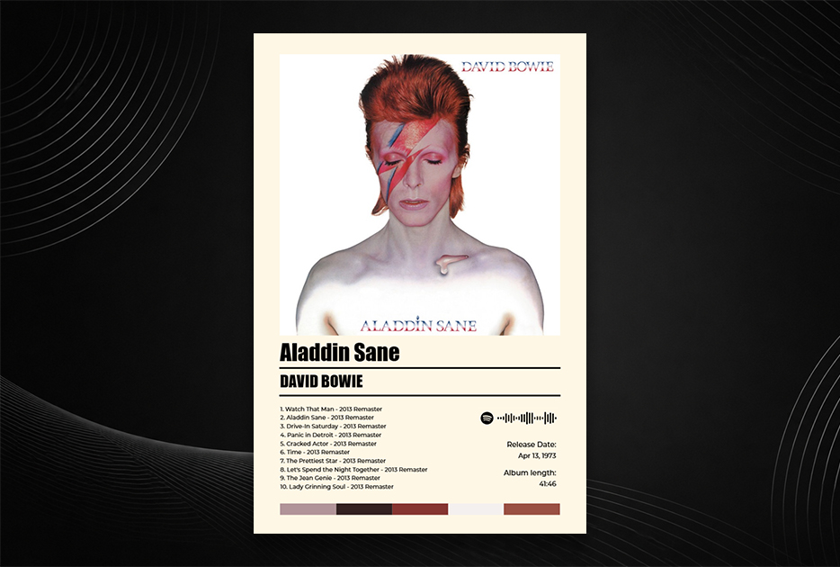
Design note: The teardrop at the collarbone is often overlooked — find it, and the image becomes even more striking.
4. Nirvana — Nevermind (1991)
Why it's iconic: A naked baby swimming toward a dollar bill on a fishhook. The image is provocative, funny, and pointed — a perfect visual metaphor for the album's critique of consumer culture, delivered with a kind of deadpan absurdism.
What makes it poster-worthy: The underwater photography is genuinely beautiful — cool blues, soft light, the movement of the water. The image works on multiple levels: you can appreciate it as a photograph before you engage with its meaning.
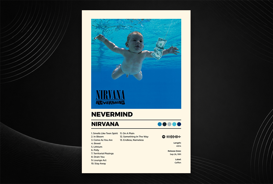
Design note: The font choice — a clean, sans-serif wordmark — lets the photograph breathe without competing.
5. The Velvet Underground & Nico — The Velvet Underground & Nico (1967)
Why it's iconic: Andy Warhol produced the album and designed the cover: a yellow banana on a white background, with the instruction "Peel slowly and see" on original pressings (which revealed a flesh-colored banana beneath). It was the first major instance of a fine artist's visual language applied wholesale to a rock album cover.
What makes it poster-worthy: Its power is entirely in restraint. A single banana. White space. Warhol's signature. On a wall, it reads as gallery art — because it was. The banana has since become one of the most imitated graphics in all of rock.
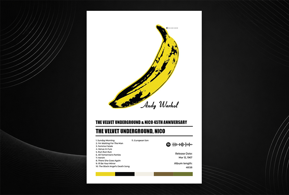
Design note: If you print this one, go large. The minimalism only fully lands at poster scale.
6. Kendrick Lamar — To Pimp a Butterfly (2015)
Why it's iconic: A group of Black men — friends, family, collaborators — celebrate on the White House lawn. A judge lies defeated at their feet. The composition references both W. Eugene Smith's photojournalism and the visual language of street photography. Photographed by Denis Rouvre.
What makes it poster-worthy: It's a political image that functions as a joyful one — the celebration is real, the joy is evident, the context gives it weight. It's one of the most discussed album covers of the 21st century, and it rewards extended looking.
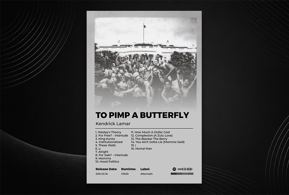
Design note: The gold lettering of the title, styled to look spray-painted, adds texture without overwhelming the photograph.
7. Joy Division — Unknown Pleasures (1979)
Why it's iconic: A series of stacked radio wave pulses from the first pulsar ever discovered, plotted white on black. Designed by Peter Saville based on an image he found in the Cambridge Encyclopaedia of Astronomy. No band name. No album title on the front cover. Just data, turned into art.
What makes it poster-worthy: It has spawned more merchandise and imitations than almost any other album cover in history — on t-shirts, tattoos, mugs, phone cases. The image is simple enough to be reproduced anywhere and striking enough to work at any scale. On a wall, it looks like a scientific diagram or a piece of abstract art.
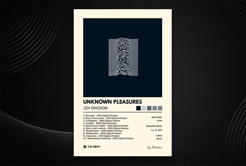
Design note: The image works in reverse too — black on white — and has been endlessly recolored. The original black-on-black remains the best.
8. Kanye West — My Beautiful Dark Twisted Fantasy (2010)
Why it's iconic: A painting — "Invitation" by George Condo — depicting a winged Kanye figure with a nude phoenix. The cover was banned by Walmart for explicit content. It's one of the most visually complex and deliberately excessive album covers ever made.
What makes it poster-worthy: It's literally a painting. And like all paintings, it reveals more detail the longer you look. The baroque excess — the textures, the figures, the gold and white palette — makes it a genuinely interesting object to have in a room.
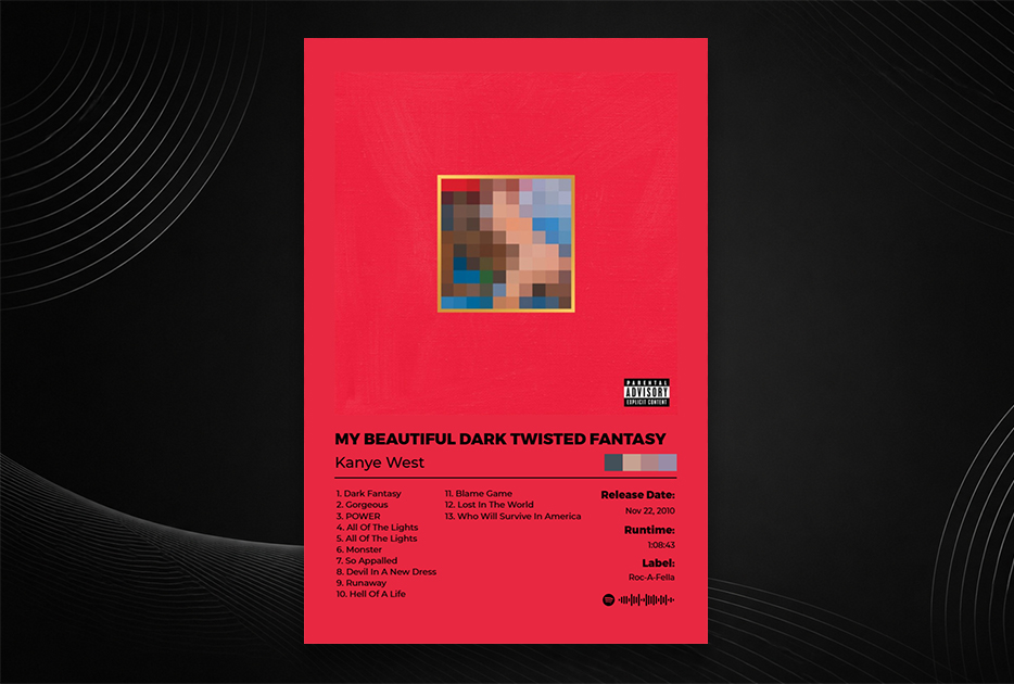
Design note: Kanye commissioned several alternative covers by Condo for this album. All of them are remarkable. This one remains the most striking.
9. Miles Davis — Kind of Blue (1959)
Why it's iconic: A soft-focus photograph of Davis performing, bathed in blue light. Understated, intimate, and absolutely representative of the music inside — the most commercially successful jazz album ever recorded.
What makes it poster-worthy: The blue toning, the performance posture, the soft grain of the photography. It's a portrait that feels like you're in the room. For a jazz fan, it's an essential piece of wall art.
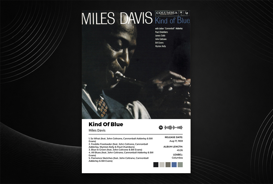
Design note: The typography is period-correct and beautiful — the kind of lettering you'd see on a concert poster from the late 1950s.
10. Prince — Purple Rain (1984)
Why it's iconic: Prince astride a purple motorcycle, looking back over his shoulder with an expression that somehow manages to be simultaneously cool, vulnerable, and commanding. The purple, the motorcycle, the pose — it became the defining image of one of music's greatest performers.
What makes it poster-worthy: It's a great photograph in the most classical sense — a portrait that captures character. The deep purple tones give it a richness that looks luxurious on a wall, and the subject's charisma is undeniable even in a still image.
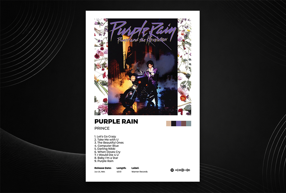
Design note: The wordmark — simply "PRINCE" in clean type — sits so naturally in the composition that you barely notice it's there.
11. Fleetwood Mac — Rumours (1977)
Why it's iconic: Mick Fleetwood and Stevie Nicks, photographed mid-performance in their stage costumes. Soft light, velvet and chiffon, a crystal ball. It's theatrical without being overwrought, and perfectly captures the slightly mystical, deeply emotional record inside.
What makes it poster-worthy: The soft palette — cream, beige, earth tones, with just a hint of warmth — makes it an easy piece to live with. It doesn't demand attention; it rewards sustained looking. The costume details are extraordinary.
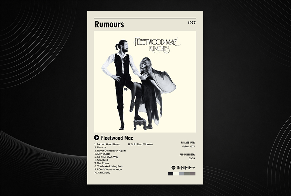
Design note: The back cover — showing the band in more candid, emotional poses — is equally remarkable. Consider printing both.
12. Frank Ocean — Blonde (2016)
Why it's iconic: Frank Ocean, close-cropped, looking down and away from camera, with his hair dyed an almost luminescent green. Shot by Tom Beard. The image has a quality of private reverie — you feel like you're seeing someone who doesn't know they're being watched.
What makes it poster-worthy: The color is extraordinary. The green of his hair against his skin tone, against the warm tones of the background, is a combination that shouldn't work and absolutely does. It photographs beautifully at any scale and has a particular magnetism that makes it hard to look away.
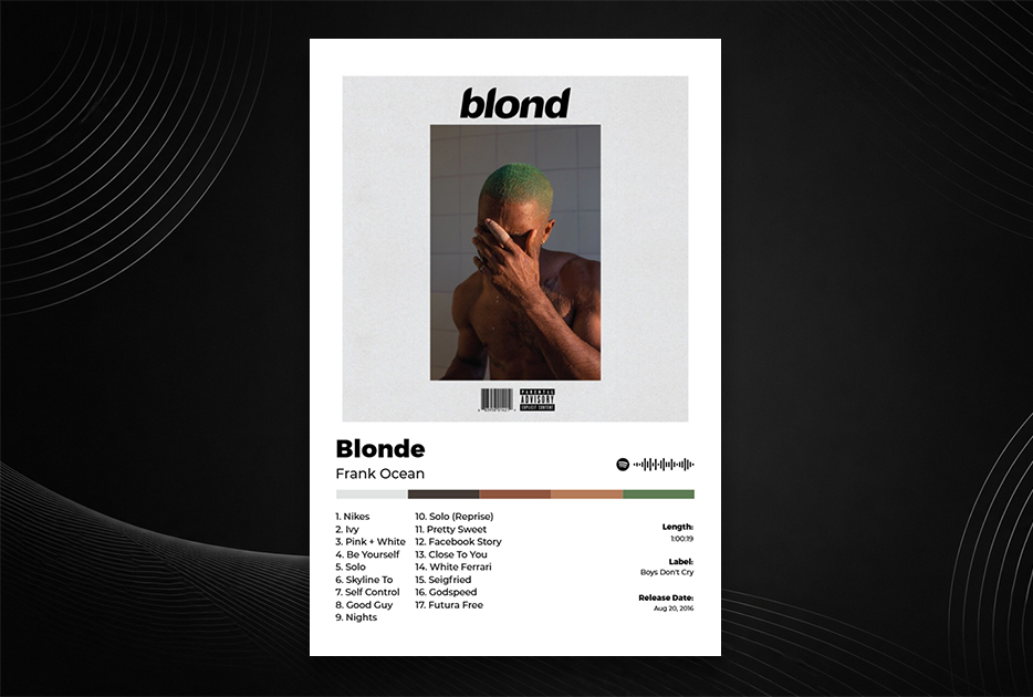
Design note: The cover uses no text on the front. Like Abbey Road, the confidence of that choice adds to its impact.
13. Daft Punk — Random Access Memories (2013)
Why it's iconic: Two robot helmets — chrome and gold — reflecting the horizon line of a desert road. The image was shot in Los Angeles by Frédéric Batier. The chrome reflections contain miniature landscapes. It's a science fiction image that feels warmly, nostalgically human.
What makes it poster-worthy: The scale of the helmets against the vast desert sky gives it an epic, cinematic quality. The gold and chrome catch every light differently. The horizon in the reflection means you're always finding new details. It's a cover that rewards attention.
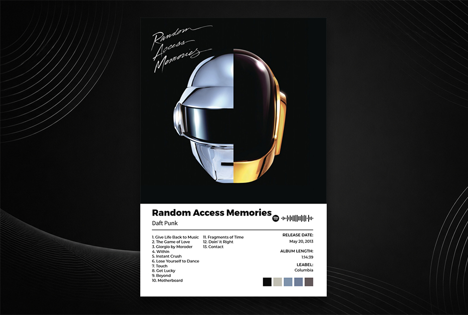
Design note: The gold helmet belongs to Thomas Bangalter, the chrome to Guy-Manuel de Homem-Christo. The choice of which is which is deliberate.
14. Radiohead — OK Computer (1997)
Why it's iconic: A dense, almost overwhelming collage of highway diagrams, text fragments, architectural photography, and floating figures — designed by Stanley Donwood and Thom Yorke. It shouldn't work as a cohesive image, and yet it feels exactly right for one of the most anxious and prescient albums ever made.
What makes it poster-worthy: Unlike the other covers on this list, OK Computer's art repays close examination over time. There are details in that image you'll notice only on the fifth or sixth viewing. In a home or studio, it functions as a piece you keep discovering.
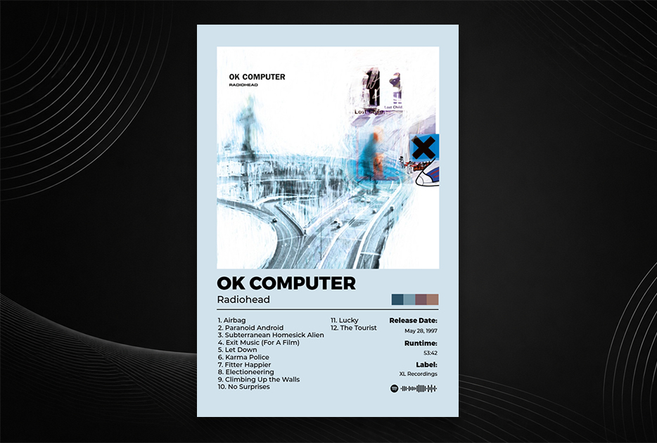
Design note: Donwood and Yorke have continued to collaborate on every Radiohead release since. The full body of work is extraordinary.
15. Michael Jackson — Thriller (1982)
Why it's iconic: Jackson in a white suit, posed on a cream background with a tiger cub. Photographed by Dick Zimmermann. The image is warm, inviting, and slightly mischievous — nothing about it suggests that the record inside would become the best-selling album in history.
What makes it poster-worthy: The simplicity of the composition and the elegance of the styling make it a timeless portrait. The cream-and-white palette means it works with almost any interior. And it's one of the most recognized images in popular culture worldwide.
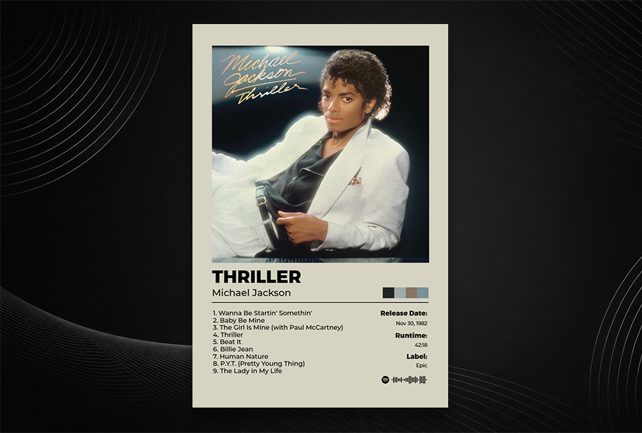
Design note: The gatefold interior photograph — Jackson in a more casual pose — is equally beautiful and often overlooked.
16. The Strokes — Is This It (2001)
Why it's iconic: A leather-gloved hand on a hip, shot from behind, in soft light. Originally accompanied by more explicit content (the US version used a different photograph). The cropping, the light, the ambiguity — it's deliberately provocative and elegant at the same time.
What makes it poster-worthy: Like Blonde, its power comes from what it withholds. The identity of the figure is never revealed. The cropping is precise. The tones are warm and photographic. It looks like a still from a Godard film.
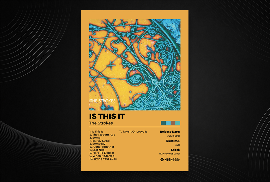
Design note: The hand belongs to photographer Colin Lane's then-girlfriend. The image sparked considerable controversy and multiple alternate covers in different markets.
17. Taylor Swift — Folklore (2020)
Why it's iconic: Swift photographed in a forest in black and white, her face partially turned away, in a knit cardigan that became culturally significant in its own right. Shot during the pandemic, it captures a particular mood of retreat and interiority that the album itself embodies.
What makes it poster-worthy: The grainy black-and-white photography, the natural setting, the soft focus of the surrounding trees — it reads as a fine art photograph, not a commercial product. Printed large, particularly in black and white, it has the quality of a darkroom print.
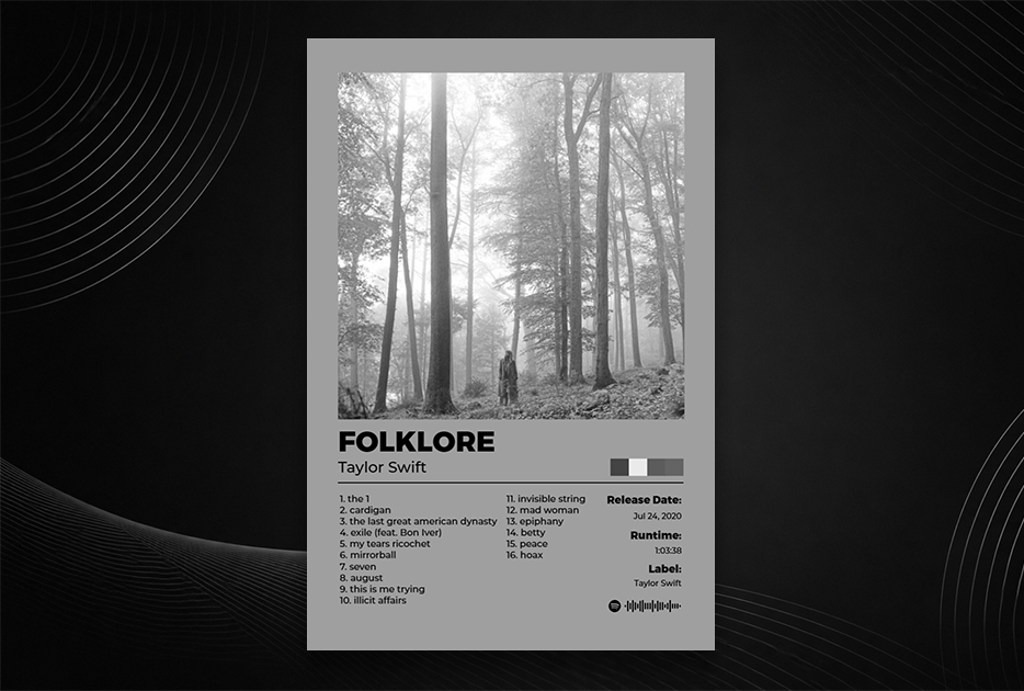
Design note: The serif typeface used for the title — lowercase, elegant — contributes significantly to the overall mood.
18. Tyler, the Creator — IGOR (2019)
Why it's iconic: Tyler in a bowl-cut blond wig, a pink suit, and an open-mouthed expression — somewhere between a scream and a laugh — against a pale background. The image is instantly strange, immediately memorable, and impossible to categorize. It designed by Tyler himself.
What makes it poster-worthy: The color palette — pale pink, cream, the yellow of the wig — is unexpectedly sophisticated. The expression defies interpretation. In a room, it functions as a conversation piece: you keep coming back to it trying to decide how you feel about it.
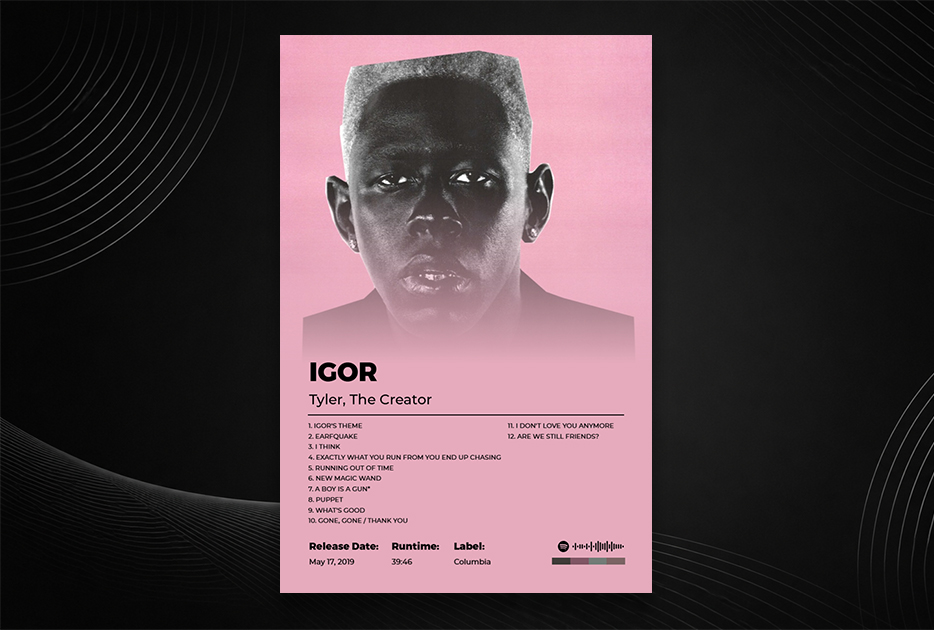
Design note: Tyler hand-makes much of his visual identity. The IGOR character appears throughout the era's videos and merchandise with consistent, deliberate aesthetic control.
19. A Tribe Called Quest — Midnight Marauders (1993)
Why it's iconic: A grid of 68 portraits — musicians, journalists, producers, artists connected to the New York hip-hop scene — arranged like a yearbook, a family tree, a community document. Each face is lit differently, photographed at different times. The cumulative effect is extraordinary.
What makes it poster-worthy: It's a document as much as a design. The grid format means it looks different the closer you stand. Individual portraits emerge. Names you recognize appear alongside faces you don't. It's a piece of history organized as art.
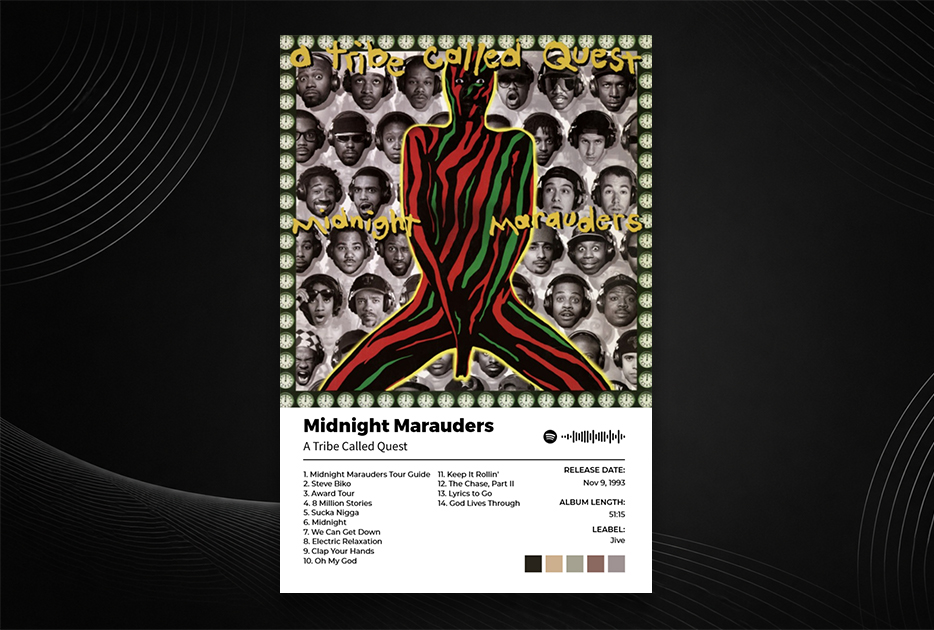
Design note: The heads are arranged by Q-Tip, and the selection represents a deliberate community — everyone on that cover was meaningful to the project in some way.
20. Lauryn Hill — The Miseducation of Lauryn Hill (1998)
Why it's iconic: A soft portrait of Hill seated at a school desk, looking directly into the camera with an expression of total composure. The styling is simple, the light is warm, the composition is intimate. It's a portrait of genuine presence.
What makes it poster-worthy: The directness of her gaze is rare in portrait photography — she's looking at you, not through you. The warm tones, the simple composition, the school desk as a symbol — it's an image that rewards time. In a home, it functions as a portrait of one of the most significant artists of the late 20th century.
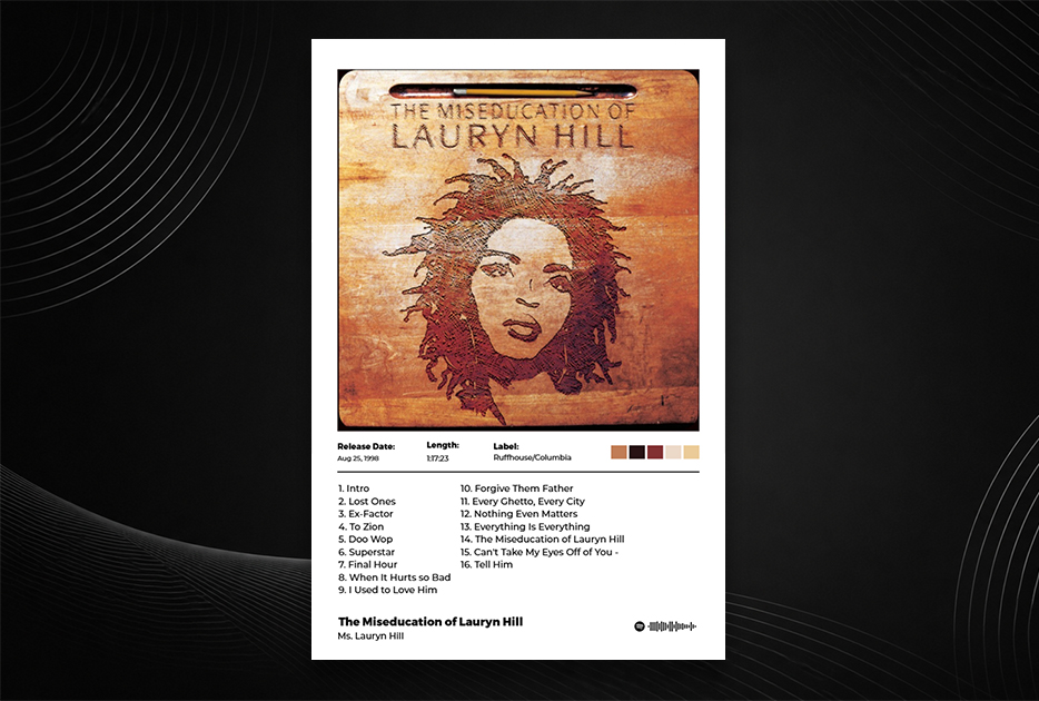
Design note: The album's title is set in a handwritten typeface, mimicking text in a school notebook — a small design decision that adds warmth and specificity.
Make Any of These Your Wall Art
Every cover on this list is available to design as a poster through PosterVibe. Search the album name, and the cover art, tracklist, artist, label, and year are automatically loaded into the editor. Pick a template that matches the album's aesthetic, customize if you want, and export at 300 DPI for print.
These covers have been hanging in museums, appearing on t-shirts, and inspiring tattoos for decades. They deserve a proper frame on your wall.
Start designing your album poster — free →
Which of these is on your wall? Which one should we have included? Let us know in the community.