
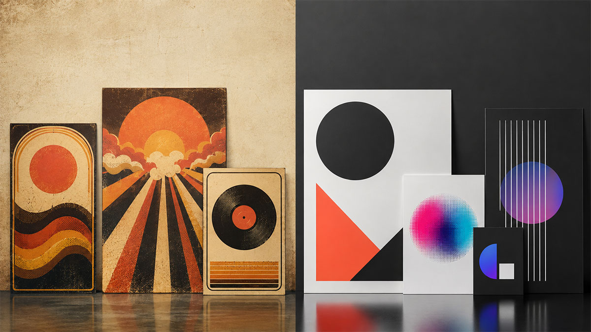
Retro vs. Modern Design: How to Nail Each Style for Music Posters
Master the visual language of retro and modern poster design. Learn the principles, palettes, and techniques that define each era.
Retro vs. Modern Design: How to Nail Each Style for Music Posters
The visual identity of a music poster sets the mood before a single note plays. Whether you're celebrating a classic vinyl reissue or showcasing today's streaming favorites, understanding the fundamental differences between retro and modern design approaches helps you create posters that authentically capture the spirit of the music.
Both retro and modern aesthetics offer powerful creative opportunities, yet they rely on contrasting visual languages. Retro design draws from analog production methods, nostalgic color treatments, and ornamental typography. Modern design embraces minimalism, bold geometry, and digital-native techniques. Knowing when and how to apply each style—or blend them thoughtfully—elevates your poster from generic to genuinely compelling.
Understanding Retro Design Principles
Retro design doesn't refer to a single era but rather a collection of vintage aesthetics spanning the 1950s through the 1980s. Each decade brought distinct visual conventions shaped by printing technology, cultural movements, and artistic trends.
Typography in Retro Posters
Retro typography tends toward expressiveness and decoration. Script fonts, rounded sans-serifs, slab serifs with personality, and psychedelic letterforms all played starring roles in different eras. Type often serves as illustration itself, with letters warped, shadowed, outlined, or filled with gradients and textures.
Consider the thick, rounded letters of 1970s disco posters or the hand-drawn quality of 1960s psychedelic rock art. These typefaces communicate warmth, personality, and human craft. When working in a retro style, choose fonts that feel hand-touched rather than mathematically precise, and don't be afraid to manipulate letterforms to fit your composition.
Color Palettes That Signal the Past
Color immediately signals era. Retro palettes often feature muted, desaturated tones that mimic the fading of old print materials or the warmth of analog photography. Burnt oranges, harvest golds, avocado greens, and earth tones anchor 1970s designs. The 1980s brought bolder neons—hot pink, electric blue, and acid yellow—often paired with black or deep purple.
Texture plays an equally important role. Retro designs frequently incorporate visible grain, halftone dot patterns, paper textures, or intentional color misregistration that references offset printing imperfections. These elements add authenticity and tactile warmth.
Compositional Approaches
Retro layouts tend toward organized complexity. They often feature centered compositions, ornamental borders, multiple typefaces in a single design, illustrated elements, and filled space rather than breathing room. The aesthetic celebrates abundance—more detail, more decoration, more visual interest packed into the frame.
Photographic treatments lean toward high-contrast black and white, warm sepia tones, or the saturated, slightly soft quality of vintage film stock. When using album covers or artist photos in retro posters, consider applying grain, vignettes, or color shifts that harmonize with period-appropriate aesthetics.
Mastering Modern Design Principles
Modern design prioritizes clarity, impact, and confident use of space. Born from digital tools and contemporary minimalist movements, modern aesthetics strip away ornamentation in favor of essential elements arranged with precision.
Typography in Modern Posters
Modern typography favors geometric sans-serifs, ultra-thin weights, bold black headlines, and generous letter-spacing. Typefaces feel mathematically constructed rather than hand-drawn, with clean lines and consistent stroke widths. Text hierarchy becomes surgical—one or two font families at most, with size and weight creating all the necessary contrast.
Type often integrates with geometric shapes or overlays imagery using transparency and blend modes. Modern designs might feature oversized type that bleeds off the canvas edge, creating dynamic tension and contemporary energy. A modern album poster maker approach emphasizes these crisp, confident typographic choices.
Color Strategies for Contemporary Appeal
Modern color palettes split into two dominant approaches: high-contrast monochromes and carefully curated accent colors. Black and white designs remain perpetually modern, especially when combined with a single vibrant accent hue. Alternatively, modern palettes might feature analogous colors in sophisticated combinations—deep navy with coral, forest green with warm terracotta, or monochromatic schemes that shift through tints and shades of a single color.
Unlike retro designs that embrace texture, modern aesthetics often prefer smooth gradients, flat color fields, or subtle noise that adds depth without calling attention to itself. Shadows tend toward long, soft gradients rather than hard drop shadows.
Compositional Techniques
Modern layouts embrace negative space as an active design element. Rather than filling every corner, modern compositions allow breathing room, using emptiness to create focus and sophistication. Asymmetrical balance replaces centered symmetry, with elements positioned according to invisible grid systems.
Geometric shapes—circles, rectangles, triangles—often frame content or create abstract visual interest. Modern designs might overlay these shapes with varying opacity, creating layered depth. Photography typically appears in one of two extremes: either ultra-sharp and vibrant or treated with dramatic filters, duotones, or gradient maps that transform the image into a graphic element.
Choosing the Right Style for Your Music
The music itself should guide your aesthetic choice. Certain genres carry strong visual associations that, when honored, create immediate recognition and emotional resonance.
Genre and Era Alignment
Classic rock, soul, funk, and disco naturally pair with retro aesthetics that reference their original cultural moment. Jazz can work beautifully in both directions—retro designs evoking Blue Note album covers or modern minimalism highlighting sophistication and timelessness. Electronic music, indie pop, and contemporary hip-hop often benefit from modern treatments that feel current and digitally native.
That said, intentional contrast can create compelling results. A modern minimalist poster for a 1960s album creates intriguing tension, while retro treatments of contemporary artists can suggest timeless quality or ironic commentary.
Audience Expectations
Consider who will see the poster and what visual language resonates with them. Vinyl collectors and nostalgia-driven music fans often appreciate retro authenticity. Younger audiences discovering older music through streaming platforms might respond better to modern interpretations that feel accessible rather than archival. Personal space decorators span all preferences, but modern minimalism tends to integrate more easily into contemporary interior design trends.
Practical Techniques for Each Style
Creating Authentic Retro Designs
Start with period-appropriate typography. Research actual posters from your target era to understand authentic font choices and type treatments. Layer textures—paper grain, halftone patterns, or subtle noise—to add analog warmth. Use the appropriate color palette, but don't oversaturate; retro rarely means hyper-vivid.
Consider adding deliberate imperfections: slight color shifts, soft edges, or worn textures that suggest age without looking damaged. Border elements, decorative rules, and corner ornaments can enhance period authenticity. When using an album poster maker, look for templates that incorporate these vintage elements or allow enough customization to add them yourself.
Executing Modern Designs
Begin with a strong grid system, even if it remains invisible in the final design. Modern layouts rely on precise alignment and mathematical relationships between elements. Choose one or two typefaces maximum, and let size and weight create hierarchy.
Embrace white space—or more accurately, empty space in whatever background color you choose. Modern design requires discipline in what you leave out. Every element should serve a clear purpose; remove anything decorative that doesn't strengthen the composition.
Experiment with scale contrast. Modern designs often feature one dramatically oversized element—a massive headline, an enlarged album cover detail, or a bold geometric shape—paired with smaller supporting elements. This creates visual impact and contemporary energy.
Tools that offer AI-powered color palette suggestions can help identify sophisticated modern color combinations you might not discover through manual exploration. Similarly, smart layout systems that maintain geometric precision support the mathematical cleanliness modern design requires.
Blending Styles Thoughtfully
The most interesting contemporary poster design often lives in the space between pure retro and pure modern. Thoughtful hybrids can capture nostalgic warmth while maintaining contemporary relevance.
Successful Hybrid Approaches
Consider using modern compositional techniques—generous negative space, geometric framing, minimal typography—but applying retro color palettes and textures. This approach feels current while nodding to vintage aesthetics. Alternatively, embrace retro layout density and decorative elements but execute them with modern colors and crisp digital precision.
Another effective strategy involves treating different poster elements differently. Perhaps the album cover image receives heavy retro treatment—grain, warmth, fading—while typography and layout remain sharp and modern. This contrast creates visual interest and suggests the meeting of past and present.
Avoiding Style Confusion
Hybrid designs require intentionality. Random mixing of retro and modern elements without a clear concept often produces confused results rather than interesting fusion. Establish which style provides the foundation, then add specific elements from the other aesthetic with purpose.
Ask whether each design choice serves your concept. If you're adding a retro texture, does it enhance the emotional message or just muddy a modern composition? If you're using modern typography over a vintage photograph, does the contrast create meaningful tension or visual conflict?
Technical Considerations for Print and Display
Regardless of style choice, technical execution determines whether your design succeeds in its final form.
Resolution and Export Settings
Poster designs destined for print require high-resolution files. When working digitally, design at actual size or larger, maintaining at least 300 DPI for crisp output. Vector elements—typography and geometric shapes—scale infinitely, but any raster elements like photographs or textures need sufficient resolution.
Color mode matters for final output. Digital displays use RGB color, while professional printing relies on CMYK. Some vibrant colors achievable in RGB cannot be accurately reproduced in CMYK printing, so if physical prints are your goal, work in CMYK from the start or verify your colors convert cleanly.
Template Customization
Starting with professionally designed templates accelerates the design process while ensuring solid foundational composition. The key lies in customization—adjusting colors, swapping typography, modifying layouts, and adding personal touches that make the template your own.
When using a spotify poster maker or similar tool that automatically imports album metadata, you gain efficiency while maintaining creative control over aesthetic treatment. The challenge becomes making design choices that honor the music's character while expressing your personal vision.
Frequently Asked Questions
Q: What is a modern album poster maker?
A: A modern album poster maker is a design tool that helps you build contemporary album posters with confident shapes, clean typography, and sophisticated color treatments. These tools typically emphasize minimalist layouts, geometric elements, and digital-native design techniques that create sleek, current aesthetics.
Q: How do I create a modern album poster maker?
A: Start with the music you want to feature, then use the layout and customization options in a modern album poster maker to make the design your own. Focus on generous white space, bold typography, geometric shapes, and restrained color palettes. Let each element serve a clear purpose rather than filling every available space.
Q: Can I mix retro and modern elements in one poster?
A: Yes, thoughtful hybrids can be highly effective. Choose one style as your foundation and add specific elements from the other aesthetic with clear intent. For example, you might use modern minimalist composition with retro color palettes, or retro typography within a modern geometric layout. The key is purposeful integration rather than random mixing.
Q: Which style works better for physical prints?
A: Both retro and modern designs print beautifully when properly executed. Modern designs with bold, simple elements often read clearly from a distance, while retro designs with rich textures and details reward closer viewing. Consider where the poster will hang—modern minimalism suits contemporary interiors, while retro warmth adds character to eclectic or vintage-inspired spaces.
Finding Your Design Voice
Mastering both retro and modern design languages expands your creative vocabulary. You don't need to commit permanently to one aesthetic—the best approach depends on the specific music, audience, and context for each project.
Experiment freely. Create the same album poster in both retro and modern styles to understand how radically aesthetic choices transform mood and meaning. Notice which design decisions feel authentic to the music and which seem forced. Your design instincts strengthen through practice and comparison.
The technical barriers to creating professional music posters have largely dissolved. What remains is the creative challenge: understanding visual language deeply enough to make intentional, effective choices. Whether you embrace retro nostalgia, modern minimalism, or thoughtful hybrids, the goal remains constant—creating posters that honor the music and resonate with viewers.
Ready to turn your favorite album into wall art? Explore PosterVibe or open the poster editor to start creating.