
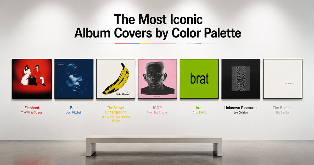
The Most Iconic Album Covers by Color Palette
Choosing wall art by color? Here are the most iconic album covers organized by palette — red, blue, yellow, pink, green, black, and white.
When you're decorating a wall, color comes first. The right palette ties a room together; the wrong one fights it. So instead of ranking covers by era or genre, here's a different way to choose your next poster — organized by the color that defines it.
Find your palette, find your print.
Red
The White Stripes — Elephant (2003). Pure red, white, and black — one of the most disciplined color schemes in rock. Bold, graphic, and impossible to ignore.
Taylor Swift — Red (2012). Warm autumn reds and a half-hidden face. Softer and more cinematic, but unmistakably red-forward.
Best for: a high-energy accent wall.
Blue
Joni Mitchell — Blue (1971). A deep, washed indigo portrait — melancholy and beautiful, the cover that made blue feel like an emotion.
Weezer — Weezer (The Blue Album) (1994). Four guys against a flat blue backdrop. Clean, deadpan, and instantly iconic.
Miles Davis — Kind of Blue (1959). Soft-focus blue-toned performance photography — timeless and calm.
Best for: a cool, calming space.
Yellow
The Velvet Underground & Nico (1967). Warhol's banana on white — the most famous yellow in music. Gallery-grade pop art.
Wu-Tang Clan — Enter the Wu-Tang (36 Chambers) (1993). The yellow logo and hooded figures — raw, bold, and unmistakable.
Best for: a warm, energizing pop of color.
Pink
Tyler, the Creator — IGOR (2019). Pale pink, cream, and yellow — an unexpectedly sophisticated palette around an unforgettable portrait.
Harry Styles — Fine Line (2019). A fisheye shot drenched in pink, shot by Tim Walker. Playful and saturated.
Best for: a soft, modern, statement room.
Green
Charli XCX — Brat (2024). A flat lime-green field and one blurry word. The most talked-about color in recent pop design.
R.E.M. — Green (1988) or Weezer — The Green Album (2001). Clean, single-color confidence.
Best for: a bold, contemporary wall.
Black
Joy Division — Unknown Pleasures (1979). White pulsar waves on pure black — endlessly reproduced, always best in its original dark form.
Metallica — Metallica (The Black Album) (1991). Near-black on black, with a coiled snake barely visible. Maximum drama from minimal contrast.
Best for: a dramatic home studio or feature wall.
White
The Beatles — The Beatles (The White Album) (1968). Pure white with embossed text — Richard Hamilton's radical anti-cover. Minimalism as a statement.
Lauryn Hill — The Miseducation of Lauryn Hill (1998) brings warmth to a near-neutral palette with its cream tones.
Best for: a clean, gallery-style minimalist space.
Make Any of These Your Wall Art
Designing a room around a palette? In PosterVibe, search any album and the cover art loads into the editor automatically — and our color-palette tools pull the exact tones from the artwork so you can match templates, type, and backgrounds to your space. Customize and export at 300 DPI.
Start designing by color — free →
What color is your wall? Find the cover to match in the community.
Ready to Create Your Own?
Put these ideas into practice with our album cover poster maker, or explore the album poster maker, spotify poster maker, tracklist poster maker.