
How to Balance Text and Image in a Poster Layout
Master the visual balance between text and imagery to create professional music posters that capture attention and communicate clearly.
How to Balance Text and Image in a Poster Layout
The difference between an amateur poster and a professional design often comes down to one principle: balance. When text and imagery compete for attention instead of working together, the entire composition suffers. Music posters face this challenge intensely—they need to showcase album artwork while communicating essential information like artist names, track lists, and release details.
Whether you're creating a poster for your vinyl collection, designing gift art for a fellow music fan, or decorating your space with your favorite albums, understanding how to balance text and image will transform your results from cluttered to compelling.
Understanding Visual Weight
Before diving into techniques, it's helpful to understand visual weight—the perceived heaviness of elements in your design. An album cover naturally carries significant visual weight because of its colors, detail, and emotional resonance. Text elements, especially large typography, also command attention.
Visual weight isn't just about physical size. A small area of bright color can balance a larger area of neutral tones. A detailed image can counterbalance bold typography. The key is creating equilibrium that feels intentional rather than accidental.
The Rule of Thirds for Poster Layouts
The rule of thirds divides your canvas into a 3×3 grid. Placing important elements along these lines or at their intersections creates natural balance and visual interest.
For music posters, consider positioning the album cover at one of the intersection points rather than dead center. This leaves breathing room for text elements without creating awkward gaps. The artist name might anchor the top third, while the track list occupies the lower third, creating a visual flow that guides the viewer's eye through the composition.
When using an album poster maker, experiment with templates that utilize this principle. Many professionally designed layouts already incorporate grid-based balance, giving you a strong foundation to build upon.
Hierarchy: What Should Viewers See First?
Establishing clear hierarchy ensures viewers process information in the intended order. For most music posters, this typically flows:
- Album artwork (the immediate visual hook)
- Artist name (primary text information)
- Album title (secondary text information)
- Supporting details (release date, track list, label information)
Size, contrast, and positioning all contribute to hierarchy. The largest text element should be your primary information—usually the artist name. The album cover, while possibly smaller in dimensions, commands attention through its visual complexity and color.
Avoid making everything the same size in an attempt to give equal importance. This creates visual confusion rather than clarity. Instead, use deliberate size differences to guide the viewer's journey through your design.
White Space Is Your Friend
Negative space—the empty areas between and around elements—isn't wasted space. It's a powerful design tool that prevents visual overwhelm and allows both text and images to breathe.
When your poster feels cluttered, resist the urge to shrink everything to fit. Instead, remove or consolidate information. A track list doesn't need elaborate decoration; clean typography with adequate spacing often works best.
Consider these white space strategies:
- Margins: Maintain consistent margins around your entire composition to frame the content
- Padding: Leave space between the album cover and adjacent text elements
- Line spacing: Increase leading (space between lines) for track lists and other text-heavy sections
- Grouping: Cluster related information together with white space separating distinct groups
White space also provides visual rest. After the eye takes in the vibrant album artwork, areas of calm allow viewers to comfortably read text information without fatigue.
Typography and Image Interaction
Text placement relative to imagery requires careful consideration. Several approaches work well for music posters:
Overlay Approach
Placing text directly over the album cover creates unity but risks legibility issues. If you choose this route:
- Use semi-transparent shapes or gradients behind text to ensure contrast
- Position text in areas of the image with minimal detail
- Choose text colors that contrast strongly with the underlying image
- Consider outlining or adding shadows to text for separation
Some album covers have busy, detailed artwork that makes overlays challenging. When using an album cover poster maker, test overlay options with different opacity levels and background shapes.
Separation Approach
Keeping text and images in distinct zones often produces cleaner results. Common patterns include:
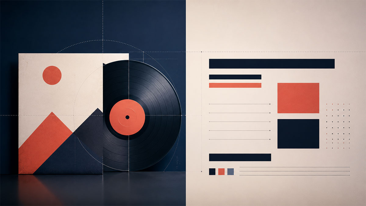
- Side-by-side: Album cover on one side, text information on the other
- Top and bottom: Cover in the upper portion, text details below (or vice versa)
- Center and corners: Cover centered with text elements in corners or edges
This approach gives both text and imagery room to shine without compromise. It's particularly effective when you have substantial text content like full track lists.
Integrated Approach
The most sophisticated designs weave text and image together organically. The album cover might bleed off one edge while text wraps around it. Typography might echo visual elements from the artwork, creating conversation between text and image.
This requires more design experience but tools like a spotify poster maker often include templates that handle this integration professionally, letting you benefit from expert design decisions.
Color Harmony Between Text and Images
Color choices dramatically impact how well text and images balance. Your text colors should relate to the album artwork without disappearing into it.
Complementary colors (opposites on the color wheel) create vibrant contrast. If your album cover features cool blues, warm orange or yellow text will pop.
Analogous colors (neighbors on the color wheel) create harmony and sophistication. This approach works when you want text to feel integrated rather than contrasting.
Neutral colors (black, white, gray) provide safe, reliable contrast against most album artwork. When in doubt, start here.
Many modern design tools offer AI-powered color palette suggestions that pull colors directly from your album artwork. This ensures your text colors harmonize naturally with the image.
Scale and Proportion
The relative size of your album cover versus text elements fundamentally affects balance. A massive album cover with tiny text feels image-heavy and may obscure important information. Oversized text with a small cover image diminishes the visual impact of the artwork.
Consider your poster's purpose:
- Decorative wall art: Prioritize larger album artwork with supporting text information
- Informational posters: Balance cover size with readable, prominent text details
- Gift items: Ensure recipient names or personalization have appropriate prominence
A tracklist poster maker helps you experiment with different proportions quickly, showing how track list size affects overall composition.
Alignment Creates Order
Proper alignment prevents the scattered, amateur look that undermines even well-intentioned designs. Every text element should align with something—the album cover edge, other text elements, or invisible grid lines.
Left alignment creates a strong, clean edge and works well for track lists and body text. Center alignment feels formal and balanced, ideal for artist names and album titles. Right alignment is less common but can create interesting asymmetry when balanced against a left-positioned album cover.
Avoid mixing alignment systems randomly. Choose an alignment strategy and apply it consistently throughout your design. The exception: you might center a main headline while left-aligning supporting text, but this should feel intentional, not accidental.
Testing Your Balance
Step back from your design—literally. View it from across the room or at thumbnail size. Does your eye move naturally through the composition, or does it get stuck? Do text and image feel like they belong together, or do they compete?
Try these balance tests:
- Squint test: Squint at your design. The major shapes and value contrasts should create a pleasing pattern
- Upside-down test: Flip your design upside-down. This removes meaning and lets you see pure visual balance
- Fresh eyes: Leave your design and return hours later. Fresh perspective reveals balance issues you'd otherwise miss
If something feels off, it probably is. Trust your instincts and keep refining.
Common Balance Mistakes to Avoid
Centering everything: While symmetry has its place, centering both your album cover and all text creates static, predictable compositions. Introduce intentional asymmetry.
Tangents: When the edge of your album cover barely touches text elements, it creates visual tension. Either overlap decisively or maintain clear separation.
Inconsistent spacing: If the margin between your album cover and artist name is 20 pixels, but the margin between artist name and album title is 50 pixels, the rhythm breaks. Maintain consistent spatial relationships.
Too many font sizes: Limit yourself to 2-3 font sizes maximum. More creates chaos that undermines balance.
Ignoring the edges: Don't crowd elements against the poster boundaries. Margins frame your composition and prevent a cramped feeling.
Practical Tools and Workflows
Professional design software offers precise control over every element, but requires significant learning investment. For most music fans creating personal wall art or gifts, specialized tools designed for music posters offer the right balance of power and accessibility.
When working with album metadata that populates automatically, you save time while ensuring accuracy. This lets you focus on the creative decisions—choosing layouts, adjusting proportions, refining typography—rather than manual data entry.
Templates provide professionally designed starting points that already incorporate sound balance principles. Customizing a well-balanced template is faster and often produces better results than starting from scratch.
Making Balance Decisions With Confidence
Balancing text and image becomes intuitive with practice, but these principles accelerate your learning:
- Start with proven templates and understand why they work before deviating
- Make one change at a time so you can assess its impact on overall balance
- Use grids and guides to maintain alignment and consistent spacing
- Pull color palettes from your album artwork for automatic harmony
- Embrace white space as a design element, not a void to fill
- Establish clear hierarchy so viewers know where to look first
Your goal isn't perfectly centered symmetry—it's visual equilibrium that feels intentional and guides viewers naturally through your design. The best music posters honor both the artwork and the information, creating unified compositions where nothing feels like an afterthought.
Ready to turn your favorite album into wall art? Explore PosterVibe or open the poster editor to start creating.