
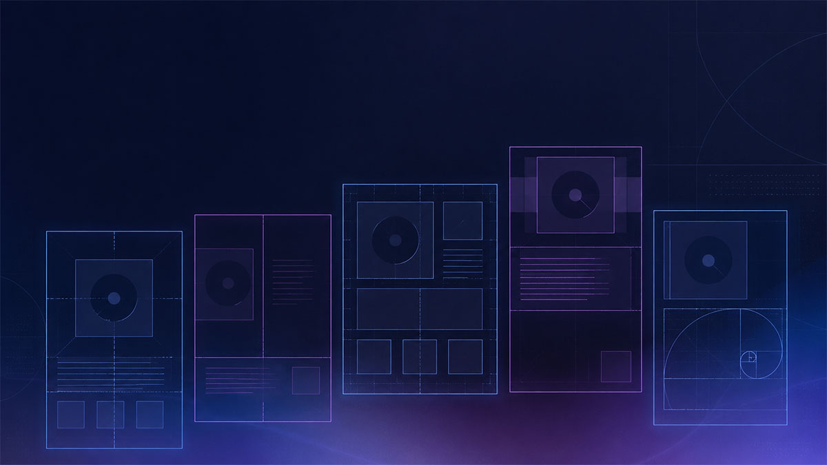
Grid Layouts for Music Posters: 5 Templates Explained
Master grid-based poster design with five popular music poster layouts that balance album art, typography, and track lists professionally.
Grid Layouts for Music Posters: 5 Templates Explained
Grid systems form the invisible backbone of professional poster design. They create visual hierarchy, establish rhythm, and ensure that album covers, artist names, and track listings work together harmoniously. Understanding common grid layouts helps you choose the right template for your music poster project and customize it effectively.
This guide walks through five popular grid-based layouts used in music poster design, explaining how each organizes visual information and when to use them.
Why Grids Matter in Music Poster Design
Grids divide your poster into proportional columns and rows, creating alignment points for text and images. This structure prevents designs from feeling chaotic while maintaining flexibility for creative expression.
Music posters present unique layout challenges. You typically need to display album artwork prominently, communicate the artist and album name clearly, include release information, and often list complete track listings—all within a single composition. Grids solve this by assigning logical zones to each element.
Professional templates built on grid systems ensure consistent spacing, readable typography, and balanced compositions even when you customize colors, fonts, or dimensions.
Template 1: The Classic Centered Grid
Structure
The centered grid divides the poster vertically into thirds or quarters, with the album cover occupying the central position. Text elements frame the artwork above and below, creating symmetry along the vertical axis.
Layout Breakdown
- Top third: Artist name and album title, typically set in bold display typography
- Middle section: Album artwork centered, occupying 40-50% of total poster height
- Bottom third: Release information, record label, or key track names
- Margins: Equal spacing on left and right sides maintains visual balance
When to Use This Layout
The centered grid works exceptionally well when album artwork is visually striking and deserves maximum attention. It's ideal for iconic covers with strong graphic elements or photography that functions as the poster's focal point.
This layout suits square album artwork particularly well, as the centered positioning creates natural breathing room for horizontal poster formats. It also accommodates both minimalist designs and more ornate typographic treatments without feeling overcrowded.
Customization Tips
Adjust the artwork size based on its visual complexity—busier covers may benefit from larger display, while simpler designs can be smaller to emphasize typography. Experiment with typography scale to establish clear hierarchy between artist name and supporting information.
Template 2: The Split-Screen Grid
Structure
Split-screen layouts divide the poster into two distinct vertical halves. One side features the album artwork, while the opposite side contains typography, track listings, or additional graphic elements.
Layout Breakdown
- Left or right half: Album cover scaled to fill the vertical space with balanced margins
- Opposite half: Text content organized in a secondary grid, often with multiple columns for track listings
- Vertical divider: Either a clear split or subtle gradation between sections
- Typography zone: Usually employs a 2-3 column sub-grid for organized text flow
When to Use This Layout
Split-screen grids excel when you need to display substantial textual information alongside album art. This layout provides ample room for complete track listings, liner notes, or extended credits without compromising artwork visibility.
The format also works beautifully for albums with strong vertical elements in their cover design, as these complement the vertical division. It's particularly effective for double albums or special editions where additional context enhances the poster's value.
Customization Tips
The split doesn't need to be exactly 50/50. Try 60/40 or 40/60 divisions to emphasize either artwork or text based on your priorities. Consider using color blocking to distinguish the two zones, perhaps pulling accent colors from the album artwork into the typography section's background.
Template 3: The Modular Grid
Structure
Modular grids divide the poster into multiple rectangular modules—typically a 3×3, 4×4, or 3×5 system. Album artwork and text elements occupy different modules, creating an asymmetric but balanced composition.
Layout Breakdown
- Album artwork: Spans multiple modules (often 2×2 or 2×3 sections)
- Typography modules: Distributed across remaining grid cells
- Track listing: May occupy one or more narrow columns
- White space: Some modules intentionally left empty for visual breathing room
- Flexible zones: Content size adjusts by spanning different numbers of modules
When to Use This Layout
Modular grids offer maximum flexibility and work well for contemporary, editorial-style poster designs. They're ideal when you want a more dynamic, magazine-inspired aesthetic rather than traditional poster symmetry.
This layout particularly suits albums with multiple visual elements—perhaps band photos in addition to cover art—or when you want to feature lyrics, album reviews, or other supplementary content beyond basic release information.
Customization Tips
Use the grid to create visual rhythm by varying module occupancy. Let the album cover span four modules while titles occupy one and track listings occupy two narrow columns. Intentional empty space is crucial—resist filling every module, as negative space provides visual rest and emphasizes occupied zones.
Template 4: The Top-Heavy Grid
Structure
Top-heavy layouts position the album artwork in the upper portion of the poster, occupying 60-70% of the vertical space. Text content fills the lower zone in organized columns or centered blocks.
Layout Breakdown
- Upper zone: Album cover displayed large, sometimes extending to poster edges
- Lower band: Track listing, credits, or description in 2-4 narrow columns
- Typography area: Often uses a multi-column sub-grid for dense information
- Visual weight: Artwork dominates, creating clear focal point
When to Use This Layout
Top-heavy grids maximize album artwork impact while efficiently organizing substantial text content below. This works particularly well for landscape-oriented posters or when the album cover features strong imagery that benefits from large-scale display.
The layout mimics how we naturally scan visual information—image first, details second—making it highly intuitive for viewers. It's excellent for promotional contexts where the artwork needs to grab attention from a distance, with details readable upon closer inspection.
Customization Tips
Adjust the division point between artwork and text zones based on content volume. If you're including complete track listings with durations, shift to a 65/35 split. For minimal text, 75/25 maintains better proportion. Consider bleeding the artwork to the top edge for a more contemporary, magazine-cover feel.
Template 5: The Asymmetric Grid
Structure
Asymmetric grids intentionally avoid centered placement and equal divisions, using mathematical proportions like the golden ratio or Fibonacci sequence to create dynamic balance through calculated imbalance.
Layout Breakdown
- Album artwork: Positioned off-center, often following golden ratio placement
- Primary text: Occupies the larger remaining zone
- Secondary text: Fills smaller zones, creating hierarchical flow
- Visual tension: Unequal spacing creates energy while maintaining overall balance
- Directional flow: Layout guides eye movement through strategic element placement
When to Use This Layout
Asymmetric grids suit modern, art-forward poster designs where visual sophistication matters. They work beautifully for alternative, indie, or experimental music where conventional layouts might feel too conservative.
This approach requires confidence with white space and typography, as the lack of symmetry means every placement decision significantly impacts the composition's success. When executed well, asymmetric grids create the most distinctive, memorable posters.
Customization Tips
Use alignment strategically—while placement is asymmetric, maintaining consistent alignment lines prevents chaos. Consider placing the album cover according to the golden ratio (roughly 38% from one edge) for naturally pleasing proportions. Balance visual weight rather than physical space; large type can counterbalance a large image even when occupying less area.
Choosing the Right Grid for Your Project
Select your grid layout based on three factors: album artwork characteristics, information volume, and intended poster use.
For iconic, visually striking covers: Use centered or top-heavy grids that maximize artwork display.
For extensive track listings or liner notes: Choose split-screen or modular grids that provide dedicated text zones.
For contemporary, editorial aesthetics: Consider modular or asymmetric grids that create dynamic compositions.
For traditional or vintage styles: Centered grids offer classic proportions that complement retro typography.
Tools designed for music poster creation often provide these grid templates as starting points, allowing you to customize colors, fonts, and spacing while maintaining professional structure. When you open the poster editor, look for template options that correspond to these grid systems, then adjust elements to match your specific album and aesthetic preferences.
Working Within Grid Constraints
Grids provide structure without sacrificing creativity. Think of them as guides rather than rigid rules. Professional designers regularly break grid systems intentionally—letting text slightly overlap boundaries, extending images beyond modules, or adjusting proportions for specific content.
The key is understanding the grid before breaking it. Establish your structural foundation first, then make deliberate departures that enhance rather than undermine the composition.
When customizing templates, maintain consistent spacing intervals even when adjusting layouts. If your grid uses 20-pixel margins, keep that increment when repositioning elements. This consistency creates visual cohesion even in heavily modified designs.
Grid Layouts and Print Considerations
When designing for physical printing, grids help ensure proper margins and safe zones. Most print workflows require bleed areas extending beyond the final trim size. Grid systems should account for this, keeping critical text and important image areas within safe zones while allowing backgrounds to extend into bleed.
Standard poster sizes often follow specific proportions—11×17, 18×24, 24×36 inches—and your grid should align with these dimensions. Templates built for music posters typically accommodate common sizes, ensuring your design translates properly to physical output without awkward cropping or scaling issues.
Ready to turn your favorite album into wall art? Explore PosterVibe or open the poster editor to start creating.
Ready to Create Your Own?
Put these ideas into practice with our album poster maker, or explore the album cover poster maker, spotify poster maker, tracklist poster maker.