
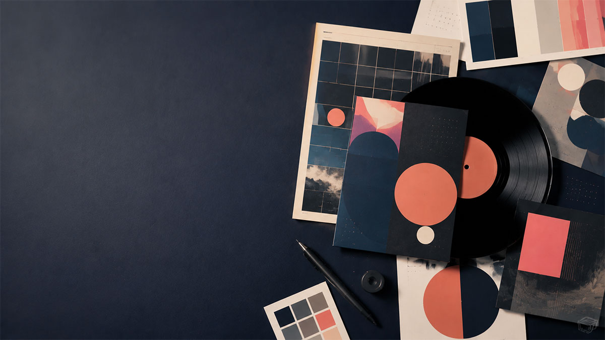
The Anatomy of a Perfect Album Poster: Design Elements That Make Music Art Pop
Discover the essential design elements that transform album artwork into stunning posters, from layout and typography to color theory.
The Anatomy of a Perfect Album Poster: Design Elements That Make Music Art Pop
Album posters have evolved from simple promotional tools into sought-after art pieces that celebrate music and personal taste. Whether you're decorating a bedroom, studio, or gift shopping for a vinyl enthusiast, understanding what makes an album poster visually compelling helps you create or select designs that truly stand out. This guide breaks down the core elements that separate forgettable prints from frame-worthy music art.
The Foundation: Album Artwork and Visual Hierarchy
Every great album poster starts with the cover itself. The album artwork establishes the visual identity and emotional tone, but how you present it determines whether your poster feels professional or cluttered.
Cover Placement and Sizing
The album cover should command attention without overwhelming other elements. In classic poster layouts, the cover typically occupies 30-50% of the composition, positioned either centered or following the rule of thirds. This creates natural focal points that guide the viewer's eye through the design.
Consider the artwork's visual weight. Minimalist covers like The xx's debut album benefit from generous white space, while busy artwork such as Sgt. Pepper's Lonely Hearts Club Band may require restraint in surrounding elements to prevent visual chaos.
Balancing Information and Aesthetics
The challenge lies in incorporating metadata—artist name, album title, release date, and track listings—without diminishing the artwork's impact. Strategic placement creates breathing room while maintaining informational value. Track lists work well as vertical elements along poster edges or beneath the cover in clean, readable columns.
Typography: The Voice of Your Design
Typography communicates almost as much as the music itself. Font choices, sizing, and spacing transform simple text into design elements that reinforce the album's genre and mood.
Font Selection for Genre Alignment
Different musical styles call for distinct typographic treatments:
Jazz and Classical: Serif fonts like Garamond or Baskerville convey sophistication and timelessness. These refined typefaces complement the elegance inherent in these genres.
Rock and Punk: Bold, distressed, or hand-lettered fonts match the raw energy. Condensed sans-serifs or custom lettering adds rebellious character.
Electronic and Hip-Hop: Modern sans-serifs like Helvetica, Futura, or geometric fonts reflect contemporary production and urban aesthetics.
Folk and Indie: Script fonts or organic hand-drawn typography creates warmth and intimacy, though readability must remain paramount.
Hierarchy and Readability
Establish clear typographic hierarchy by varying size, weight, and placement. The artist name and album title typically receive the largest treatment, with release information and track listings scaled down appropriately. Maintain sufficient contrast between text and background—at least 4.5:1 for body text and 3:1 for larger headings to ensure legibility.
Line spacing and kerning matter more than many realize. Cramped text feels amateurish, while proper spacing creates sophistication and ease of reading from various distances.
Color Theory: Beyond the Cover Palette
Color choices can make or break a poster's emotional impact. While the album cover provides a starting palette, thoughtful color application throughout the design creates cohesion and visual interest.
Extracting and Extending Color Palettes
Begin by identifying the dominant, accent, and neutral colors within the album artwork. Extract 3-5 key colors to inform your background, text, and decorative elements. This creates harmony between the cover and surrounding design.
Consider color psychology aligned with the music's emotional content. Blue conveys calm and melancholy—perfect for introspective albums. Red and orange bring energy suitable for intense or passionate music. Earth tones ground folk and organic sounds, while neon or saturated hues amplify electronic or pop sensibilities.
Contrast and Complementary Schemes
High contrast between foreground and background ensures readability and visual punch. If your cover features dark tones, consider lighter backgrounds and vice versa. Complementary color schemes (opposite on the color wheel) create vibrant tension, while analogous schemes (adjacent colors) offer harmonious subtlety.
Advanced approaches include duotone treatments that recolor album covers using two complementary hues, creating striking vintage or contemporary effects while maintaining recognizability.
Layout and Composition Principles
Professional poster layouts follow compositional principles that create balance, movement, and visual interest.
Grid Systems and Alignment
Grid-based layouts provide invisible structure that organizes disparate elements into coherent wholes. Common approaches include:
Centered layouts: Symmetrical and classic, ideal for formal presentations
Asymmetrical grids: Dynamic and modern, creating visual tension through intentional imbalance
Modular grids: Flexible systems allowing complex information like track listings to integrate seamlessly
Align elements consistently—left, right, or center—within your chosen system. Random placement reads as careless rather than creative.
White Space as a Design Element
Empty space isn't wasted space. Strategic use of white (or negative) space gives designs room to breathe, emphasizes focal points, and conveys sophistication. Overcrowded posters feel amateur regardless of individual element quality.
Margins and padding around text blocks and images prevent claustrophobia. Generally, maintain at least 0.5-1 inch margins from poster edges and consistent spacing between distinct content areas.
Dimensions and Format Considerations
Poster dimensions impact both aesthetics and practical usability. Standard sizes ensure compatibility with readily available frames and printing capabilities.
Common Poster Sizes
Popular dimensions include:
- 12" × 12": Square format echoing vinyl LP dimensions
- 18" × 24": Classic poster proportion, readily frameable
- 24" × 36": Large statement pieces
- A3 and A2: International standard sizes (11.7" × 16.5" and 16.5" × 23.4")
Choose dimensions based on intended display location and viewing distance. Bedroom walls accommodate larger formats, while smaller posters suit office spaces or grouped gallery walls.
Print-Ready Specifications
If you plan to print your design physically, technical specifications matter significantly. Resolution should be at least 300 DPI (dots per inch) for sharp, professional output. Lower resolutions appear pixelated when printed at larger sizes.
Color mode selection depends on output method. RGB works for digital displays, while CMYK ensures accurate color reproduction in physical printing workflows where supported. Include bleed areas (typically 0.125") extending beyond final trim size to prevent white borders from slight cutting variations.
Finishing Touches: Details That Elevate
Subtle refinements separate good posters from great ones.
Decorative Elements and Texture
Consider adding complementary graphic elements that reinforce the album's aesthetic without competing with the cover. Geometric shapes, subtle patterns, or themed icons can fill empty areas purposefully. Texture overlays—grain, halftone patterns, or subtle gradients—add depth and tactile quality to digital designs.
Release Information and Authenticity Markers
Including release dates, record labels, or catalog numbers adds documentary value appreciated by serious collectors. Format this information discreetly, often in smaller type along poster edges or beneath track listings. This detail work signals care and authenticity.
Track Listing Presentation
Track lists can be purely functional or become design features themselves. Options include:
- Simple numbered lists in readable columns
- Integrated into graphic elements like vinyl groove illustrations
- Color-coded by album side or mood
- Paired with track durations for completeness
Ensure accuracy—misspelled song titles or incorrect track order undermine otherwise professional designs.
Bringing It All Together
Creating the perfect album poster requires balancing multiple elements into a cohesive whole. Start with strong album artwork, apply thoughtful typography that matches musical genre and mood, extend color palettes strategically, organize content through deliberate layout systems, and add finishing details that demonstrate care.
The best album posters honor the music while functioning as standalone art pieces. They spark conversation, evoke emotion, and transform personal music passion into tangible visual form suitable for any space.
Whether you're working from scratch or customizing existing templates, understanding these anatomical elements empowers you to make informed design choices. Modern tools make implementing these principles accessible even without professional design training, letting music fans create print-ready posters quickly.
Ready to turn your favorite album into wall art? Explore PosterVibe or open the poster editor to start creating.
Ready to Create Your Own?
Put these ideas into practice with our album poster maker, or explore the album cover poster maker, spotify poster maker, tracklist poster maker.