
How to Use Negative Space in Album Poster Design
Learn how to harness negative space to create striking, professional album posters that balance visual impact with elegant simplicity.
How to Use Negative Space in Album Poster Design
Negative space—the empty or unmarked areas surrounding and between design elements—is one of the most powerful yet underutilized tools in poster design. When used intentionally, negative space transforms cluttered layouts into elegant, eye-catching compositions that guide the viewer's attention exactly where you want it. For album poster design, mastering negative space can mean the difference between a chaotic collage and a gallery-worthy print that showcases your favorite music with sophistication.
Understanding Negative Space in Design
Negative space isn't simply "blank" space. It's an active design element that shapes how viewers perceive and interact with your poster. Also called white space—though it can be any color—negative space provides breathing room, creates visual hierarchy, and often forms subtle shapes that add depth to your composition.
In album poster design, negative space serves several critical functions:
- Focuses attention on the album cover, artist name, or key typographic elements
- Creates balance between dense information (track lists, release dates) and visual rest
- Establishes mood through spaciousness, intimacy, or tension
- Improves readability by separating text elements and preventing visual overwhelm
- Adds sophistication through restraint and intentional composition
The most memorable album posters often employ generous negative space to let iconic album artwork breathe, rather than cramming every available pixel with decoration.
Types of Negative Space in Poster Design
Macro Negative Space
Macro negative space refers to large, obvious empty areas in your layout. This might be a wide margin surrounding your album cover, a blank half of your poster, or substantial padding around text blocks. Macro negative space creates dramatic impact and immediately signals a minimalist, modern aesthetic.
For album posters featuring visually complex or busy album covers, generous macro negative space prevents competition between elements. A detailed album cover with intricate artwork benefits from clean surroundings that don't fight for attention.
Micro Negative Space
Micro negative space exists between and within smaller elements: letter spacing, line height, padding around individual text elements, and margins between track list items. While less dramatic than macro space, thoughtful micro spacing dramatically improves legibility and polish.
When displaying track lists, proper micro negative space between track numbers, titles, and durations makes information scannable. Tight spacing creates visual noise; generous spacing communicates professionalism.
Active Negative Space
Active negative space forms recognizable shapes or creates optical effects. This advanced technique might use the space around an album cover to suggest musical instruments, sound waves, or thematic imagery related to the album's content.
While active negative space creates clever, memorable designs, it requires careful execution. The effect should enhance rather than overshadow the album itself.
Practical Techniques for Album Posters
The Rule of Thirds with Breathing Room
Divide your poster into a 3×3 grid and position your album cover at one of the intersection points rather than dead center. Fill the remaining two-thirds with intentional negative space, using it to balance typography, release information, or simply to create visual rest.
This asymmetrical approach feels more dynamic than centered layouts while providing ample room for the eye to travel across the composition.
Strategic Color Use in Negative Space
Negative space doesn't need to be white or neutral. Drawing colors from the album cover and using them as negative space backgrounds creates cohesive designs that feel intentional rather than empty.
Consider using AI-powered color palette tools to extract harmonious colors directly from album artwork, then apply these to negative space areas for a unified look. A deep burgundy negative space might complement a jazz album's warm cover tones, while stark black space could amplify a metal album's intensity.
Typography Floating in Space
Allow generous negative space to surround typographic elements—artist names, album titles, and dates. Rather than boxing text or adding decorative frames, let typography float against clean backgrounds.
Increase letter spacing slightly for album titles positioned in large negative space areas. This creates a more intentional, designed feel compared to default spacing, which can appear cramped when surrounded by emptiness.
Asymmetrical Balance
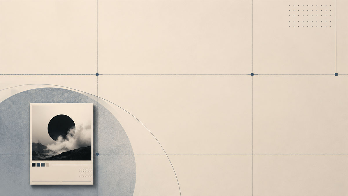
Place your album cover in one corner or along one edge, using the opposite space for minimal text elements. This creates tension and visual interest while maintaining balance through careful weight distribution.
An album cover in the bottom-left corner might be balanced by the artist name in small type in the upper-right, with the vast middle area left intentionally empty. The negative space itself becomes the dominant visual element.
Border and Margin Strategy
Generous, consistent margins around your entire poster create an instant gallery-ready quality. A border of negative space—whether 10% or 20% of your total dimensions—frames the content and signals thoughtful design.
Consider asymmetrical margins where one side (often the bottom or left) features extra space, creating a modern, unconventional frame that draws attention through unexpected proportions.
Common Negative Space Mistakes to Avoid
Fear of Empty Space
The most common mistake is filling every available area with decorative elements, patterns, or additional imagery. Trust that negative space itself carries visual weight. A poster that's 60% negative space can feel more complete than one that's 100% filled.
Inconsistent Spacing
Random, unequal spacing between elements creates visual chaos. Establish a spacing system—perhaps multiples of 8 or 10 pixels—and apply it consistently to margins, padding, and gaps between elements.
Ignoring Negative Space Color
Default white backgrounds work, but they're rarely the most interesting choice. Experiment with subtle off-whites, colors pulled from the album cover, or bold contrasting hues that make the album artwork pop.
Centering Everything
While centered layouts have their place, they often waste the dynamic potential of negative space. Off-center compositions with intentional negative space feel more contemporary and visually engaging.
Cluttered Track Lists
Track lists require careful negative space management. Cramming tracks together reduces readability. Instead, use generous line spacing, clear separation between track numbers and titles, and possibly alternating subtle background tints to guide the eye.
Genre-Specific Negative Space Approaches
Minimalist and Electronic Music
Genres associated with minimalism benefit from extreme negative space—think 70-80% empty space with the album cover small and precisely positioned. This mirrors the music's aesthetic and creates striking, modern posters.
Classic Rock and Vintage Albums
Vintage albums often featured busy artwork. Balance this with clean, generous negative space in neutral tones. Position the album cover prominently but surround it with breathing room, perhaps using aged paper textures in the negative space for era-appropriate character.
Hip-Hop and Urban Music
Bold typography and strong contrast work well here. Use negative space to amplify impact—large artist names with substantial spacing, album covers positioned dramatically against solid color backgrounds with minimal additional elements.
Jazz and Classical
These genres suit sophisticated, spacious layouts. Consider elegant serif typography with generous tracking, positioned thoughtfully within ample negative space that communicates refinement and timelessness.
Testing and Refining Your Negative Space
The Squint Test
Squint at your design or view it from across the room. The major shapes created by negative and positive space should create a clear, balanced composition. If everything blurs into noise, you need more negative space.
The Hierarchy Test
Can you immediately identify the most important element? Negative space should guide attention to your primary focus—typically the album cover or artist name. If your eye doesn't know where to land first, redistribute negative space to create clearer hierarchy.
The Print Preview
View your design at actual print size if possible. Negative space that feels generous on screen might feel sparse at poster dimensions, or vice versa. Adjust accordingly for your intended output size.
Implementing Negative Space in Your Workflow
When working with design tools that offer customizable templates, look for layouts that already incorporate strong negative space principles. Starting with a foundation that respects emptiness makes refinement easier than trying to carve space out of cluttered templates.
If you're working in the poster editor, experiment by removing elements rather than adding them. Start with just the album cover and artist name, positioned with generous margins. Add additional elements—release date, track list, labels—only where they serve a clear purpose, preserving as much breathing room as possible.
For album covers with busy or dark imagery, lighter negative space backgrounds prevent the poster from feeling heavy. Conversely, simple or light album covers can handle darker negative space that creates drama and contrast.
Consider creating variations with different negative space ratios. A poster that's 40% negative space will feel completely different from one that's 70% negative space, even with identical elements. Test multiple approaches to discover what best serves the album's character.
Balancing Information and Space
Album posters often need to include track lists, release information, record labels, and other metadata. The challenge is incorporating this information without sacrificing the negative space that makes the design breathe.
Solutions include:
- Using significantly smaller type for secondary information, allowing it to occupy less visual weight
- Positioning track lists along one edge with ample line spacing
- Separating mandatory information into distinct zones, each surrounded by its own negative space
- Employing subtle type in the negative space areas that doesn't compete with primary elements
- Accepting that some information might need to be omitted in favor of stronger visual impact
The most successful album posters make deliberate choices about what information is essential and what can be minimized or removed to preserve the design's breathing room.
Conclusion
Negative space is not empty space—it's powerful, intentional design real estate that shapes how viewers experience your album poster. By embracing emptiness, establishing consistent spacing systems, and resisting the urge to fill every pixel, you create sophisticated designs that honor the music they represent.
Whether you're designing a poster for a minimalist electronic album or a baroque classical recording, negative space provides the breathing room that separates amateur designs from professional work. The albums you love deserve presentation that's as thoughtful as the music itself.
Ready to turn your favorite album into wall art? Explore PosterVibe or open the poster editor to start creating.
Ready to Create Your Own?
Put these ideas into practice with our minimal album poster maker, or explore the album poster maker, spotify poster maker.