The Worst Album Covers Ever — And What They Could Have Been
Even great artists release bad covers. Here are some of the most infamous album-cover misfires — and the design lessons they teach about getting it right.
For every Abbey Road, there's a cover that makes you wonder if anyone in the room said "wait, are we sure?" Even legendary artists have shipped duds. But bad covers are useful — each one is a free lesson in what not to do.
Here are some of the most infamous misfires, and what each could have been.
The Beatles — Yesterday and Today (1966), the "Butcher Cover"
The band posed in white coats draped with raw meat and dismembered baby dolls. Distributors revolted, and Capitol hastily pasted a bland photo of the group around a steamer trunk over it.
The lesson: shock without intent just reads as a mistake. The replacement was boring, but the original was off-putting for no clear reason.
What it could have been: the band's actual wit deserved a concept with a point — playful surrealism, not gore for its own sake.
Black Sabbath — Born Again (1983)
A lurid red-and-yellow demonic baby with claws and fangs. Even members of the band have gone on record disliking it.
The lesson: clashing colors plus muddy printing equals a cover that looks cheap rather than menacing.
What it could have been: Sabbath's strength was atmospheric dread — a darker, restrained palette would have unsettled far more than neon ever could.
Metallica & Lou Reed — Lulu (2011)
A cracked white mannequin head on a plain background — flat, lifeless, and disconnected from both artists' identities.
The lesson: a cover should signal something. This one signals nothing, which is its own kind of failure.
What it could have been: the project was bold and divisive; the cover should have been too, not a stock-photo shrug.
Weezer — Raditude (2009)
A real photo of a dog leaping through the air — goofy where the band wanted fun, but mostly just confusing. (Even Weezer leaned into the joke afterward.)
The lesson: "random and quirky" rarely lands as charming; it usually lands as arbitrary.
What it could have been: Weezer's best covers (the Blue and Green albums) work because they're deadpan and clean. Restraint was right there.
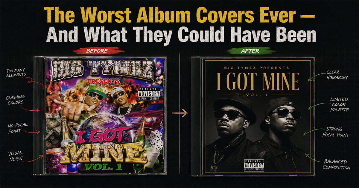
Lil Wayne — Rebirth (2010)
A muddled, busy composition that tried to signal a rock-pivot but read as cluttered and unfocused.
The lesson: a reinvention needs a clear new visual idea, not a pile of signifiers.
What it could have been: one strong, simple image of the pivot would have sold the concept far better.
The Common Threads
Look across every bad cover and the same culprits appear: no clear concept, clashing color, busy compositions, and shock with no purpose. The fixes are always the same — one idea, clean execution, a palette that prints well, and a reason for every element.
That's not just how you avoid a bad cover. It's how you make a great poster.
Make a Better One Yourself
In PosterVibe, search any album and the cover art, tracklist, and year load into the editor automatically — then apply the lessons above: pick a clean template, limit your palette, give the layout room, and export at 300 DPI.
Good design isn't luck. It's restraint.
Start designing a better poster — free →
What's the worst cover you've ever seen? Roast it in the community.