10 Jazz Albums With Art So Good They Hang in Museums
Reid Miles, Francis Wolff, Mati Klarwein, S. Neil Fujita — these 10 jazz album covers are genuine works of art that belong in (and have appeared in) museums.
Some album covers are good enough to study in a design school. A handful are good enough to hang in a museum — and many of these actually have, in exhibitions on graphic design, photography, and modern art.
Jazz, more than any genre, produced this kind of work. Here are 10 jazz album covers that crossed the line from packaging into fine art.
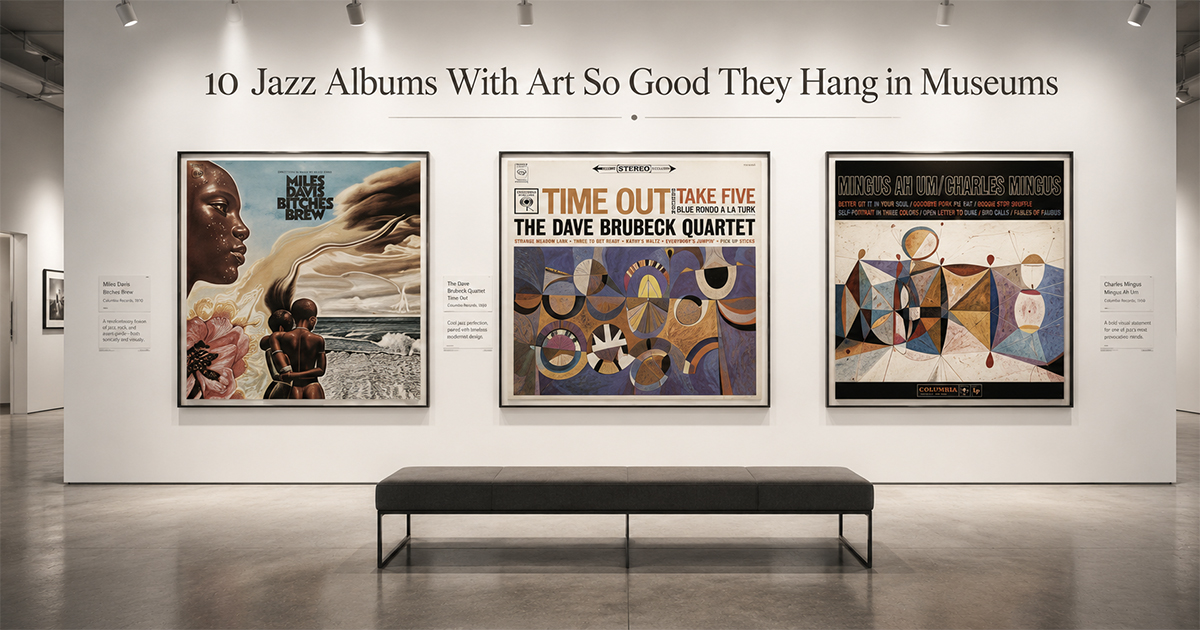
1. Miles Davis — Bitches Brew (1970)
Mati Klarwein's surreal gatefold painting is gallery-grade by any measure — Klarwein's work hangs in collections worldwide. A split composition of faces, storms, and flowers in fevered color. The most ambitious painting ever wrapped around a jazz record.
2. Dave Brubeck — Time Out (1959)
S. Neil Fujita's bold abstract painting in burnt orange and black — mid-century modernism at its purest. Fujita's design work has been celebrated in exhibitions on postwar American graphic design.
3. Charles Mingus — Mingus Ah Um (1959)
Another Fujita masterpiece — a dense, turbulent abstract in earthy reds and blues. Framed, it passes for an abstract expressionist canvas, which is essentially what it is.
4. Eric Dolphy — Out to Lunch! (1964)
Reid Miles at his most conceptual: a stark white field, a handless clock, and a "WILL BE BACK" sign. Pure graphic wit decades ahead of its time — the kind of work design museums love to display.
5. Cannonball Adderley — Somethin' Else (1958)
A crisp Francis Wolff portrait and Reid Miles' clean, confident typography. The definitive Blue Note look — photography and type in perfect balance.
6. Andrew Hill — Point of Departure (1964)
Reid Miles' restrained, elegant design pairs a contemplative Wolff portrait with masterful type placement. A quiet, sophisticated composition that holds a wall effortlessly.
7. Ornette Coleman — The Shape of Jazz to Come (1959)
Bold, declarative, and forward-looking — the title alone is a manifesto, and the design matches its confidence. A landmark of both music and mid-century cover art.
8. Larry Young — Unity (1965)
A masterclass in Reid Miles typography — the title set as a pure graphic statement. The kind of type-driven cover that graphic designers still cite as a reference.
9. Dexter Gordon — Go! (1962)
A warm, intimate Francis Wolff photograph of Gordon mid-performance, cigarette smoke and all. Wolff's session photography is itself exhibited as fine-art photography.
10. Joe Henderson — Page One (1963)
Clean Blue Note design with a striking Wolff portrait and assured type. Understated and beautiful — proof that the label's house style produced gallery work again and again.
The Blue Note Effect
Six of these ten come from a single label — and that's no accident. Between roughly 1955 and 1967, art director Reid Miles and co-founder/photographer Francis Wolff built a design language so influential that their original covers and photographs now circulate as collectible prints and museum pieces. They treated the album cover not as advertising, but as art — and the world eventually agreed.
Make Any of These Your Wall Art
In PosterVibe, search any of these albums and the cover art, tracklist, and year load into the editor automatically. Choose a clean template that honors the original design, customize, and export at 300 DPI for print.
Hang museum-grade jazz art on your own wall.
Start designing your jazz poster — free →
Which jazz cover belongs in a museum? Tell us in the community.