
What is CMYK and Why Does It Matter for Printing Posters?
Understanding CMYK color mode is essential for high-quality poster printing. Learn how it differs from RGB and why it matters.
What is CMYK and Why Does It Matter for Printing Posters?
If you've ever designed a poster on your computer only to find the printed version looks washed out or different from what you expected, you've likely encountered the RGB-to-CMYK color shift. Understanding the difference between these color modes—and why CMYK matters for physical printing—can save you from disappointing results and wasted materials.
Whether you're creating music posters, album artwork, or any print-ready design, knowing how CMYK works helps ensure your final product matches your creative vision.
What is CMYK?
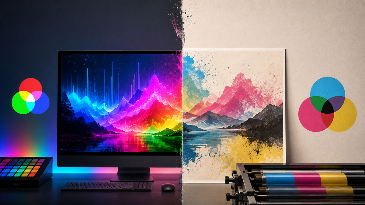
CMYK stands for Cyan, Magenta, Yellow, and Key (black)—the four ink colors used in most commercial printing processes. Unlike digital screens that emit light, printed materials reflect light off ink and paper. CMYK is a subtractive color model, meaning colors are created by subtracting (absorbing) certain wavelengths of light and reflecting others.
Here's how it works:
- Cyan absorbs red light
- Magenta absorbs green light
- Yellow absorbs blue light
- Black (Key) adds depth and true darkness that combining CMY alone cannot achieve
When you layer these inks in different percentages and combinations, they create the full spectrum of colors you see in printed materials—from magazines and brochures to posters and album covers.
RGB vs. CMYK: Understanding the Difference
Most people create designs on computers, phones, or tablets—all of which use RGB (Red, Green, Blue) color mode. RGB is an additive color model where colors are created by combining light. When all three colors combine at full intensity, you get white; when none are present, you get black.
The key differences:
RGB (Screen Display)
- Used for digital displays
- Additive color model (adds light)
- Wider color gamut (can display more vibrant colors)
- Perfect for websites, social media, and digital viewing
CMYK (Print Output)
- Used for physical printing
- Subtractive color model (absorbs light)
- Narrower color gamut (more limited color range)
- Essential for posters, brochures, and printed materials
The critical issue: RGB can display colors that CMYK physically cannot reproduce with ink. Bright, saturated blues, electric greens, and vivid oranges often shift when converted to CMYK, becoming duller or slightly different in hue.
Why CMYK Matters for Poster Printing
When you send a design file to a professional printer, they need it in CMYK format to ensure accurate color reproduction. Here's why this matters specifically for posters:
Color Accuracy
If you design a music poster in RGB mode and send it directly to print without conversion, the printer will automatically convert it to CMYK—often with unpredictable results. Colors may shift dramatically, and the vibrant album cover you carefully selected might print looking muddy or faded.
By working in CMYK from the start (or at least previewing your design in CMYK before finalizing), you see exactly how colors will appear on paper.
Professional Print Quality
Professional print services and modern album poster creator tools that support print workflows typically require or recommend CMYK files, especially at high resolutions like 300 DPI. This ensures:
- Consistent color output across different printers
- No unexpected color shifts between proof and final print
- Compatibility with commercial printing equipment
- Better communication between designer and printer
Avoiding Costly Reprints
Printing posters—especially at larger sizes or in quantity—represents a significant investment. Discovering that your carefully designed poster prints with the wrong colors wastes both money and time. Converting to CMYK and reviewing the color shifts before printing helps prevent these expensive mistakes.
Common Color Shift Challenges
Certain colors are particularly problematic when converting from RGB to CMYK:
Bright, Saturated Colors
Electric blues, neon greens, and bright purples often fall outside the CMYK gamut. These colors will shift toward more muted versions when printed. If your album cover features these hues, expect some adjustment.
Pure RGB Colors
Colors like pure red (RGB: 255, 0, 0) or pure blue (RGB: 0, 0, 255) don't have exact CMYK equivalents. They'll print slightly differently than they appear on screen.
Gradients and Subtle Tones
Smooth gradients in RGB can sometimes appear banded or show unexpected color shifts in CMYK, especially in shadow areas or subtle transitions.
How to Work with CMYK for Poster Design
Here are practical strategies for ensuring your poster prints exactly as intended:
Preview in CMYK Mode
Before finalizing your design, convert it to CMYK or use your design software's CMYK preview mode. This shows you how colors will actually print, allowing you to make adjustments before it's too late.
Most professional design applications like Adobe Photoshop, Illustrator, and InDesign offer CMYK preview modes. Some specialized tools like an album cover poster maker that support print workflows may handle this conversion automatically.
Adjust Colors Proactively
If you notice significant color shifts in CMYK preview:
- Increase saturation slightly to compensate for the duller CMYK output
- Adjust hues toward CMYK-friendly alternatives
- Test print small versions to verify colors before committing to full-size posters
Use CMYK-Safe Color Palettes
When designing from scratch, consider choosing colors that translate well to CMYK. Earthy tones, most pastels, and less saturated colors typically convert with minimal shift. If you're using a spotify poster maker or similar tool that automatically pulls album artwork, be aware that digital album covers are designed for screens and may need color adjustment for print.
Understand Your Export Options
When exporting for print, look for these settings:
- Color mode: CMYK (not RGB)
- Resolution: 300 DPI minimum for sharp, professional results
- Format: PDF is often preferred by professional printers, though high-quality PNG or TIFF files in CMYK also work
Some platforms offer CMYK export for specific plans or workflows, so verify your tool supports this before beginning a print-focused project.
Real-World Poster Printing Workflow
Here's a typical workflow for creating a print-ready poster:
- Design Phase: Create your layout, including album artwork, track listings, and text elements. Many people use tools like a tracklist poster maker to automatically populate album details.
- Color Review: Switch to CMYK preview mode and review all colors. Make adjustments to compensate for any shifts.
- Resolution Check: Ensure your design is at least 300 DPI at the final print size. Lower resolutions will appear pixelated or blurry when printed.
- Export: Export your design in CMYK color mode as a high-resolution PDF, PNG, or TIFF file.
- Proof Review: If possible, request a printed proof from your printer to verify colors before committing to a full print run.
- Final Print: Approve the proof and proceed with printing.
When RGB is Appropriate
While CMYK is essential for physical printing, RGB remains the correct choice for:
- Digital sharing: Social media posts, website images, digital portfolios
- Screen display: Digital photo frames, TV displays, computer wallpapers
- Online galleries: Sharing your designs in community galleries or digital marketplaces
If you're creating a poster purely for digital display, RGB's wider color gamut gives you access to more vibrant colors and is the better choice.
Tools That Support CMYK Export
Not all design tools support CMYK output. When choosing a platform for creating print-ready posters:
- Verify CMYK export is available (often in specific plans or workflows)
- Check for 300 DPI high-resolution export options
- Look for PDF export capability, the industry standard for professional printing
- Confirm the tool supports your intended final dimensions
Professional design applications like Adobe Creative Suite offer full CMYK support. Some specialized online tools for creating music posters also include CMYK export for users who plan to print their designs, though availability varies by platform and subscription level.
Printing Location Considerations
Beyond color mode, consider:
Paper Type
Different paper stocks absorb ink differently. Glossy paper produces more vibrant colors than matte paper. If possible, request samples on your chosen paper stock.
Printer Capabilities
Some printers offer expanded color gamuts beyond standard CMYK (like spot colors or additional ink channels). Discuss options with your print provider if color accuracy is critical.
Proofing Process
Always request a proof before committing to large quantities or expensive materials. A physical proof shows exactly how your poster will print, including color accuracy, registration, and overall quality.
Practical Tips for Color-Critical Projects
Use Spot Colors When Needed
For brand-critical projects requiring exact color matches (like reproducing a specific album's signature color), ask your printer about Pantone spot colors. These are premixed inks that ensure perfect color consistency, though they cost more than standard CMYK printing.
Calibrate Your Monitor
Even in CMYK mode, your screen may not accurately represent printed colors if it's poorly calibrated. Consider professional monitor calibration if you regularly create print materials.
Build Relationships with Printers
Experienced print professionals can offer guidance on color management, paper selection, and design adjustments that improve print quality. Don't hesitate to ask questions before submitting files.
Conclusion
Understanding CMYK and its importance for poster printing transforms you from someone who hopes their design prints well to someone who confidently creates print-ready artwork. While the narrower CMYK color gamut requires some adjustment from what you see on screen, knowing how to work within these constraints—and when to convert from RGB—ensures your music posters, album artwork, and other printed materials look professional and accurate.
The investment in learning about color modes pays dividends in print quality, cost savings, and creative control. Whether you're designing a single poster for your room or preparing files for commercial printing, CMYK knowledge is essential for success.
Ready to turn your favorite album into wall art? Explore PosterVibe or open the poster editor to start creating.