
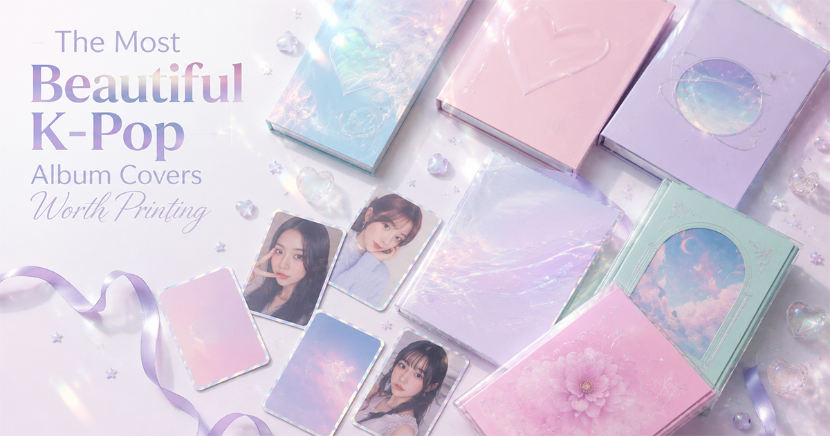
The Most Beautiful K-Pop Album Covers Worth Printing
K-pop treats album art as a complete visual world. Here are the most beautiful K-pop album covers — minimalist, Y2K, dreamy, and bold — worth printing and framing.
No genre treats the album cover as seriously as K-pop. Each release arrives as a complete visual world — concept photography, custom typography, color stories, and packaging designed to be collected and displayed. That makes K-pop covers some of the most print-worthy in modern music.
Here are some of the most beautiful, organized by the aesthetic they nail. (K-pop albums often ship in multiple physical versions — we're highlighting the cover art and visual direction each is best known for.)
1. NewJeans — Get Up (2023)
NewJeans built their identity on restraint: clean type, soft pastel palettes, a minimalist bunny logo, and a Y2K-tinged simplicity that stands out in a genre known for maximalism. The artwork feels more like a fashion lookbook than a pop release — calm, confident, and endlessly framable.
Best for: a minimalist, pastel bedroom wall.
2. IU — LILAC (2021)
A warm, retro-leaning palette built around its namesake lilac, with soft film-grain photography and elegant lettering. IU's covers consistently feel like vintage editorial — nostalgic without being kitsch.
Best for: a soft, romantic, '70s-tinted aesthetic.
3. BTS — BE (2020)
Created during the pandemic, BE leaned into homey intimacy — clean layouts, muted tones, and a deliberately personal, lived-in feel. A reminder that a major pop cover can whisper instead of shout.
Best for: a quiet, neutral-toned space.
4. aespa
aespa's visual world is built on chrome, neon, and a hyper-digital, sci-fi aesthetic — avatars, glitch effects, and futuristic color grading. Their covers look like stills from a near-future film and pop hard against a dark wall.
Best for: a bold, futuristic, high-contrast room.
5. Red Velvet
Red Velvet's two-sided concept — "Red" (bright, playful) and "Velvet" (smooth, mature) — gives their artwork a wide, candy-colored range. The "Red" side in particular is a riot of saturated, graphic color that reads beautifully at poster scale.
Best for: a playful, color-forward space.
6. TWICE
TWICE specialize in bright, cheerful, pastel-pop visuals with strong typography and clean studio photography. Their covers are reliably warm and high-energy — easy, joyful wall art.
Best for: a bright, upbeat room.
7. LE SSERAFIM
A sleek, fashion-driven aesthetic — high-end editorial photography, restrained palettes, and a confident, grown-up minimalism. Their artwork wouldn't look out of place on the cover of a style magazine.
Best for: a modern, fashion-editorial look.
8. (G)I-DLE
Bold, concept-heavy, and unafraid of drama — (G)I-DLE's covers swing from gothic to vivid pop, always with a strong central image and decisive color. Great for a statement piece.
Best for: a dramatic, high-impact wall.
9. Taeyeon
As a soloist, Taeyeon's covers lean moody and atmospheric — soft focus, melancholic palettes, and cinematic lighting that matches her ballad-leaning catalog. Quietly beautiful framed prints.
Best for: a calm, introspective space.
10. SEVENTEEN
SEVENTEEN balance bright group energy with increasingly refined art direction — strong color blocking, clean grids, and bold logotypes. Their later releases in particular have a polished, design-led confidence.
Best for: an energetic, graphic-forward room.
Make Any of These Your Wall Art
K-pop is built to be collected and displayed — so it's a natural fit for poster printing. In PosterVibe, search the album, and the cover art, tracklist, artist, and year load into the editor automatically. Pick a template that matches the concept, customize the layout, and export at 300 DPI.
Turn your bias's best era into a frame on your wall.
Start designing your K-pop poster — free →
Which K-pop cover belongs on this list? Tell us in the community.
Ready to Create Your Own?
Put these ideas into practice with our album cover poster maker, or explore the album poster maker, spotify poster maker, tracklist poster maker.