
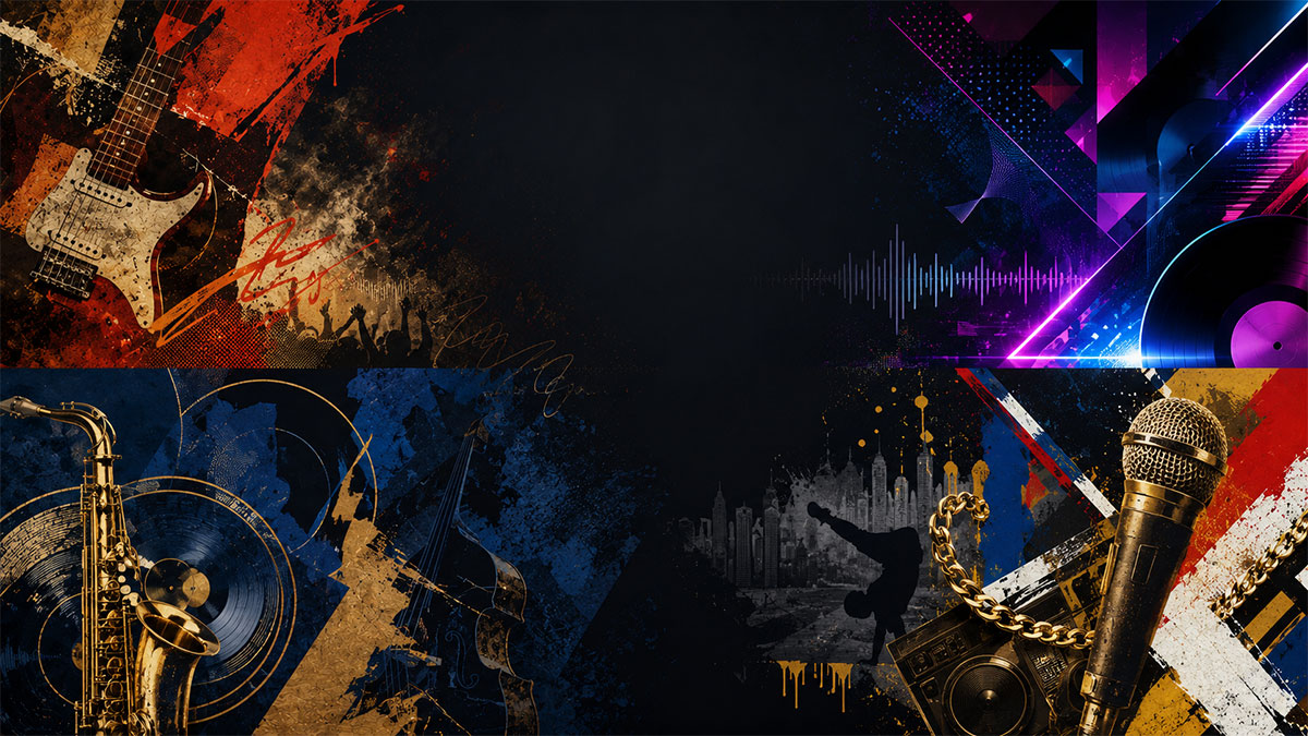
The Design Language of Different Music Genres: A Visual Guide
Discover how visual design reflects musical identity across genres—from minimalist jazz to bold punk aesthetics.
The Design Language of Different Music Genres: A Visual Guide
Every music genre carries its own visual DNA. The colors, typography, imagery, and composition choices that define rock posters differ dramatically from those used in electronic music or classical releases. Understanding these visual conventions helps you create album artwork and posters that instantly communicate the music's spirit before a single note plays.
This guide explores the design language of major music genres, breaking down the visual elements that make each style immediately recognizable and showing how these principles apply when creating music posters.
Why Genre-Specific Design Matters
Visual consistency within music genres isn't arbitrary—it's a form of communication. When someone spots a poster with distressed textures, bold sans-serif type, and high-contrast black-and-white photography, they immediately think punk or alternative rock. Neon gradients and geometric shapes signal electronic music. These visual shortcuts help audiences find music they'll love and help artists connect with their target listeners.
For anyone creating album posters, whether for personal collections or promotional purposes, understanding these visual languages ensures your designs feel authentic rather than generic. An album poster maker that offers template variety acknowledges these genre distinctions, providing starting points that respect each style's unique aesthetic.
Rock and Alternative: Raw Energy and Rebellion
Typography Characteristics
Rock design favors bold, impactful typography. Classic rock often uses thick serif fonts or hand-drawn lettering that feels substantial and timeless. Alternative and indie rock lean toward irregular, handwritten fonts or distressed sans-serifs that convey authenticity and DIY spirit. Punk takes this further with cut-and-paste ransom-note aesthetics, stenciled letters, and deliberately crude execution.
Color Palettes
Classic rock embraces warm, saturated colors—deep reds, oranges, and yellows reminiscent of concert lighting and vinyl-era printing. Alternative rock often employs muted, desaturated palettes or stark black-and-white contrasts. Punk thrives on high-impact combinations: black and red, black and yellow, or complete monochrome.
Imagery and Composition
Rock imagery ranges from photorealistic band portraits to surreal illustrations and symbolic iconography. Concert photography, urban landscapes, and performance shots dominate. Compositions tend toward centered, symmetrical layouts for classic rock, while alternative and punk favor asymmetry, collage elements, and intentional imperfection.
Hip-Hop and R&B: Bold Statements and Cultural Signifiers
Typography Characteristics
Hip-hop typography makes statements. Expect heavy, blocky sans-serifs, custom graffiti-style lettering, or ultra-modern geometric fonts. Many designs feature metallic effects, 3D extrusions, or chrome finishes. R&B often balances bold display fonts with elegant script faces, creating sophisticated contrast.
Color Palettes
Hip-hop embraces bold primaries, metallics (gold, silver, chrome), and high-contrast combinations. Black and gold suggests luxury; red and black conveys power. Contemporary R&B often uses softer gradients, pastels, and moody, atmospheric color schemes that reflect emotional depth.
Imagery and Composition
Portrait photography dominates, often with direct eye contact and confident poses. Urban environments, luxury imagery, and cultural symbolism appear frequently. Compositions range from minimalist single-subject focus to densely layered collages incorporating typography, patterns, and multiple visual elements.
Electronic and Dance: Futuristic Minimalism
Typography Characteristics
Electronic music design often features clean, geometric sans-serifs or futuristic custom typefaces. Minimalism prevails—sometimes the artist or album name appears in small, understated type, letting imagery dominate. Techno and harder electronic styles may use industrial, stenciled, or pixel-based fonts.
Color Palettes
Neon and fluorescent colors define much electronic music design: electric blues, hot pinks, acid greens, and vibrant purples. Gradients and color transitions are common. Alternatively, some electronic subgenres embrace stark monochrome or limited two-color palettes for maximum impact.
Imagery and Composition
Abstract geometric shapes, gradients, and digital manipulation characterize electronic design. Minimalist compositions with ample negative space are common. Imagery often includes light effects, waveforms, synthesizer-inspired visuals, and computer-generated patterns. The aesthetic frequently references technology, science fiction, and digital culture.
Jazz and Classical: Sophistication and Timelessness
Typography Characteristics
Jazz design historically favored elegant serif fonts, though mid-century modern sans-serifs also became iconic. Classical music uses traditional serif typefaces that convey formality and heritage. Both genres prioritize legibility and timeless elegance over trendy experimentation.
Color Palettes
Jazz embraces rich, sophisticated palettes: deep blues, warm browns, burgundy, and gold. Black-and-white photography remains a staple. Classical music often uses muted, dignified colors—navy, forest green, burgundy, and cream—or monochromatic schemes that emphasize refinement.
Imagery and Composition
Jazz imagery includes intimate performance photography, abstract color fields, and mid-century illustration styles. Classical design features instrument photography, formal portraits, historical artwork, or abstract representations of musical concepts. Compositions emphasize balance, symmetry, and generous white space.
Country and Folk: Authenticity and Storytelling
Typography Characteristics
Country music often uses vintage-inspired serif fonts, Western-style lettering, or hand-drawn script that feels personal and handcrafted. Folk embraces handwritten aesthetics, typewriter fonts, and understated sans-serifs that emphasize authenticity over flash.
Color Palettes
Earthy, natural palettes dominate: browns, tans, forest greens, dusty blues, and warm oranges. Vintage color treatments that mimic aged photographs or sun-faded prints are common. The overall feel is warm, organic, and grounded.
Imagery and Composition
Imagery draws from rural landscapes, Americana, vintage photography, and natural textures like wood and paper. Illustrations often feature folk art styles or botanical elements. Compositions tend toward centered, balanced layouts with comfortable amounts of breathing room.
Pop: Versatility and Trend-Forward Design
Typography Characteristics
Pop music design adapts to current trends more rapidly than any other genre. Recent years have seen everything from bold, colorful bubble letters to minimalist sans-serifs. The key is clarity and immediate impact—type must work at thumbnail size and on massive billboards alike.
Color Palettes
Pop embraces vibrant, saturated colors and isn't afraid of pink, purple, yellow, and rainbow gradients. Pastel phases alternate with high-contrast bold periods. The palette often reflects current design trends across fashion, social media, and visual culture.
Imagery and Composition
Pop imagery centers on the artist, often with polished, high-production photography. Compositions can be minimalist or maximalist depending on current trends. Playful elements, unexpected juxtapositions, and eye-catching visual hooks are priorities.
Metal and Hard Rock: Darkness and Intensity
Typography Characteristics
Metal typography ranges from gothic blackletter fonts to custom illegible logos that become iconic symbols. Thrash and death metal favor sharp, angular letterforms. Doom metal uses heavy, ornate fonts. The type itself conveys aggression and power.
Color Palettes
Black dominates, often paired with white, red, or metallic silver. Some subgenres embrace deep purples, dark greens, or blood reds. The overall mood is dark, ominous, and intense.
Imagery and Composition
Imagery includes fantasy art, occult symbolism, horror elements, and intricate illustrations. Photography tends toward high-contrast, dramatic lighting. Compositions are often dense and detailed, rewarding close examination. Symmetry and centered focal points are common.
Applying Genre Design Principles
When creating music posters, these genre conventions provide valuable starting points rather than rigid rules. The most effective designs honor genre expectations while adding personal creativity. Consider:
Consistency with musical content: A jazz album deserves sophisticated, timeless design—not neon gradients and geometric shapes.
Target audience expectations: Fans of specific genres have visual literacy within those styles and appreciate authentic execution.
Creative interpretation: Understanding rules lets you break them intentionally for effect, creating designs that honor tradition while offering fresh perspectives.
Using an album cover poster maker with genre-specific templates helps maintain visual authenticity while allowing customization. The best tools offer starting points rooted in genre conventions alongside flexibility for personal expression.
Creating Multi-Genre Designs
Some albums blend genres, requiring visual approaches that acknowledge multiple influences. Successful multi-genre designs might:
- Combine elements from both styles (jazz-hip-hop might use sophisticated colors with bold typography)
- Choose one dominant visual language with subtle nods to the secondary genre
- Create entirely new visual approaches that represent the unique fusion
The key is intentionality—understanding what each genre's visual language communicates and making deliberate choices about which signals to send.
Technical Considerations Across Genres
Regardless of genre, certain technical principles apply to effective poster design:
Hierarchy: Establish clear visual priority—typically artist name, album title, then supporting details like release date or tracklist poster maker elements.
Legibility: Typography must remain readable at various sizes, especially for text-heavy designs.
Composition: Balance visual weight across the design, using negative space effectively.
Color harmony: Even bold, contrasting palettes should maintain intentional color relationships.
Print readiness: For physical posters, consider resolution, color mode, and bleed requirements.
Many designers use a spotify poster maker as a foundation, automatically populating album metadata before applying genre-appropriate visual treatments.
Evolving Genre Aesthetics
Genre design languages aren't static. What defined punk visually in 1977 differs from contemporary punk aesthetics, though certain core elements persist. Stay current by:
- Studying recent releases within your target genre
- Following contemporary designers working in that musical space
- Understanding how digital platforms influence design choices
- Recognizing when retro aesthetics are being used intentionally versus feeling dated
Conclusion
Understanding the visual language of music genres transforms poster design from guesswork into informed creative decisions. Each genre's typography, color palettes, imagery, and composition conventions evolved to reflect the music's character and connect with its audience.
Whether you're creating posters for personal enjoyment, building a music collection display, or promoting releases, these visual principles help ensure your designs feel authentic and effective. The best results come from respecting genre traditions while adding personal creativity and contemporary awareness.
Ready to turn your favorite album into wall art? Explore PosterVibe or open the poster editor to start creating.