
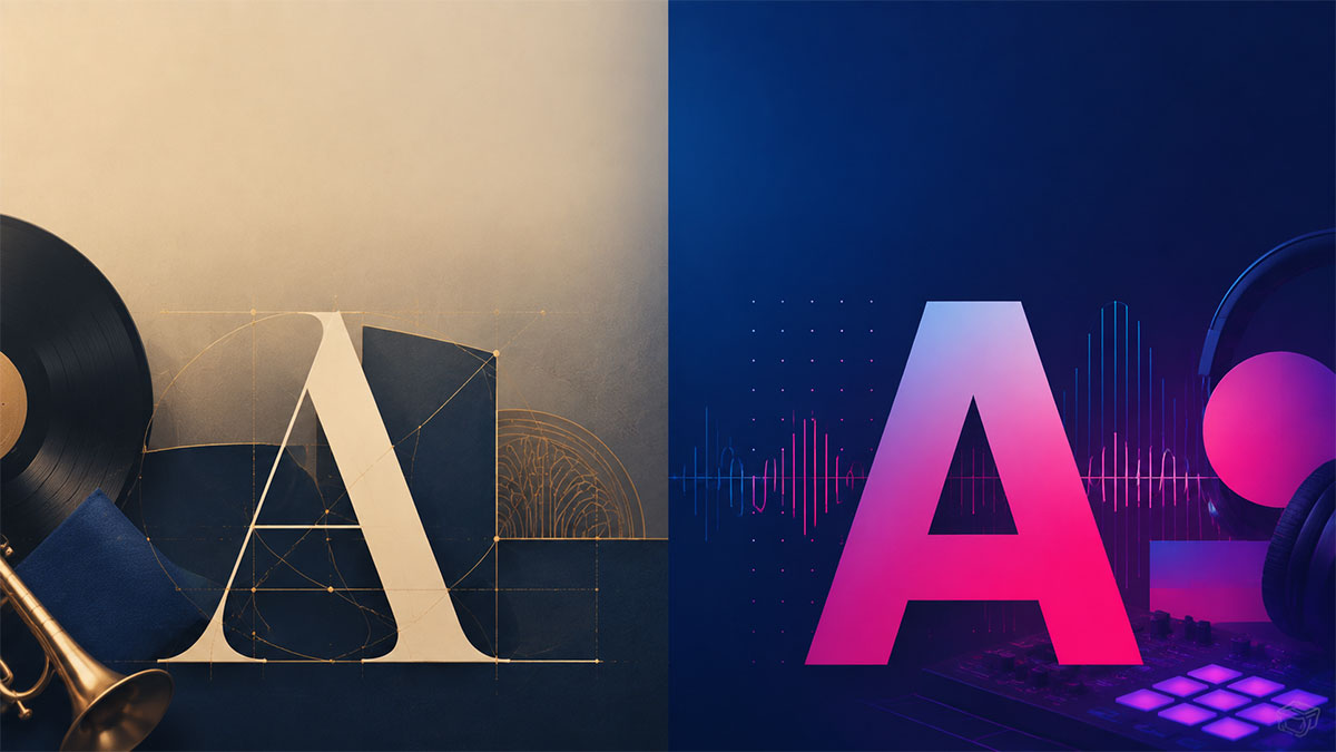
Serif vs. Sans-Serif: Which Font Works for Which Genre?
Learn how to choose between serif and sans-serif fonts for different music genres to create posters that capture the right mood and style.
Serif vs. Sans-Serif: Which Font Works for Which Genre?
Choosing the right typeface can make or break your music poster design. The fonts you select communicate far more than just the album title and artist name—they convey mood, genre, and cultural context before anyone reads a single word. Understanding when to use serif versus sans-serif fonts is one of the most fundamental design decisions you'll make when creating album artwork or music posters.
Understanding Serif and Sans-Serif Fonts
Before diving into genre-specific applications, let's clarify what distinguishes these two font families.
Serif fonts feature small decorative strokes (called serifs) at the ends of letterforms. These flourishes give serif typefaces a traditional, formal, and often elegant character. Classic examples include Times New Roman, Garamond, Baskerville, and Didot. Serifs originated in Roman inscriptions and have carried associations with history, authority, and refinement for centuries.
Sans-serif fonts lack these decorative strokes, presenting clean, streamlined letterforms. The term "sans" comes from French, meaning "without." Popular sans-serif typefaces include Helvetica, Arial, Futura, and Gotham. These fonts emerged prominently in the 20th century and typically convey modernity, minimalism, and directness.
Neither category is inherently superior—each serves different aesthetic and communicative purposes depending on your design goals.
Jazz and Classical: The Serif Stronghold
Serif fonts excel when designing posters for jazz, classical, and traditional music genres that emphasize sophistication and timelessness.
Jazz album covers have historically favored elegant serif typefaces that complement the genre's improvisational artistry and cultural heritage. Fonts like Bodoni and Didot, with their high contrast between thick and thin strokes, capture jazz's dramatic dynamics. More rounded serifs like Garamond work beautifully for vocal jazz, suggesting warmth and intimacy.
Classical music posters benefit from serif fonts that communicate prestige and permanence. Consider using refined serifs such as Caslon or Bembo for chamber music, or more ornate options like Trajan for orchestral works. The historical weight of these typefaces aligns perfectly with centuries-old compositions while maintaining readability at various sizes.
When working with these genres, pair serif headings with complementary serif body text, or create hierarchy by mixing a decorative serif for the artist name with a simpler serif for album details.
Rock and Punk: Breaking the Rules
Rock music's relationship with typography is more rebellious and varied than any other genre.
Classic rock from the 1960s and 70s often employed bold, condensed sans-serif fonts that projected power and directness. However, psychedelic rock embraced ornate, flowing letterforms—sometimes serif-based—that challenged legibility in favor of artistic expression.
Punk rock deliberately rejected design conventions, often using distressed sans-serif fonts, DIY cut-and-paste aesthetics, or intentionally crude lettering. The raw energy of punk translated into typefaces that looked photocopied, ransom-note style, or hand-scrawled. While technically sans-serif fonts dominate punk design, they're usually modified, degraded, or customized to appear anti-establishment.
Hard rock and metal developed their own typographic language, with aggressive, angular sans-serif fonts or highly stylized custom lettering that sometimes incorporated medieval or blackletter influences (which technically qualify as serif fonts, though highly decorative ones).
For rock posters, consider the specific subgenre carefully. Arena rock might call for bold, geometric sans-serifs, while folk rock could benefit from earthy, handcrafted serif options.
Electronic and Dance: Clean Sans-Serif Territory
Electronic music genres overwhelmingly favor sans-serif typography that mirrors the genre's technological origins and forward-looking aesthetics.
House, techno, and minimal electronic music benefit from geometric sans-serif fonts like Futura, Avant Garde, or DIN. These typefaces suggest precision, modernity, and the mechanical origins of synthesized sound. The clean lines and uniform stroke weights create visual rhythm that complements repetitive electronic beats.
Dubstep and bass music often push sans-serif fonts to extremes—extra bold weights, extreme condensation, or futuristic modifications that suggest digital distortion and heavy low-end frequencies.
Ambient and experimental electronic music sometimes breaks from this pattern, occasionally incorporating refined serif fonts to create tension between the organic (traditional typography) and synthetic (electronic production).
When designing for electronic genres, prioritize geometric sans-serifs, explore variable widths and weights, and don't be afraid of stark, minimal compositions with ample negative space.
Hip-Hop and R&B: Bold Sans-Serif with Flexibility
Hip-hop and R&B have developed distinctive typographic traditions that favor impact and personality.
Hip-hop poster design typically employs bold, condensed sans-serif fonts that command attention and project confidence. Custom lettering and graffiti-influenced typography also play significant roles, though these often derive from sans-serif foundations. The genre's visual language prioritizes impact over subtlety, with fonts that work effectively at large scale.
Contemporary R&B has embraced more refined aesthetics in recent years, sometimes incorporating elegant thin sans-serifs or even sophisticated serifs for artists positioning themselves in the tradition of classic soul. The typography often reflects the production values—polished, contemporary R&B calls for sleek typefaces, while raw, alternative R&B might use more experimental approaches.
For these genres, consider bold sans-serifs for artist names, but remain open to mixing styles for album titles or supporting information, especially when the music itself blends genres.
Indie and Alternative: The Great Mixing Ground
Indie and alternative music resist easy typographic categorization, often intentionally mixing serif and sans-serif fonts to create unique visual identities.
Indie rock and folk frequently combine fonts in unexpected ways—perhaps a vintage serif for the artist name with a quirky sans-serif for the album title. This eclectic approach reflects the genre's DIY ethos and resistance to commercial formulas.
Dream pop and shoegaze often favor soft, ethereal sans-serif fonts or delicate serifs that suggest the music's atmospheric qualities. Typography might be reversed out of photographs, layered transparently, or otherwise integrated into imagery rather than imposed upon it.
The key principle for indie genres is authenticity over convention. Choose typefaces that genuinely reflect the artist's aesthetic rather than following genre formulas.
Country and Americana: Heritage Serifs
Country music's deep roots in American tradition make it natural serif font territory, though contemporary country has diversified typographically.
Traditional and classic country benefits from slab serifs like Rockwell or Clarendon, which evoke Western heritage and Americana. These sturdy, confident typefaces suggest authenticity and connection to tradition.
Contemporary country-pop often adopts cleaner sans-serif approaches that align with mainstream pop aesthetics, though many designs still incorporate serif elements to maintain genre recognition.
Bluegrass and folk work beautifully with vintage-inspired serif fonts that suggest historical continuity and craftsmanship.
Practical Typography Tips for Music Posters
Regardless of genre, follow these principles when selecting fonts:
Establish clear hierarchy. Your artist name, album title, and supporting information should have distinct typographic treatments that guide the viewer's eye through the composition.
Limit your typeface selection. Using one serif and one sans-serif font (or even just one typeface family with multiple weights) typically produces more cohesive results than mixing numerous fonts.
Consider readability at different sizes. Your typography needs to work whether the poster is viewed from across a room or shared as a small thumbnail on social media.
Respect the music. The best typographic choices emerge from genuine engagement with the artist's sound and aesthetic rather than generic genre assumptions.
Test contextually. View your typography choices alongside album artwork, photography, and other design elements rather than in isolation.
Putting Typography Into Practice
When you're ready to apply these principles to your own music poster designs, having access to professional templates with customizable typography can streamline the creative process. The ability to experiment with different typeface combinations while maintaining proper hierarchy and layout helps you discover what works for specific genres and artists.
Whether you're creating artwork for your favorite album, designing promotional materials for a local band, or simply exploring music-inspired visual design, understanding the cultural and aesthetic associations of serif and sans-serif fonts gives you a stronger foundation for making intentional, effective typographic choices.
Ready to turn your favorite album into wall art? Explore PosterVibe or open the poster editor to start creating.
Ready to Create Your Own?
Put these ideas into practice with our typography album poster maker, or explore the album poster maker, spotify poster maker.