Minimalist Album Covers That Prove Less Is More
One color, one shape, one idea. These minimalist album covers prove that restraint is the boldest design choice — and they make the best wall art.
The hardest thing in design is knowing what to leave out. The covers below do exactly that — they strip away everything but a single color, shape, or idea, and end up more powerful for it. They're also, not coincidentally, some of the best wall art in music: confident, timeless, and easy to live with.
Here are the minimalist covers that prove less is more.
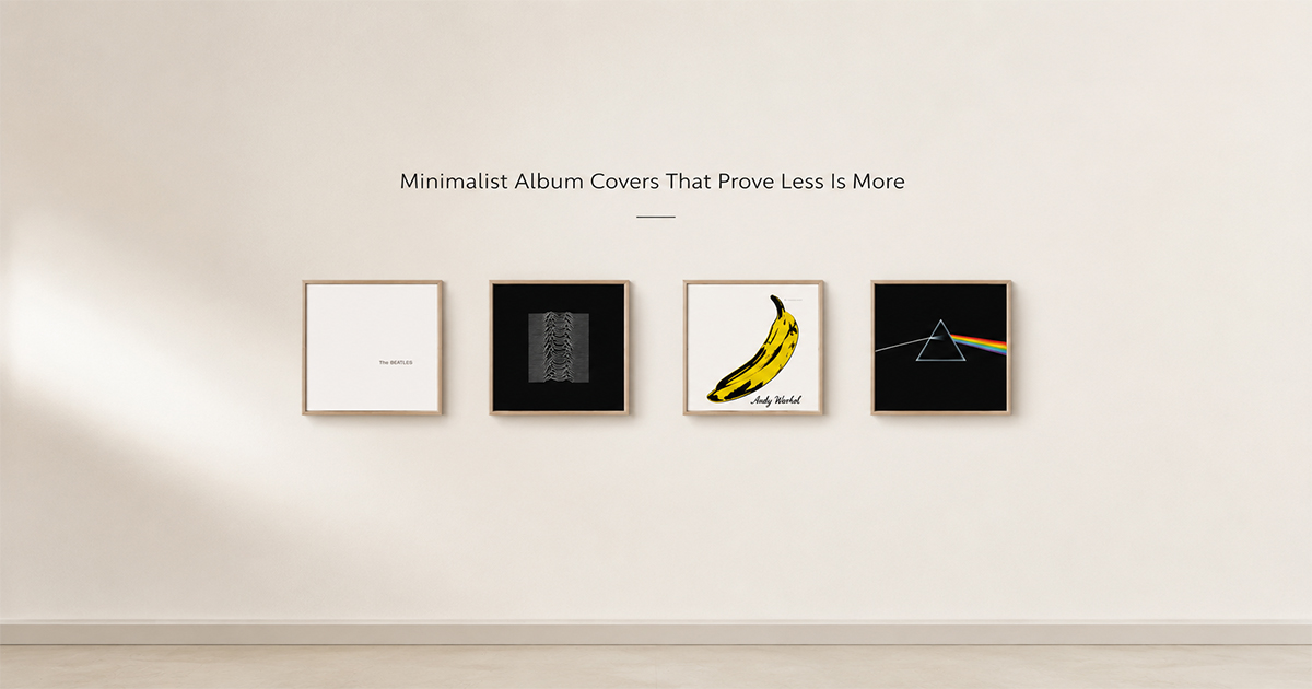
1. The Beatles — The Beatles (The White Album) (1968)
Pure white, with only an embossed title and serial number. Richard Hamilton's radical anti-cover was a direct rebuke to the maximalism of Sgt. Pepper's. Nothing has ever said more by showing less.
2. Joy Division — Unknown Pleasures (1979)
Peter Saville's white pulsar waves on black. No band name, no title — just data turned into art. The most imitated minimalist cover ever made.
3. The Velvet Underground & Nico (1967)
Warhol's single yellow banana on white. A fine artist proving that one object, perfectly placed, is all a cover needs.
4. Pink Floyd — The Dark Side of the Moon (1973)
A prism, a beam of light, a spectrum, on black. Pure geometry — minimalism as scientific elegance.
5. The xx — xx (2009)
A single white X on a black field. Quiet, modern, and instantly recognizable — restraint as a brand.
6. Metallica — Metallica (The Black Album) (1991)
Black on black, a snake barely visible. The boldest move a huge band could make: almost nothing at all.
7. New Order — Power, Corruption & Lies (1983)
Peter Saville pairs a classical Fantin-Latour flower painting with a cryptic color-coded alphabet — no text, no logo. Elegant, intellectual minimalism.
8. Kanye West — Yeezus (2013)
A bare jewel case and a single strip of red tape. Aggressively, provocatively empty — anti-design taken to its logical end.
9. Frank Ocean — Blonde (2016)
A single portrait, no text on the front. The confidence of leaving off the title is the whole design.
10. Charli XCX — Brat (2024)
A flat lime-green square and one blurry lowercase word. So minimal it looked like a mistake — and so confident it defined a year.
Make Any of These Your Wall Art
Minimalist covers are the easiest to frame and the most timeless to own. In PosterVibe, search the album and the cover art loads into the editor automatically — then strip the layout back, give it white space, and export at 300 DPI for print.
The boldest wall is often the simplest one.
Start designing a minimalist poster — free →
What's the most minimal cover you love? Tell us in the community.