The Most Iconic Album Covers by Color Palette
Choosing wall art by color? Here are the most iconic album covers organized by palette — red, blue, yellow, pink, green, black, and white.
When you're decorating a wall, color comes first. The right palette ties a room together; the wrong one fights it. So instead of ranking covers by era or genre, here's a different way to choose your next poster — organized by the color that defines it.
Find your palette, find your print.
Red
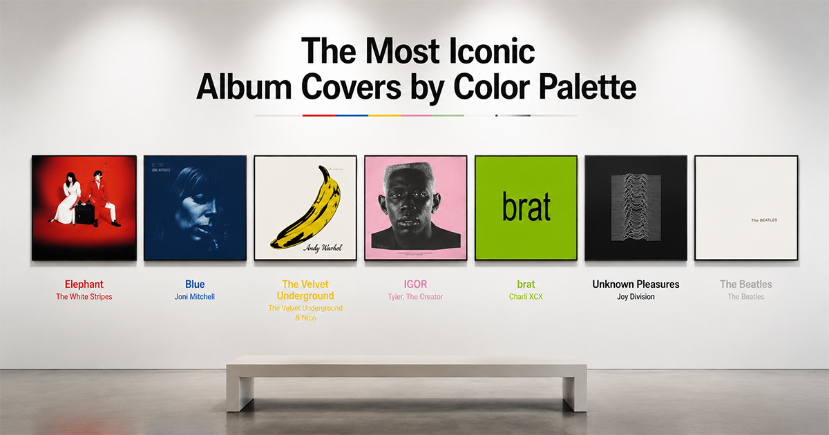
The White Stripes — Elephant (2003). Pure red, white, and black — one of the most disciplined color schemes in rock. Bold, graphic, and impossible to ignore.
Taylor Swift — Red (2012). Warm autumn reds and a half-hidden face. Softer and more cinematic, but unmistakably red-forward.
Best for: a high-energy accent wall.
Blue
Joni Mitchell — Blue (1971). A deep, washed indigo portrait — melancholy and beautiful, the cover that made blue feel like an emotion.
Weezer — Weezer (The Blue Album) (1994). Four guys against a flat blue backdrop. Clean, deadpan, and instantly iconic.
Miles Davis — Kind of Blue (1959). Soft-focus blue-toned performance photography — timeless and calm.
Best for: a cool, calming space.
Yellow
The Velvet Underground & Nico (1967). Warhol's banana on white — the most famous yellow in music. Gallery-grade pop art.
Wu-Tang Clan — Enter the Wu-Tang (36 Chambers) (1993). The yellow logo and hooded figures — raw, bold, and unmistakable.
Best for: a warm, energizing pop of color.
Pink
Tyler, the Creator — IGOR (2019). Pale pink, cream, and yellow — an unexpectedly sophisticated palette around an unforgettable portrait.
Harry Styles — Fine Line (2019). A fisheye shot drenched in pink, shot by Tim Walker. Playful and saturated.
Best for: a soft, modern, statement room.
Green
Charli XCX — Brat (2024). A flat lime-green field and one blurry word. The most talked-about color in recent pop design.
R.E.M. — Green (1988) or Weezer — The Green Album (2001). Clean, single-color confidence.
Best for: a bold, contemporary wall.
Black
Joy Division — Unknown Pleasures (1979). White pulsar waves on pure black — endlessly reproduced, always best in its original dark form.
Metallica — Metallica (The Black Album) (1991). Near-black on black, with a coiled snake barely visible. Maximum drama from minimal contrast.
Best for: a dramatic home studio or feature wall.
White
The Beatles — The Beatles (The White Album) (1968). Pure white with embossed text — Richard Hamilton's radical anti-cover. Minimalism as a statement.
Lauryn Hill — The Miseducation of Lauryn Hill (1998) brings warmth to a near-neutral palette with its cream tones.
Best for: a clean, gallery-style minimalist space.
Make Any of These Your Wall Art
Designing a room around a palette? In PosterVibe, search any album and the cover art loads into the editor automatically — and our color-palette tools pull the exact tones from the artwork so you can match templates, type, and backgrounds to your space. Customize and export at 300 DPI.
Start designing by color — free →
What color is your wall? Find the cover to match in the community.