
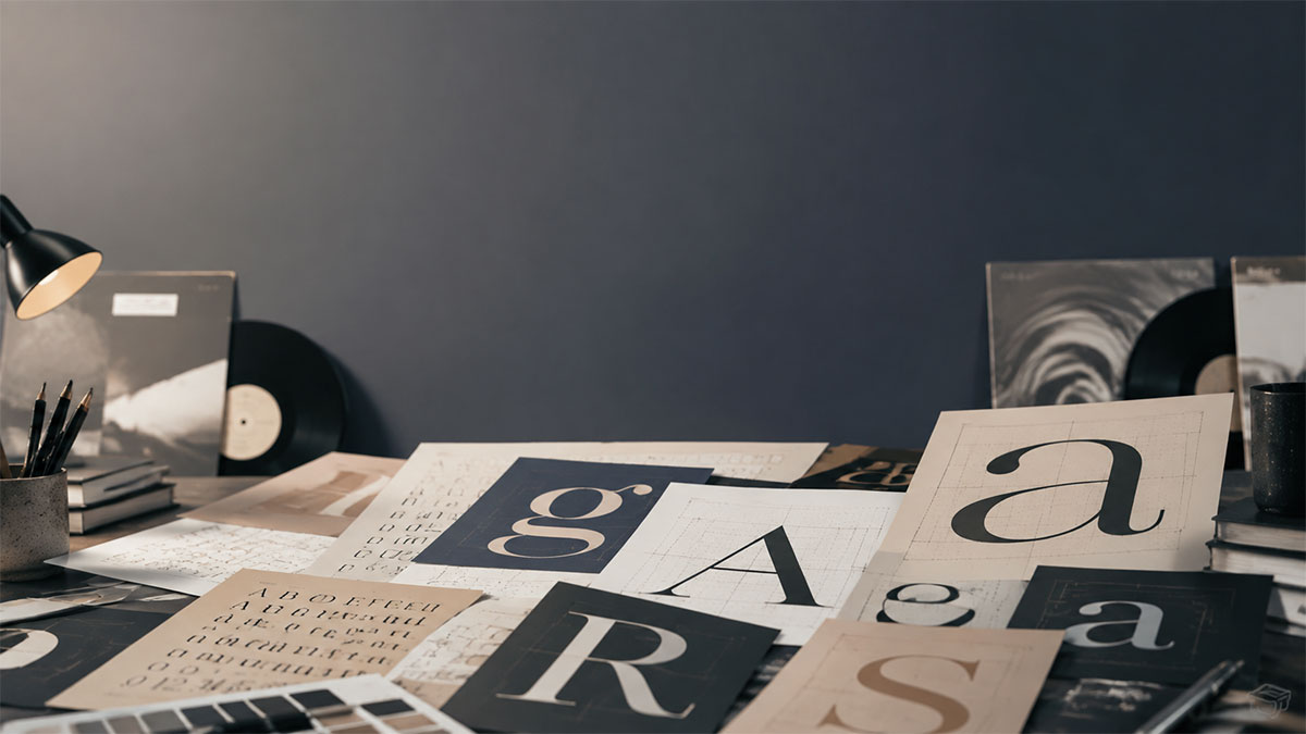
Font Pairing Guide for Music Poster Design: Typography Tips That Work
Master the art of combining typefaces for music posters. Learn proven font pairing strategies that create visual harmony and impact.
Font Pairing Guide for Music Poster Design: Typography Tips That Work
Typography can make or break a music poster. The right font pairing creates visual interest, establishes hierarchy, and conveys the mood of the music—while poor choices result in designs that feel amateurish or difficult to read. This comprehensive guide walks you through the principles and practical strategies for pairing fonts effectively in music poster design.
Understanding Typography Fundamentals
Before diving into specific pairings, it's essential to understand the basic typeface categories and their characteristics.
The Five Main Typeface Categories
Serif fonts feature small decorative strokes at the ends of letterforms. These traditional typefaces convey elegance, authority, and timelessness—ideal for classical music, jazz, or vintage aesthetics. Common examples include Garamond, Baskerville, and Times New Roman.
Sans-serif fonts lack these decorative strokes, offering clean, modern letterforms. They work well for contemporary genres like electronic music, indie rock, and pop. Popular choices include Helvetica, Futura, and Gotham.
Display fonts are designed specifically for headlines and large-scale use. These attention-grabbing typefaces include everything from bold condensed fonts to decorative scripts, each bringing strong personality to a design.
Script fonts mimic handwriting or calligraphy, ranging from elegant formal scripts to casual brush lettering. These work particularly well for romantic ballads, acoustic music, or retro designs.
Monospace fonts give each character equal width, creating a technical, typewriter-like appearance. They're effective for electronic music, experimental genres, or creating deliberate contrast.
The Golden Rules of Font Pairing
Rule 1: Limit Your Selection
The most common mistake in music poster design is using too many typefaces. Restrict yourself to two or three fonts maximum—typically one for the main headline (artist or album name), one for supporting information (track listings, dates), and occasionally a third for accent elements.
Rule 2: Create Contrast
Effective font pairings rely on contrast rather than similarity. Pair fonts that are distinctly different in style, weight, or proportion. For example, combining a bold sans-serif headline with a light serif body creates clear visual hierarchy and keeps the design from feeling monotonous.
Rule 3: Maintain Mood Consistency
While your fonts should contrast structurally, they should agree in mood and era. A sleek modern sans-serif paired with an ornate Victorian script creates discord rather than harmony. Both fonts should support the overall aesthetic direction and musical genre.
Rule 4: Establish Clear Hierarchy
Your font pairing should make it instantly clear which information is most important. Use size, weight, and typeface choice to guide the viewer's eye from the most prominent element (usually the artist name) down through supporting details.
Proven Font Pairing Strategies
Strategy 1: Serif + Sans-Serif
This classic combination offers built-in contrast while maintaining professionalism. Use a bold sans-serif for the artist name to command attention, then pair it with a refined serif for album titles or track listings. This pairing works across genres but particularly suits indie folk, alternative rock, and singer-songwriter posters.
The key is ensuring sufficient weight difference—a heavy sans-serif with a light or regular-weight serif, or vice versa.
Strategy 2: Display + Simple Sans-Serif
Let a distinctive display font carry the personality while a neutral sans-serif handles the practical information. This approach works brilliantly for genre-specific designs where the display font can capture the musical style—a grunge-inspired typeface for alternative rock, a geometric display font for electronic music, or a bold condensed font for hip-hop.
The supporting sans-serif keeps secondary information legible without competing for attention.
Strategy 3: Font Family Variation
Many professional typeface families include multiple weights and styles designed to work together harmoniously. Using different weights from the same family—such as a bold condensed weight for headlines and a light extended weight for body text—creates cohesive yet dynamic designs.
This approach is particularly effective when you want consistency without monotony, and it's a safe choice when you're still developing your pairing instincts.
Strategy 4: Contrasting Weights Within One Style
Staying within a single typeface category but using extreme weight differences can create striking results. Pair an ultra-bold sans-serif with an ultra-light version of a different sans-serif family. This sophisticated approach works well for minimalist designs and contemporary music genres.
Strategy 5: Modern + Vintage
Deliberately pairing fonts from different eras can create compelling tension. A clean modern sans-serif combined with a vintage script or aged serif evokes nostalgia while maintaining readability. This works particularly well for tribute posters, anniversary editions, or genres that blend old and new influences.
Genre-Specific Pairing Recommendations
Rock and Alternative
Bold condensed sans-serifs or distressed display fonts paired with clean, readable sans-serifs for track information. Consider high-contrast pairings that convey energy and edge.
Jazz and Classical
Elegant serifs for the main type combined with lighter-weight serifs or refined sans-serifs for supporting text. Sophistication and readability are paramount.
Electronic and Dance
Geometric sans-serifs or futuristic display fonts with monospace or technical-looking typefaces for details. Clean, modern pairings that suggest precision and energy.
Hip-Hop and R&B
Bold, impactful display fonts or custom lettering for artist names, balanced with straightforward sans-serifs for album and track information. Strong personality with clear hierarchy.
Folk and Acoustic
Hand-lettered styles or warm serifs paired with simple sans-serifs or softer geometric fonts. Approachable, organic pairings that feel personal.
Technical Considerations for Poster Design
Readability at Different Sizes
Music posters need to work at multiple scales—eye-catching from across a room and readable up close. Test your font pairings at various sizes to ensure the artist name remains bold and clear at a distance while track listings stay legible at smaller scales.
Avoid overly decorative fonts for body text, regardless of how well they pair aesthetically. Function must balance form.
Print vs. Digital Display
Fonts that look crisp on screen may behave differently in print. Very thin strokes can disappear at small sizes when printed, while extremely bold condensed letters may fill in. If you're designing for physical printing, preview your pairings at the actual output size when possible.
Licensing and Usage Rights
Ensure any fonts you use are properly licensed for commercial use if you plan to sell posters or use them professionally. Many free fonts are restricted to personal use only.
Common Font Pairing Mistakes to Avoid
Using too-similar fonts creates confusion rather than hierarchy. If viewers can't immediately distinguish between your headline and body fonts, the pairing isn't working.
Choosing fonts that compete happens when both selections have strong personality. Let one font be the star while the other plays a supporting role.
Ignoring x-height compatibility can make perfectly good fonts look awkward together. X-height—the height of lowercase letters—should be reasonably similar between paired fonts for visual harmony.
Overusing trending fonts dates your design quickly. While it's fine to be aware of current typography trends, classic combinations have staying power.
Practical Exercises to Develop Your Pairing Skills
Create multiple versions of the same poster with different font pairings. This side-by-side comparison quickly reveals which combinations create the strongest hierarchy and most appropriate mood.
Study professional music poster designs from different eras and genres. Identify the font pairings used and analyze why they work for that particular context.
Build a personal library of font combinations that resonate with you, organized by mood or genre. This becomes a valuable reference for future projects.
Applying Font Pairing in Your Designs
When working on music poster projects, start by selecting your dominant typeface—the one that will carry the most important information and set the overall tone. This choice should reflect the musical genre, artist personality, and poster aesthetic.
Once you've established your hero font, choose a complementary typeface that provides contrast while supporting the overall mood. Test the pairing with actual content at various sizes before committing to the design.
Many online design tools provide templates with professionally paired fonts already selected, which can serve as starting points or inspiration for your own combinations. These templates offer practical examples of how effective pairings work in real music poster layouts.
Remember that typography is just one element of successful poster design. Your font pairing should work harmoniously with color choices, imagery, layout, and white space to create a cohesive whole that honors the music and engages viewers.
Refining Your Typography Skills
Developing an eye for effective font pairing takes practice and experimentation. Start with proven combinations and gradually push into more adventurous territory as your confidence grows. Pay attention to typography in your daily environment—album covers, concert posters, magazine layouts—and analyze what makes certain pairings successful.
The most effective music posters use typography not just as a vehicle for information, but as a core part of the visual storytelling. Your font choices should evoke the emotional quality of the music itself, whether that's the raw energy of punk rock, the sophistication of jazz, or the intimacy of folk.
Ready to turn your favorite album into wall art? Explore PosterVibe or open the poster editor to start creating.
Ready to Create Your Own?
Put these ideas into practice with our typography album poster maker, or explore the album poster maker, spotify poster maker.