
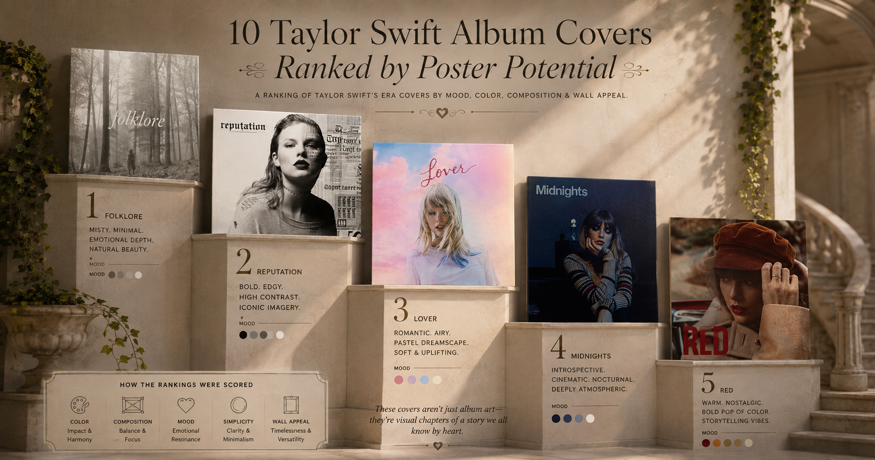
10 Taylor Swift Album Covers Ranked by Poster Potential
Which Taylor Swift album cover looks best on your wall? We rank all 10 eras by poster potential — composition, color, and framing impact.
Taylor Swift's albums aren't just records — they're eras, each with its own color story, typography, and mood. That makes her covers some of the most collectible in pop. But which ones actually look best blown up and framed on a wall?
We ranked her studio album covers by pure poster potential: composition, color, and how well each holds up at 24×36 inches.
1. folklore (2020)
A grainy black-and-white photograph of Taylor standing alone in a forest, dwarfed by trees, face half-turned. It reads as a fine-art darkroom print, not a pop release. The lowercase serif title is perfect. Printed large in black and white, nothing else in her catalog comes close.
2. evermore (2021)
The autumnal sequel to folklore — Taylor from behind in a plaid coat, single braid, warm woodland tones. The earthy palette makes it one of the most livable, frame-anywhere covers she's released.
3. reputation (2017)
Stark black-and-white, Taylor's face beside repeating newspaper-print text. Bold, graphic, and confrontational — it works almost like a typographic poster. High contrast means it commands a wall.
4. Red (2012)
Half of Taylor's face under a hat, lips and scarf in frame, warm autumn tones. Intimate and cinematic, with a vintage-photo softness that frames beautifully.
5. 1989 (2014)
A cropped Polaroid cutting off above the lips, seagulls and a pale palette. The Polaroid framing and deliberate imperfection became one of pop's most imitated aesthetics.
6. Lover (2019)
Pastel pink-and-blue painted skies and glittery, dreamy color. The most overtly decorative cover she's made — soft, romantic, and ready-made for a pastel room.
7. Midnights (2022)
Moody deep-blue tones, a lighter flame illuminating her face, '70s-retro styling. Atmospheric and cinematic, with a rich palette that glows on a dark wall.
8. The Tortured Poets Department (2024)
Black-and-white, Taylor reclining, soft and intimate. Understated and editorial — a quieter, photographic cover that suits a minimalist frame.
9. Speak Now (2010)
The swirling purple gown in motion — romantic and theatrical, full of movement. The deep violet is gorgeous, even if the styling reads slightly more of-its-moment than the timeless entries above.
10. Fearless (2008)
Golden, windswept hair and warm light — the cover that launched her crossover. Nostalgic and warm, though softer and lower-contrast than her later, more deliberately art-directed eras.
Make Any Era Your Wall Art
Want your favorite era on your wall? In PosterVibe, search the album and the cover art, tracklist, and year load straight into the editor. Pick a template that matches the era's mood — minimal serif for folklore, bold type for reputation — customize, and export at 300 DPI for print.
Start designing your Taylor Swift poster — free →
Which era did we rank too low? Defend it in the community.
Ready to Create Your Own?
Put these ideas into practice with our album cover poster maker, or explore the album poster maker, spotify poster maker, tracklist poster maker.