
How Album Cover Designers Choose Color Palettes: A Deep Dive into Music Visual Identity
Discover the strategic methods album cover designers use to select color palettes that capture musical essence and connect with audiences.
How Album Cover Designers Choose Color Palettes: A Deep Dive into Music Visual Identity
The color palette of an album cover does more than catch the eye—it communicates mood, genre, era, and artistic intent before a single note plays. For designers working on music packaging, color selection is a strategic process that balances psychological impact, market positioning, and pure visual storytelling. Understanding how professionals approach this challenge reveals both timeless principles and contemporary techniques that anyone creating music posters can apply.
The Psychology Behind Music and Color
Album cover designers begin with the fundamental relationship between color and emotion. Warm colors like reds, oranges, and yellows typically convey energy, passion, and immediacy—qualities that align naturally with rock, pop, and upbeat electronic music. Cool colors such as blues, greens, and purples suggest introspection, calm, or melancholy, making them frequent choices for indie, ambient, and jazz recordings.
This psychological foundation isn't arbitrary. Designers draw on color theory research and cultural associations that audiences bring to visual media. A deep purple might evoke luxury and creativity, while stark black and white signals minimalism, sophistication, or raw authenticity. The designer's task is matching these inherent color meanings to the specific sonic and thematic content of the album.
Genre conventions also play a significant role. Metal albums gravitate toward blacks, reds, and metallic tones. Hip-hop covers often feature bold, saturated colors or high-contrast compositions. Classical and jazz recordings frequently employ muted, elegant palettes. While innovative designers sometimes subvert these expectations for effect, understanding genre color language helps ensure the cover communicates to its intended audience at first glance.
Starting with the Music Itself
Professional album cover designers typically begin by immersing themselves in the music. Listening repeatedly to the album reveals emotional arcs, lyrical themes, and sonic textures that suggest visual directions. A sparse, acoustic album might inspire earthy tones and desaturated palettes, while a maximalist electronic record could call for vivid, clashing colors that mirror its sonic density.
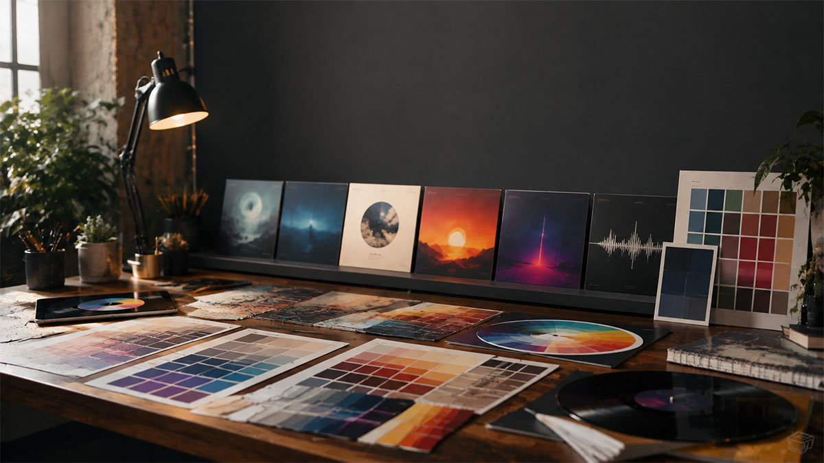
Many designers create mood boards during this exploratory phase, collecting images, artworks, photographs, and color swatches that resonate with the music's feel. These reference collections help identify recurring color themes and establish a visual vocabulary before formal design begins. The mood board serves as a bridge between auditory experience and visual expression.
Collaboration with artists matters enormously in this process. Musicians often have strong opinions about how their work should be visually represented, and productive conversations about color can reveal aspects of the music's meaning that might not be immediately obvious. A song that sounds melancholic might actually be about hope, suggesting a different color approach than surface listening would indicate.
Technical Approaches to Palette Development
Once a general direction emerges, designers employ several technical methods to develop specific color palettes. The classic color harmony approaches provide structured starting points:
Monochromatic schemes use variations in lightness and saturation of a single hue, creating cohesive, sophisticated looks that work well for minimalist or mood-focused albums. Think of albums bathed entirely in shades of blue or variations of sepia tones.
Analogous palettes combine colors adjacent on the color wheel—such as blues, blue-greens, and greens—producing harmonious, natural-feeling compositions that suggest continuity and flow. These work particularly well for albums with cohesive sonic identities.
Complementary schemes pair opposite colors like blue and orange or red and green, generating visual tension and energy. This approach suits albums with dynamic contrasts or dramatic themes, though it requires careful balancing to avoid visual clash.
Triadic and split-complementary arrangements offer more complex color relationships, using three colors evenly spaced around the color wheel or variations on complementary pairings. These sophisticated schemes allow designers to incorporate more color variety while maintaining visual coherence.
Beyond traditional harmony rules, many contemporary designers use digital tools to extract palettes from photographs, artworks, or other visual references. This technique grounds the color selection in existing imagery that already captures the desired mood, then adapts those extracted colors to the album design context.
Cultural and Contextual Considerations
Color meanings vary significantly across cultures, and designers working on internationally distributed albums must navigate these differences thoughtfully. White signifies purity in Western contexts but mourning in some Eastern cultures. Red conveys luck and celebration in Chinese culture but danger or warning in Western design language. Understanding the target audience's cultural background influences palette decisions, especially for artists with global reach.
Historical and era-specific color associations also inform design choices. Designers creating covers that reference particular musical periods often adopt the color aesthetics of those times—the psychedelic saturated hues of the 1960s, the neon brights of the 1980s, or the desaturated earth tones of 1990s alternative rock. These period-appropriate palettes trigger nostalgia and immediately position the album within a particular musical lineage.
Contemporary design trends influence album cover palettes as well, though the best designers balance current aesthetics with timelessness. An album cover needs to feel fresh on release day but shouldn't look hopelessly dated five years later. This tension encourages thoughtful color choices that acknowledge trends without becoming enslaved to them.
Practical Production Constraints
Designers must also consider how color palettes will reproduce across different media and contexts. Album covers appear as small streaming thumbnails, physical vinyl sleeves, CD jewel cases, and promotional materials. Colors that look striking in one format might lose impact in another.
Print production introduces additional considerations. The CMYK color space used in professional printing has a different gamut than RGB digital displays, meaning some vibrant screen colors can't be accurately reproduced in print. Experienced designers account for this by choosing palettes that work across both digital and physical formats, or they create optimized versions for each medium.
Budget constraints sometimes influence color decisions as well. Special print treatments like metallic inks, spot colors, or fluorescent hues add production costs. While major label releases might afford these enhancements, independent artists often work within standard four-color printing parameters. Designers create compelling palettes within whatever production realities apply to the project.
Testing and Refinement
Once initial palette concepts are developed, professional designers test them rigorously. This means viewing color combinations at various scales, on different devices and screens, and in both digital and printed formats when possible. A palette that seems perfect on a large monitor might feel completely different as a small smartphone thumbnail.
Designers also evaluate how typography, photography, and graphic elements interact with the chosen colors. A beautiful palette in the abstract might clash with necessary text elements or fail to provide adequate contrast for legibility. These practical considerations often lead to palette adjustments—lightening a background to improve text readability, or shifting a hue slightly to better complement photographic skin tones.
Feedback from stakeholders informs refinement as well. Artists, labels, art directors, and sometimes focus groups offer perspectives that help designers fine-tune their color choices. While too many opinions can dilute a strong concept, thoughtful feedback often catches issues the designer might have overlooked or reveals opportunities for improvement.
Contemporary Tools and AI Assistance
Modern designers have access to sophisticated color tools that streamline palette development. Adobe Color, Coolors, and similar applications help generate harmonious combinations, extract palettes from images, and test accessibility and contrast ratios. These tools don't replace design judgment but accelerate exploration and refinement.
AI-powered color assistance has emerged as a valuable resource in recent years. Smart color palette generators can analyze an album's mood, genre, or reference images to suggest harmonious combinations. For creators designing their own music posters, these AI tools democratize access to color expertise that might otherwise require years of training to develop.
When working with platforms that offer AI color palette features, users can experiment more freely, testing combinations they might not have considered while still grounded in color theory principles. This technology particularly benefits music fans creating posters for personal spaces who want professional-looking results without formal design backgrounds.
Applying These Principles to Your Music Posters
Understanding how professional album cover designers choose color palettes empowers anyone creating music-related visual projects. Start by listening carefully to the music and identifying emotional keywords—energetic, melancholic, mysterious, joyful. Let these descriptors guide your initial color exploration.
Consider the context where your poster will be displayed. A poster for a personal bedroom might use different colors than one for a public space or gift. Think about complementary colors in the room's decor or the emotional atmosphere you want to create.
Don't hesitate to reference existing album covers, artworks, or photographs that capture the feeling you're after. Extracting color palettes from inspiring images provides concrete starting points and ensures your choices are grounded in proven visual relationships.
Test your color selections at the actual size and format you'll use. What works as a large print might not translate to smaller dimensions, and vice versa. Pay attention to how text and images interact with your background colors, ensuring adequate contrast and visual hierarchy.
Ready to turn your favorite album into wall art? Explore PosterVibe or open the poster editor to start creating.
Ready to Create Your Own?
Put these ideas into practice with our album cover poster maker, or explore the album poster maker, spotify poster maker, tracklist poster maker.